
CSS float is a property that forces any element to float (right, left, none, inherit) inside its parent body with the rest of the element to wrap around it. This property can be used to place an image or an element inside its container and other inline elements will wrap around it.
For eg. : Images in newspaper and articles are placed in certain position with rest of the content wrapped around it.
One should keep in mind that this can only be applied to float the element horizontally (i.e. right or left ) not vertically.
Syntax :
float: left | right | none | inherit ;Values :
float : right;    /* Floats the element to right of it's container */
float : left;     /*  Floats the element to left of it's container */
float : none;     /*  It will restrict the element to float */
float : initial;  /*  The element remains to it's default position */
float : inherit;  /*  Enables the element to inherit the property from its parent element */
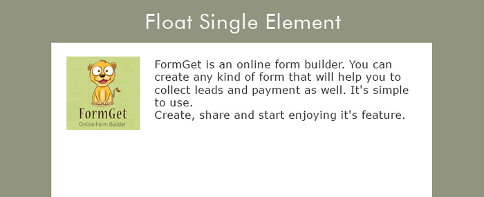
Example 1 – Floating single element
Here we will be going to see how an element floats inside its container with the help of an example.
CSS File : style.css
Below is the CSS that we have used here. In which property is set to float : left.
img {
float: left;
width: 200px;
height: 150px;
}
HTML File : float_left.html
This is our html page in which few demo paragraphs are created with an image in it to show float effect.
<!DOCTYPE html>
<html>
<head>
<title>CSS float left</title>
<!-- Include CSS file here -->
<link href="css/style.css" rel="stylesheet">
</head>
<body>
<p>The result is that the image will float to the left in the paragraph.</p>
<p><img src="images/cat.jpg">
Lorem Ipsum has been the industry's standard dummy text ever since the 1500s,
when an unknown printer took a galley of type and scrambled it to make a type specimen book.
</p>
</body>
</html>
Example 2 – Floating multiple elements
In the above example we have seen to float a single element, here we will be going to see how multiple element (here it is an image) floats inside it’s container one to another. In this you may also find that as you will minimize the window size they will automatically get shifted to the defined position. It is because they do not get enough space to spread.

CSS File : style.css
Here it is our CSS file which is implied to all the images with the class name as slides.
.slides {
float: left;
width: 150px;
height: 100px;
margin: 5px;
}
HTML File : float_multiple.html
Our HTML page with multiple images to show the float effect in it.
<!DOCTYPE html>
<html>
<head>
<title>CSS float left for multiple elements</title>
<!-- Include CSS file here -->
<link href="css/style.css" rel="stylesheet">
</head>
<body>
<h3>Multiple Image Float CSS</h3>
<p>Resize the browser-window to see the changes. The image will automatically shift to left</p>
<img class="slides" src="images/balls.jpg"/>
<img class="slides" src="images/cloud.jpg"/>
<img class="slides" src="images/flowers.jpg"/>
<img class="slides" src="images/nature.jpg"/>
<img class="slides" src="images/spiral.jpg"/>
<img class="slides" src="images/sunflower.jpg"/>
<img class="slides" src="images/waves.jpg"/>
<img class="slides" src="images/forest.jpg"/>
</body>
</html>
Using Clear to turn off float :
To avoid viewing the wrapped element around the floated element you have to use clear property. Using this the wrapped element will switch to next line.

CSS File : style.css
Simple CSS lines that is being used to clear the element from both sides of the paragraph using property clear : both.
img {
float: left;
}
p.para {
clear: both;
}
HTML File : clear.html
Easy HTML lines with an image and two paragraphs for illustrating clear effect in it.
<!DOCTYPE html>
<html>
<head>
<title>
<!-- Include CSS file here -->
<link href="css/style.css" rel="stylesheet">
</head>
<body>
<img src="images/fogo.jpg" width="95" height="84">
<p>Lorem Ipsum has been the industry's standard dummy text ever since the 1500s,
when an unknown printer took a galley of type and scrambled it to make a type specimen book.
</p>
<p class="para">Lorem Ipsum has been the industry's standard dummy text ever since the 1500s,
when an unknown printer took a galley of type and scrambled it to make a type specimen book.
</p>
</body>
</html>Conclusion:
In the above tutorial we have learned about the CSS float property. Hope you have benefited from it. Keep visiting our websites for more knowledge and information.
Recommended Blogs –