
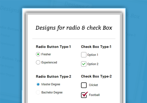
This blog post explains and provide you different CSS Styles for checkbox and radio button .
Here, are the following types, you just copy our code or download it to implement in your forms.
In our CSS style we put label along with radio button and checkbox to treated them as a single unit and defined CSS for it.
HTML File:
<!DOCTYPE html>
<html>
<head>
<title>Designed Checkbox and Radio Button</title>
<!-- include css file here-->
<link rel="stylesheet" href="css/design_checkbox.css"/>
</head>
<body>
<div id="main">
<div id="first">
<h1>Stylish Designs for Radio & Check Box</h1>
<div id="radio">
<h3> Radio Button Type-1 </h3>
<input type="radio" name="option" id="radio1" checked="checked"/>
<label for="radio1" >Fresher</label>
<input type="radio" name="option" id="radio2" />
<label for="radio2" >Experienced</label>
<h3 class="h3"> Radio Button Type-2 </h3>
<input type="radio" name="study" id="radio11" class="education" checked="checked" />
<label for="radio11" class="degree" >Master Degree</label>
<input type="radio" name="study" id="radio12" class="education" />
<label for="radio12" class="degree">Bachelor Degree</label>
</div>
<div id="check">
<h3> Check Box Type-1 </h3>
<input type="checkbox" name="option1" id="checkbox1" class="check1" />
<label for="checkbox1" class="label1">Option 1</label>
<input type="checkbox" name="option1" id="checkbox2" class="check1" checked="checked"/>
<label for="checkbox2" class="label1">Option 2</label>
<h3> Check Box Type-2 </h3>
<input type="checkbox" name="option2" id="checkbox11" class="check2" />
<label for="checkbox11" class="label2">Cricket</label>
<input type="checkbox" name="option2" id="checkbox12" class="check2" checked="checked"/>
<label for="checkbox12" class="label2">Football</label>
</div>
</div>
</div>
</body>
</html>
CSS For html part:
/* below line is used for online google font */
@import url(http://fonts.googleapis.com/css?family=Arvo);
@import url(http://fonts.googleapis.com/css?family=Roboto);
hr {
border: 0;
border-top: 1px solid #ccc;
margin-bottom: -10px;
}
div#main{
width: 960px;
height: 825px;
margin: 0px auto;
font-family: 'Roboto', sans-serif;
}
div#first {
width: 460px;
height:500px;
padding: 10px 25px 20px 25px;
float:left;
border: 12px solid #ccc;
margin-top:60px;
box-shadow: 0 0 25px;
}
div#radio{
width:210px;
float:left;
padding-left:20px;
}
div#check{
width:190px;
padding-left:40px;
float:left;
}
.h3{
margin-top: 32px;
}
h1{
font-family: 'Arvo', serif;
text-align:center;
}
CSS For Radio button Type1:
/* -------------------------------------
CSS for Radio Button Type-1
---------------------------------------- */
input[type=radio] {
display:none;
}
/*--------------------------------------------------------------------------------
Creating radio button and label as a Single unit(for Cross browser compatibility)
----------------------------------------------------------------------------------*/
input[type=radio] + label{
padding-left:31px;
display:inline-block;
line-height:24px;
background-repeat:no-repeat;
cursor:pointer;
}
input[type=radio]:checked + label {
background-position: 0 -24px;
}
label{
background-image:url('../images/radio2.png');
}
CSS For Radio button Type2:
/* -------------------------------------
CSS for Radio Button Type-2
---------------------------------------- */
input[type=radio].bachelor {
display:none;
}
/*--------------------------------------------------------------------------------
Creating radio button and label as a Single unit(for Cross browser compatibility)
----------------------------------------------------------------------------------*/
input[type=radio].bachelor + label.degree{
padding-left:31px;
display:inline-block;
line-height:24px;
background-repeat:no-repeat;
cursor:pointer;
}
input[type=radio].bachelor:checked + label.degree {
background-position: 0 -24px;
}
label.degree{
background-image:url('../images/radio1.png');
}
CSS For Check-Box Type1:
/* -------------------------------------
CSS for Checkbox Type-1
---------------------------------------- */
input[type=checkbox].check1 {
display:none;
}
/*--------------------------------------------------------------------------------
Creating Checkbox and label as a Single unit(for Cross browser compatibility)
----------------------------------------------------------------------------------*/
input[type=checkbox].check1 + label.label1{
padding-left:35px;
display:inline-block;
line-height:30px;
background-repeat:no-repeat;
cursor:pointer;
}
input[type=checkbox].check1:checked + label.label1 {
background-position: 0 -30px;
}
label.label1{
background-image:url('../images/check1.png');
}
CSS For Check-Box Type2:
/* -------------------------------------
CSS for Checkbox Type-2
---------------------------------------- */
input[type=checkbox].check2 {
display:none;
}
/*--------------------------------------------------------------------------------
Creating Checkbox and label as a Single unit(for Cross browser compatibility)
----------------------------------------------------------------------------------*/
input[type=checkbox].check2 + label.label2 {
padding-left:44px;
display:inline-block;
line-height:34px;
background-repeat:no-repeat;
cursor:pointer;
}
input[type=checkbox].check2:checked + label.label2 {
background-position: 0 -34px;
}
label.label2{
background-image:url('../images/check2.png');
}
Check some more informative blogs here –
- CSS Progress Bar
- CSS Submit Button Designs