
Cascading Style Sheets level 3 allow us to design various HTML elements in elegant fashion, submit button is one of them.
This blog post helps you to design stylish button using CSS-3.
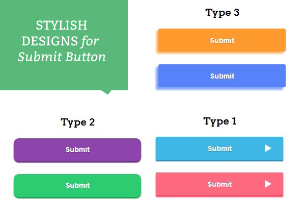
Here are the HTML and CSS codes given below just follow the codes or download it and apply them to your button and give elegant style to it.
HTML file: design_submit_button.html
<!DOCTYPE html>
<html>
<head>
<title>Design Submit Button - Demo Preview</title>
<meta content="noindex, nofollow" name="robots">
<!-- Include CSS File Here-->
<link href="css/design_submit_button.css" rel="stylesheet">
</head>
<body>
<div id="main">
<div id="first">
<h1>Stylish Designs for Submit Button</h1>
<form id="myform" name="myform">
<h3>Type 1</h3>
<div class="btn">
<input class="button1" type="button" value="Submit">
</div>
<div class="btn">
<input class="button2" type="button" value="Submit">
</div>
<h3>Type 2</h3>
<div class="btn1">
<input class="button3" type="button" value="Submit">
</div>
<div class="btn1">
<input class="button4" type="button" value="Submit">
</div>
<h3>Type 3</h3>
<div class="btn">
<input class="button5" type="button" value="Submit">
</div>
<div class="btn">
<input class="button6" type="button" value="Submit">
</div>
</form>
</div>
</div>
</body>
</html>
CSS File: design_submit_button .css
@import "http://fonts.googleapis.com/css?family=Arvo";
/* Above line is used for online Google font */
hr{
border:0;
border-top:1px solid #ccc;
margin-bottom:-10px
}
div#main{
width:828px;
height:764px;
margin:0 auto;
font-family:'Arvo',serif
}
div#first{
width:350px;
height:740px;
padding:0 25px 20px;
float:left;
text-align:center
}
.btn{
width:260px;
height:50px;
margin-left:45px
}
.btn1{
width:260px;
height:85px;
margin-left:42px
}
.button1{
width:250px;
height:45px;
border:none;
outline:none;
box-shadow:0 3px 2px 0 #2c80a2;
color:#fff;
font-size:14px;
text-shadow:0 1px rgba(0,0,0,0.4);
background-color:#3fb8e8;
font-weight:700;
background-image:url(../images/1.png);
background-repeat:no-repeat;
background-position:200px
}
.button1:hover{
background-color:#1baae3;
cursor:pointer
}
.button1:active{
padding-top:2px;
box-shadow:none
}
.button2{
width:250px;
height:45px;
border:none;
outline:none;
color:#fff;
margin-top:20px;
font-size:14px;
background-color:#ff6a80;
text-shadow:0 1px rgba(0,0,0,0.4);
box-shadow:0 3px 2px 0 #ff3755;
font-weight:700;
background-image:url(../images/1.png);
background-repeat:no-repeat;
background-position:200px
}
.button2:hover{
background-color:#ff566f;
cursor:pointer
}
.button2:active{
padding-top:2px;
box-shadow:none
}
.button3{
color:#fff;
padding:20px 100px;
border:none;
outline:none;
font-size:20px;
text-shadow:-2px 2px 0 rgba(0,0,0,0.2);
font-weight:700;
transition:all .1s linear;
background:linear-gradient(to bottom,#bced7f,#99e43c);
box-shadow:-1px 0 1px #80d01d,0 1px 1px #80d01d,-2px 1px 1px #80d01d,-1px 2px 1px #80d01d,-3px 2px 1px #80d01d,-2px 3px 1px #80d01d,-4px 3px 1px #80d01d,-3px 4px 1px #80d01d,-5px 4px 1px #80d01d,-4px 5px 1px #72ba1a,-6px 5px 1px #72ba1a
}
.button3:active{
box-shadow:none;
-moz-transform:translate3d(-6px,6px,0);
-ms-transform:translate3d(-6px,6px,0);
-webkit-transform:translate3d(-6px,6px,0);
transform:translate3d(-6px,6px,0)
}
.button4{
color:#fff;
padding:20px 100px;
border:none;
outline:none;
font-size:20px;
text-shadow:-2px 2px 0 rgba(0,0,0,0.2);
font-weight:700;
transition:all .1s linear;
background:linear-gradient(to bottom,#977d60,#685642);
box-shadow:-1px 0 1px #584938,0 1px 1px #584938,-2px 1px 1px #584938,-1px 2px 1px #584938,-3px 2px 1px #584938,-2px 3px 1px #584938,-4px 3px 1px #584938,-3px 4px 1px #493c2e,-5px 4px 1px #493c2e,-4px 5px 1px #493c2e,-6px 5px 1px #493c2e
}
.button4:active{
box-shadow:none;
-moz-transform:translate3d(-6px,6px,0);
-ms-transform:translate3d(-6px,6px,0);
-webkit-transform:translate3d(-6px,6px,0);
transform:translate3d(-6px,6px,0)
}
.button5{
width:250px;
height:45px;
border:none;
outline:none;
box-shadow:-4px 4px 5px 0 #feb361;
color:#fff;
font-size:14px;
text-shadow:0 1px rgba(0,0,0,0.4);
background-color:#FE9A2E;
border-radius:3px;
font-weight:700
}
.button5:hover{
background-color:#FF8000;
cursor:pointer
}
.button5:active{
margin-left:-4px;
margin-bottom:-4px;
padding-top:2px;
box-shadow:none
}
.button6{
width:250px;
height:45px;
border:none;
outline:none;
box-shadow:-5px 5px 5px 0 #8aa7fb;
margin-top:20px;
color:#fff;
font-size:14px;
text-shadow:0 1px rgba(0,0,0,0.4);
background-color:#5882FA;
border-radius:3px;
font-weight:700
}
.button6:hover{
background-color:#2E64FE;
cursor:pointer
}
.button6:active{
margin-left:-5px;
margin-bottom:-5px;
padding-top:2px;
box-shadow:none
}
Conclusion:
Thus, giving style to button becomes more easy when you use CSS-3. learn more in next blog post.
Recommended blogs –
- CSS Float Property
- 12 Inspiring Form Designs You Will Love To See