
The box shadow property allows web designers to design multiple drop shadow(outer or inner) for any box element ,using values for color,size and offset etc.
In this tutorial we are going to explain how we can use the box shadow property for drop shadow effect.
The box shadow property can be assigned through comma separation in order to specify horizontal offset, vertical offset, optional blur distance and optional spread distance of the shadow.
Color value and inset(to create an inner shadow) are optional.
Box Shadow Compatibility
The number in the below browser’s image shows the first browser version, that supports the property of box shadow.

You can also refer live demo or download the Script file.
Extract the downloaded files, save it and run index.html on browser
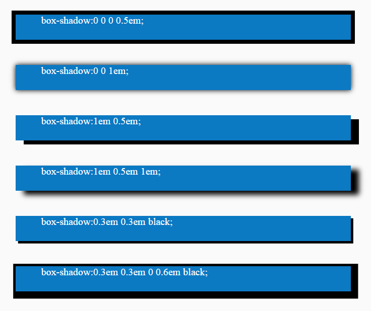
Box Shadow General Description

Horizontal offset : The horizontal offset means shadow in x-axis. When it is positive the shadow is drawn to the right side of the element and when its negative it is drawn to the left side.
Vertical offset : The vertical offset means shadow in the y-axis. When offset is positive the shadow is drawn below the element and when its negative it is drawn above.
Color Value : You can also define the color value of the shadow i.e. rgba/hsla color values are possible.
Optional : Inset is a optional attributes. Using inset we can draw the shadow inside the element.
Optional : This blurs radius define how big and how much blurred the shadow you want. If the value is larger then shadow is lighter.Negative values are not allowed if value is not set, set 0 defaults for sharp edges.
Optional : This attribute defines the spread distance for bigger shadow. The shadow is expanded by the given value
Note : Here we are showing some basic css3 box shadow example with code. For more css3 box shadow style, please visit our live demo section, there is approx 40 different css3 box shadow style with code.
Box Shadow Type 1:

HTML Code
Copy below code in your HTML file.
<div id="box1"></div>CSS Code
Copy below code in your CSS file, or inside style tag in HTML page.
#box1{
width:700px;
height:50px;
background-color:#0C79C3;
margin: 50px auto 50px auto;
box-shadow:1em 0.5em 1em;
}
Box Shadow Type 2:

HTML Code
Copy below code in your HTML file.
<div id="box2"></div>CSS Code
Copy below code in your CSS file, or inside style tag in HTML page.
#box2{
width:700px;
height:50px;
background-color:#0C79C3;
margin: 50px auto 50px auto;
box-shadow:inset 0 0 2em black;
}
Box Shadow Type 3:

HTML Code
Copy below code in your HTML file.
<div id="box3"></div>CSS Code
Copy below code in your CSS file, or inside style tag in HTML page.
#box3{
width:700px;
height:50px;
background-color:#0C79C3;
margin: 50px auto 50px auto;
box-shadow:0.2em 0.2em 0.7em black, inset 0 0 0.7em #b5e1ff;
}
Box Shadow Type 4:

HTML Code
Copy below code in your HTML file.
<div id="box4"></div>CSS Code
Copy below code in your CSS file, or inside style tag in HTML page.
#box4{
width:700px;
height:50px;
background-color:#0C79C3;
margin: 50px auto 50px auto;
box-shadow:inset 11em 0 black;
}
Box Shadow Type 5:

HTML Code
Copy below code in your HTML file.
<div id="box5"></div>CSS Code
Copy below code in your CSS file, or inside style tag in HTML page.
#box5{
width:700px;
height:50px;
background-color:#0C79C3;
margin: 50px auto 50px auto;
box-shadow:inset 0 0.3em black;
}
Conclusion:
So, this way you can use CSS3 Box Shadow property to create different shadow style , for more blogs keep following us.
For more related information you can also check out following blogs –
- CSS Active: Active Selector
- CSS Background Size
One Reply to “CSS3 Box Shadow”
This is exactly something I was looking for to start with.
Thanks,
Avijit