
CSS : active selector is used to select and change the styles of the active link to make them attractive. A link or tag becomes active when clicked on it.
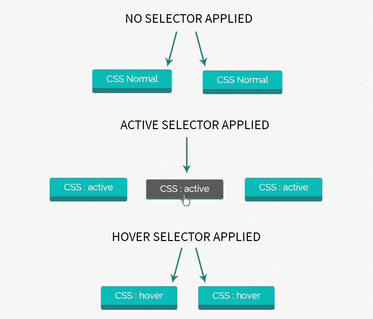
In this tutorial, we have applied CSS selector : active on link (which looks like a button) to show its effect. Here we have demonstrated to apply css on an element that has first normal selector, then : active selector and the last : hover selector to make its appearance more elegant and eye catching.
Syntax
Normal : In this element hover and active selectors are not applied.
HTML
<a href="#" class="normal-link">CSS Normal</a>CSS
.normal-link{
background: #237E7C;
}
Active Selector : It’s mainly used to create differences between normal and click visualization, or to create attractive styles for interface.
HTML
<a href="#" class="active-link">CSS : active</a>CSS
// Normal visualize of link

.active-link{
background: #237E7C;
}

// On click, it changes the background color

.active-link:active{
background: #5A5A5A;
}
Hover Selector : Hover selector is also used for attractive interface. It works when mouse is taken over link.
HTML
<a href="#" class="hover-link">CSS : hover</a>CSS
 // Normal visualize

.hover-link{
background: #237E7C;
}

// On hover, it change the background colour.

.hover-link:hover{
background: #437294;
}
You can also refer live demo or download the script file.
Extract the downloaded files, save it and run index.html on browser
HTML File
Copy below code in your HTML file.
<html>
<head>
<title>active and hover state of button</title>
<link rel="stylesheet" type="text/css" href="style.css">
</head>
<body>
<div class="main">
<h1>Example of :active and :hover selector </h1>
<div class="box">
<div class="normal_1"> <a href="#" class="normal-button teal">CSS Normal</a></div>
<div class="normal_2"> <a href="#" class="normal-button teal">CSS Normal</a></div>
<div class="active_1"> <a href="#" class="active-button teal">CSS : active</a></div>
<div class="active_2"> <a href="#" class="active-button teal">CSS : active</a></div>
<div class="active_3"> <a href="#" class="active-button teal">CSS : active</a></div>
<div class="hover_1"> <a href="#" class="hover-button teal">CSS : hover</a></div>
<div class="hover_2"> <a href="#" class="hover-button teal">CSS : hover</a></div>

</div>
</div>

<!-- Right side div -->
<div id="formget">
<a href=https://www.formget.com/app><img src="formget.jpg" alt="Online Form Builder"/></a>
</div>
</body>
</html>
CSS File
Copy below code in your CSS file, or inside style tag in HTML page.
@import url(http://fonts.googleapis.com/css?family=Raleway);

body{
margin:0 auto;
font-family: 'Raleway', sans-serif;
}

.main {
margin-left: 230px;
margin-top: 140px;
}

/* Hover */

.hover-button{
position: relative;
top: 0;
border-radius: 4px;
font-size: 18px;
padding: 8px 28px;
text-decoration: none;
border: 0px solid;
cursor: pointer;
border-bottom-width: 10px;
outline: none;
-webkit-transition: 0.3s background;
-moz-transition: 0.3s background;
transition: 0.3s background;
}

.hover-button.teal{
color: #fff;
border-color: #237E7C;
background-color: #08BBB7;
}

.hover-button.teal:hover{
background: #237E7C;
}

/* Active */

.active-button{
position: relative;
top: 0;
border-radius: 4px;
font-size: 18px;
padding: 8px 28px;
text-decoration: none;
border: 0px solid;
cursor: pointer;
border-bottom-width: 10px;
outline: none;
-webkit-transition: 0.3s background;
-moz-transition: 0.3s background;
transition: 0.3s background;
}

.active-button:active{
top: 3px;
}

.active-button.teal{
color: #fff;
border-color: #237E7C;
background-color: #08BBB7;
}

.active-button.teal:hover{
background: #0ACFCB;
}
.active-button.teal:active{
background: #5A5A5A;
border-bottom-width: 3px;
}

/* Normal Button */

.normal-button{
position: relative;
top: 0;
border-radius: 4px;
font-size: 18px;
padding: 8px 28px;
text-decoration: none;
border: 0px solid;
cursor: pointer;
border-bottom-width: 10px;
outline: none;
-webkit-transition: 0.3s background;
-moz-transition: 0.3s background;
transition: 0.3s background;
}

.normal-button.teal{
color: #fff;
border-color: #237E7C;
background-color: #08BBB7;
}
/* div set */

.box {
width: 588px;
height: 292px;
margin-top: 140px;
}
h1 {
margin-left: 30px;
}

.normal_1 {
margin-top: 50px;
margin-left: 132px;
}

.normal_2 {
margin-top: -19px;
margin-left: 350px;
}

.active_1 {
margin-top: 59px;
margin-left: 30px;
}

.active_2 {
margin-left: 220px;
margin-top: -21px;
}

.active_3 {
margin-left: 415px;
margin-top: -21px;
}

.hover_1 {
margin-left: 130px;
margin-top: 60px;
}

.hover_2 {
margin-left: 322px;
margin-top: -21px;
}
Conclusion:
In this tutorial we have learned about, how to create differences between visualization using :active, :hover selector. Hope you have benefited from it. Keep visiting our website in future for more knowledge and information.
For more related information check following blogs –