
In today’s mobile-internet era every user loves to surf the net on their mobile phones. Hence, it is important to deliver a user-friendly experience to users on each and every device.
Let’s says if your form is not responsive and the user browses it from his smartphones, that time they need to pinch, zoom and scroll the page. In that case, the form will not look good due to a lack of responsiveness. Hence, users might not like to fill the form.

That’s why it is important to build responsive forms that can compatible with all the devices. So, your customers can easily view and fill the form on whatever device or channel they are using.
Now for creating the responsive forms you can use online form builders and provide a seamless look and feel to your form.
When we talk about the form builders, Google Forms comes first in everyone’s mind because it is an efficient and free tool available in the market. Further, it lets you create different forms like feedback, survey, payment, etc.
Despite various advantages, due to some of its limitations, Google Forms might not be the most suitable one for your use.
Are Google Forms Really Responsive?
Google Forms is not optimized for mobile devices or tablets. It works online in desktop and when you go offline, some of the form fields, images, background designs look distorted due to lack of responsive design. As a result, users might get frustrated while filling out the form.
Making forms responsive isn’t easy, it requires lots of programming knowledge. Thus to reduce this burden, you can switch to any paid online form builders. Here, I am providing you Pabbly Form Builder – one of its best alternatives which lets you create responsive forms without any significant technical efforts.
Every form you build with this software adjusts automatically to the width of your content container and provide a hassle-free experience to your users.
If you want to create a simple form without worrying about the form responsiveness then follow these steps and create your form.
Steps to make Google Forms responsive:
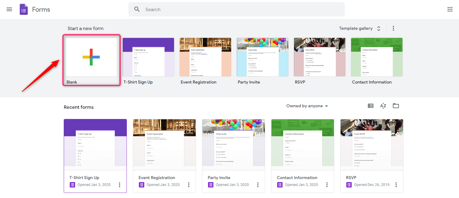
Step 1: Firstly, you’ll need to create the actual Google Form. Start by logging into your Google account and then pick a template or blank form that you want to use.
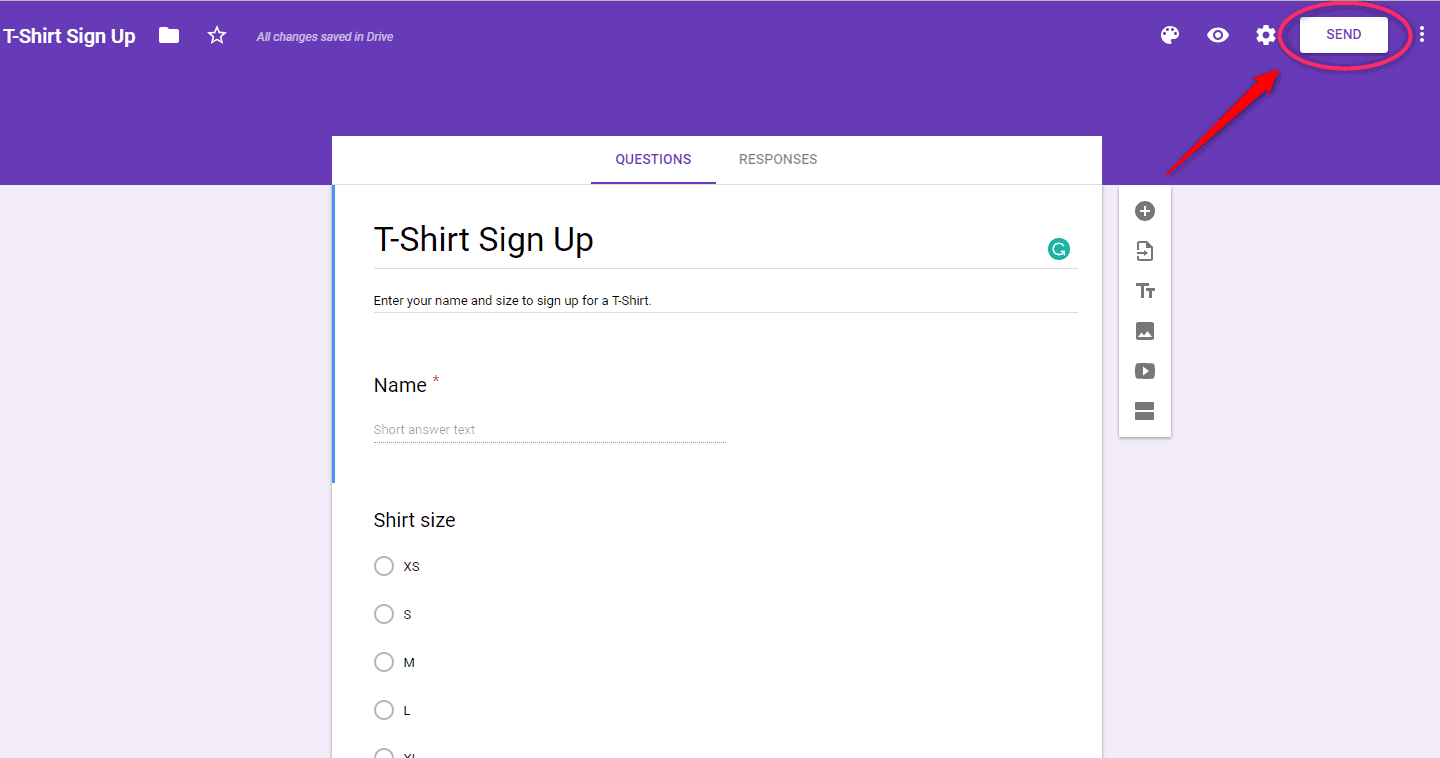
Step 2: After creating the form, click on the “Send” button of your Google Forms and you’ll see a number of options to share your form, including email, link sharing, HTML and more.
Step 3: Select the tab label “<>” to change the height and width of the form.
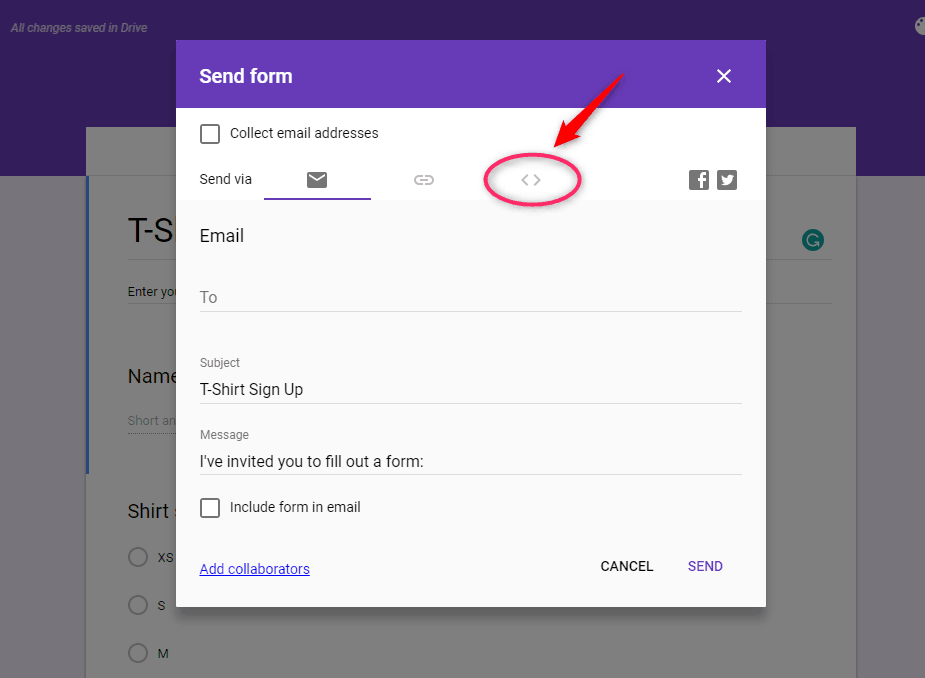
Step 4: In the tab labeled < >, you’ll see a code snippet under Embed HTML where you can adjust the size of your form.
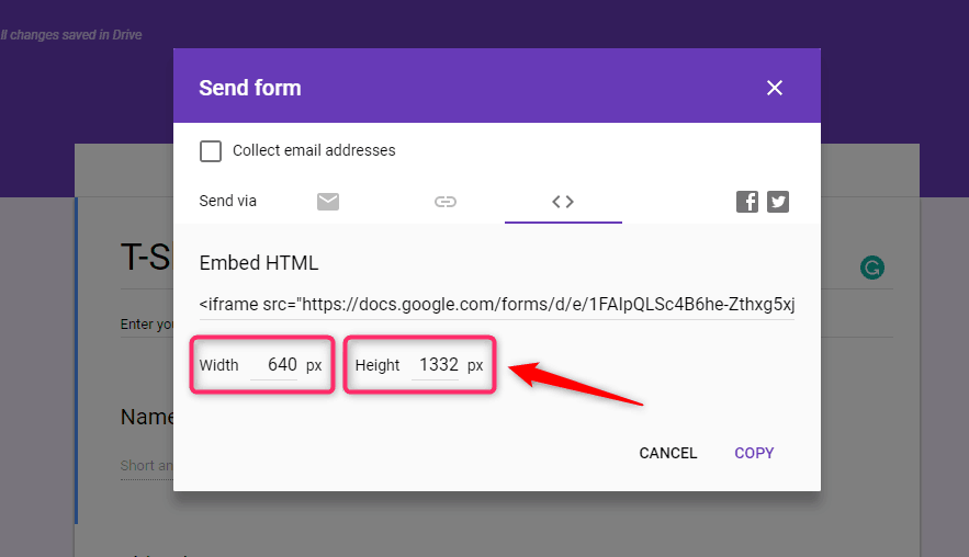
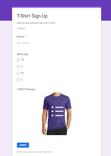
If you see this code the width of the form is “640” by default, if you take this code and paste it as it is on mobile view then your Google Forms will get distorted. In that case, you need to change the width of your form to 100%.
Once you finish tweaking, you should end up with a decent looking mobile form, as pictured here, without the requirement to squeeze-zoom every page continually.
Build Responsive Forms with Pabbly Form Builder (3 Steps)
No matter where your customers are or what device they’re using, they can easily browse your website on different screen sizes without any headache with Pabbly Form Builder. Whether it is Desktop, tablet, and smartphone, all living in happy forms harmony.
Step 1: Create a form with the required fields and then go to the “Share” option. Where you’ll get multiple options like share form, embed full form, and pop up form.
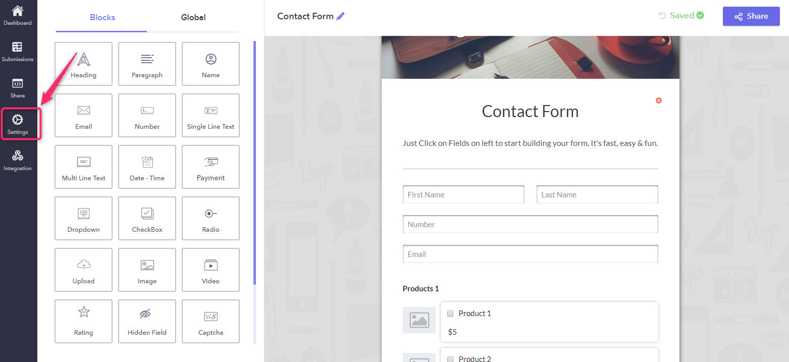
Step 2: When you choose the “Embed Full Form” option the settings will get opened.
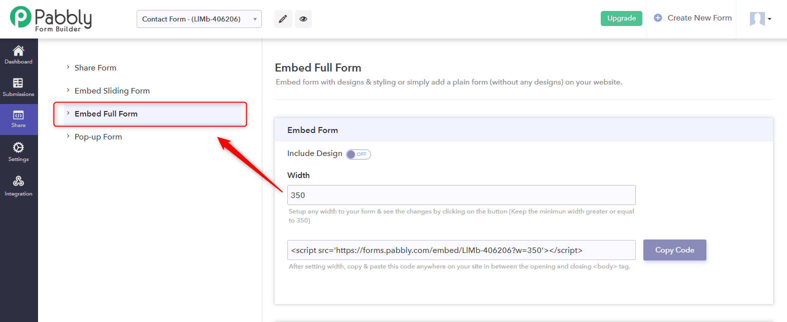
Step 3: You can set up any width to your form & see the changes by clicking on the preview button. The height of the form is automatically adjusted according to the screen sizes.
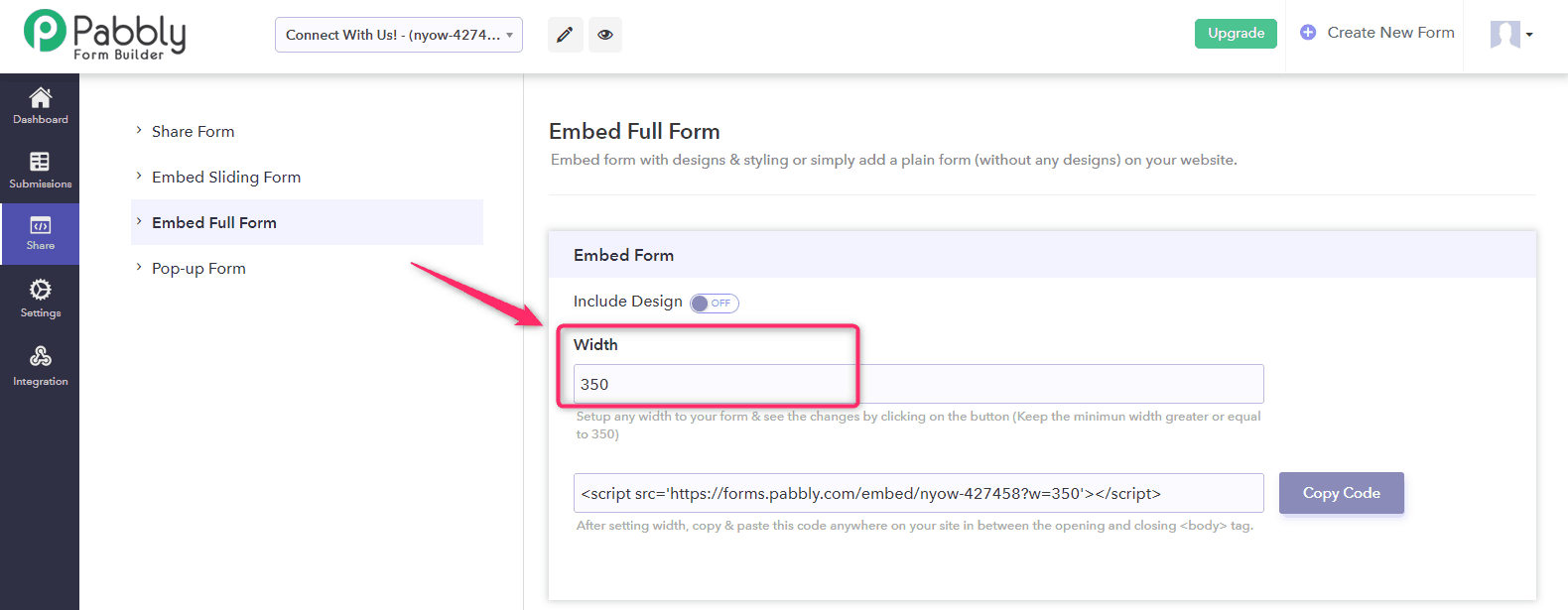
After setting width, just copy & paste the HTML code anywhere on your site in between the opening and closing <body> tag and your responsive form is ready.
Wrapping up
It is good to make dynamic changes in the appearance of forms that are compatible with different size displays on desktops, laptops, tablets, and phones. Forms are an integral part of many websites that helps to gain access to the results and we’re passionate about improving the experience of every customer.
If you want an inbuilt responsive form for the website then you can choose Pabbly Form Builder. It might be the best bid you that doesn’t ruin your user’s experience.
Otherwise, Google Forms is a great online form builder.
You May Also Like To Read: