
Bootstrap Modal is basically a pop-up box that is used to provide information and alert to the user. It is displayed on top of the current page.
One of the multi-purpose lightweight JavaScript popup that is custom-built and responsive and can be used: to display alert popups, videos, and images in a website, to warn users for session timeout or to seek their permission before submitting important information.
Our bootstrap themes will provide you an appropriate solution to your problems.
The Bootstrap Modal comprises of three sections :-
1. The Header
2. The Message Body
3. The footer
The most interesting thing about implementing modals is that we don’t have to write any JavaScript code to use it, as all the code and styles are predefined in Bootstrap, we just have to use the proper combination of Markup and Attributes to trigger the actions accordingly.
Watch the live demo or download code from the link given below:
Code:
To employ the above modal, simply copy-paste the below code snippet to a HTML file, which can be run normally.
<!DOCTYPE html>
<html lang="en">
<head>
<meta charset="UTF-8">
<title>Bootstrap Modals</title>
<link rel="stylesheet" href="https://maxcdn.bootstrapcdn.com/bootstrap/3.3.5/css/bootstrap.min.css">
<link rel="stylesheet" href="https://maxcdn.bootstrapcdn.com/bootstrap/3.3.5/css/bootstrap-theme.min.css">
<script src="https://ajax.googleapis.com/ajax/libs/jquery/1.11.3/jquery.min.js"></script>
<script src="https://maxcdn.bootstrapcdn.com/bootstrap/3.3.5/js/bootstrap.min.js"></script>
<script type="text/javascript">
$(document).ready(function(){
$("#myModal").modal('show');
});
</script>
</head>
<body>
// This is Modal Box To hold Complete Content in Div
<div id="myModal" class="modal fade">
<div class="modal-dialog">
<div class="modal-content">
// This is the Div for HEADER
<div class="modal-header">
<button type="button" class="close" data-dismiss="modal" aria-hidden="true">×</button>
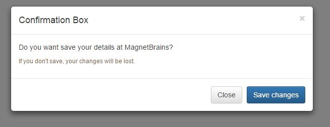
<h4 class="modal-title">Confirmation Box</h4>
</div>
// This is the Div for BODY
<div class="modal-body">
<p>Do you want save your details at MagnetBrains?</p>
<p class="text-warning"><small>If you don't save, your changes will be lost.</small></p>
</div>
// This is the Div for FOOTER
<div class="modal-footer">
<button type="button" class="btn btn-default" data-dismiss="modal">Close</button> //Close Button
<button type="button" class="btn btn-primary">Save changes</button> //Save Changes Button
</div>
</div>
</div>
</div>
</body>
</head>
</html>
Detailed explanation of Code
Activating Bootstrap modal via data attributes requires two components:-
- Controller element like a button or link
- Modal element
- The outermost container of every modal in a document must have a unique id (in this case, id=”myModal“), so that it can be targeted via data-target (for buttons) or href (for hyperlinks) attribute of the controller element.
- The attribute data-toggle=”modal” is required to add on the controller element, like a button or an anchor, along with a attribute data-target=”#myModal” or href=”#myModal” to target a specific modal to toggle.
- The .modal-dialog class sets the width as well as horizontal and vertical alignment of the modal box. Whereas the class .modal-content sets the styles like text and background color, borders, rounded corners etc.
- The .modal-header element defines a header for the modal that usually contains a modal title and a close button, whereas the .modal-body element contains the actual content like text, images, forms etc. and the .modal-footer element defines the footer that typically contains action buttons for the user.
- The .fade class on the .modal element adds a fading and sliding animation effect while showing and hiding the modal window. If you want the modal to simply appear without any effect you can remove this class.
Setting the Size of Modals
Bootstrap also gives us option to decide the size of our modals, which can be either large or small. We can a make modals larger (.modal-lg) or smaller (.modal-sm) by adding an extra class on .modal-dialog.
Activating the Modal with jQuery
To control the modal via jQuery, you need to call the .modal() function on the modal’s selector as:-
// Function to activate model via jQuery

$('#basicModal').modal(options);
Bootstrap OPTIONS:
Options are those entities which can be passed as a data attribute or JavaScript to customize the look and enhance the appearance of a Modal.
- backdrop: This can be either true or static and defines whether or not you want the user to be able to close the modal by clicking the background. Specify static for a backdrop, if you don’t want the modal to be closed when the user clicks outside of the modal.
- keyboard: if set to true, the modal will close via the ESC key.
- show: Used for opening and closing the modal. It can be either true or false.
- remote: This is used to load remote content using jQuery .load() method. You need to specify an external page in this option. It is set to false by default.
Bootstrap Modal’s Events
You can further customize the normal behavior of the Bootstrap modal by using various events that are triggered while opening and closing the modal. These events have to be bound using jQuery .on() method.
Various events available are:
- show.bs.modal: fired just before the modal is open.
- shown.bs.modal: fired after the modal is shown.
- hide.bs.modal: fired just before the modal is hidden.
- hidden.bs.modal: fired after the modal is closed.
- loaded.bs.modal: fired when remote content is successfully loaded in the modal’s content area using the remote option mentioned above.
The following table describes how to implement the Events:-
| Event | Description | Example |
|---|---|---|
| show.bs.modal | Fired after the show method is called. | $(‘#identifier’).on(‘show.bs.modal’, function () { // do something… }) |
| shown.bs.modal | Fired when modal has been visible to the user (will wait for CSS transitions to complete). | $(‘#identifier’).on(‘shown.bs.modal’, function () { // do something… }) |
| hide.bs.modal | Fired when the hide instance method has been called. | $(‘#identifier’).on(‘hide.bs.modal’, function () { // do something… }) |
| hidden.bs.modal | Fired when the modal has finished being hidden from the user. | $(‘#identifier’).on(‘hidden.bs.modal’, function () { // do something… }) |
Conclusion :
The Bootstrap modal is a very compact and easy to handle pop-ups. It is one of the best plugin to load content inside a popup screen without writing any JavaScript.
Hope you have enjoyed reading this blog post and got the concept. You can share your views in the space provided below and get in touch with us.
For more related information just go through the following blogs –