
CSS sprites are used to reduce the number of HTTP requests send to server. The smaller images are combined into a larger one at defined X and Y coordinates. After assigning this generated image to relevant page elements, using the background-position CSS property we can then shift the visible area to the required component image.
Why we use image sprites:
1 : To lower down the bandwidth used to load multiple images in a webpage.
2 : To decrease the page loading time.
You can also refer live demo or download the script file.
Extract the downloaded files, save it and run index.html on browser
How to use image sprites:
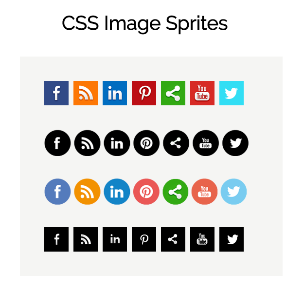
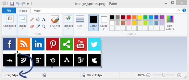
Here we used simple social icons to show you as an example of image sprites. Now, the question is that, how to measure a visible part of the component. Let’s start with the Microsoft paint tool, it’s not a tool for measuring coordinate, but we can use it to get the position of the cursor.When the cursor moves, it generate (x, y) coordinate according to cursor position in ‘bottom left corner’.
Here are the steps that help you to get a background position of an image using Microsoft paint tool. We will give you idea using two icons.
Step 1 : Open the sprite image in the Microsoft paint tool, and find the background position of a specific part.
Above, we use the first row for the demo, here we show position of the first icon on Facebook. Now we can give width and height according to smaller images and differences of icons in sprite image.
Syntax
 background: url('imgs/image_sprites.png');
background-position:0 0;
width: 50px;
height: 50px;
Step 2 : On hover, change Facebook icon from image sprites. It’s also same as above step,
Syntax
 background: url('imgs/image_sprites.png');
background-position: -1px -64px;
width: 50px;
height: 50px;
Step 3 : Find the position of RSS icon.
Syntax
background: url('imgs/image_sprites.png');
background-position:-57px 0;
width: 50px;
height: 50px;
Step 4 : On hover, change RSS icon into image sprites.
background: url('imgs/image_sprites.png');
background-position:-57px -64px;
width: 50px;
height: 50px;
Graphical position of background.
Note : The coordinate system that is used in computer imaging is based on bitmaps, by definition, are based on a grid (rows and columns) with its origin (x = 0, y = 0) in the upper left corner (as opposed to the Cartesian coordinate system, which has the origin of its positive space in the lower left).
Therefore, in background-position we always assign the coordinate with a negative sign.
Row 1
HTML Code :
Copy below code in your HTML file.
 <div class="first">
<a href="#">
<div class="sprite_face_shift">
</div>
</a>
<a href="#">
<div class="sprite_rss_shift">
</div>
</a>
<a href="#">
<div class="sprite_linked_shift">
</div>
</a>
<a href="#">
<div class="sprite_pint_shift">
</div>
</a>
<a href="#">
<div class="sprite_share_shift">
</div>
</a>
<a href="#">
<div class="sprite_youtube_shift">
</div>
</a>
<a href="#">
<div class="sprite_twitter_shift">
</div>
</a>
</div>
CSS Code :
Copy below code in your CSS file, or inside style tag in HTML page.
/* first */

.first{
width: 440px;
height: 100px;
}

.sprite_face_shift {
background: url('imgs/image_sprites.png');
background-position:0 0;
width: 50px;
height: 50px;
float:left;
display: inline-block;
margin-right: 10px;
transform: perspective(1000);
transform-style: preserve-3d;
transition: all 400ms ease;
}
.sprite_face_shift:hover {
background: url('imgs/image_sprites.png');
background-position: -1px -64px;
width: 50px;
height: 50px;
transform: rotate(-90deg);
}

.sprite_rss_shift {
background: url('imgs/image_sprites.png');
background-position:-57px 0;
width: 50px;
height: 50px;
float:left;
display: inline-block;
margin-right: 10px;
transform: perspective(1000);
transform-style: preserve-3d;
transition: all 400ms ease;
}
.sprite_rss_shift:hover {
background: url('imgs/image_sprites.png');
background-position:-57px -64px;
width: 50px;
height: 50px;
transform: rotate(-90deg);
}

.sprite_linked_shift {
background: url('imgs/image_sprites.png');
background-position: -114px 0;
width: 50px;
height: 50px;
float:left;
margin-right: 10px;
display: inline-block;
transform: perspective(1000);
transform-style: preserve-3d;
transition: all 400ms ease;
}
.sprite_linked_shift:hover {
background: url('imgs/image_sprites.png');
background-position: -114px -64px;
width: 50px;
height: 50px;
transform: rotate(-90deg);
}

.sprite_pint_shift {
background: url('imgs/image_sprites.png') ;
background-position: -171px 0;
width: 50px;
height: 50px;
float:left;
margin-right: 10px;
display: inline-block;
transform: perspective(1000);
transform-style: preserve-3d;
transition: all 400ms ease;
}
.sprite_pint_shift:hover {
background: url('imgs/image_sprites.png');
background-position: -171px -64px;
width: 50px;
height: 50px;
transform: rotate(-90deg);
}

.sprite_share_shift {
background: url('imgs/image_sprites.png');
background-position:-227px 0;
width: 50px;
height: 50px;
float:left;
display: inline-block;
margin-right: 10px;
transform: perspective(1000);
transform-style: preserve-3d;
transition: all 400ms ease;
}
.sprite_share_shift:hover {
background: url('imgs/image_sprites.png');
background-position: -227px -64px;
width: 50px;
height: 50px;
transform: rotate(-90deg);
}
.sprite_youtube_shift {
background: url('imgs/image_sprites.png');
background-position: -282px -1px;
width: 50px;
height: 50px;
float:left;
display: inline-block;
margin-right: 10px;
transform: perspective(1000);
transform-style: preserve-3d;
transition: all 400ms ease;
}
.sprite_youtube_shift:hover {
background: url('imgs/image_sprites.png');
background-position: -282px -64px;
width: 50px;
height: 50px;
transform: rotate(-90deg);
}

.sprite_twitter_shift {
background: url('imgs/image_sprites.png');
background-position: -337px -1px;
width: 50px;
height: 50px;
float:left;
display: inline-block;
transform: perspective(1000);
transform-style: preserve-3d;
transition: all 400ms ease;
}
.sprite_twitter_shift:hover {
background: url('imgs/image_sprites.png');
background-position:-337px -64px;
width: 50px;
height: 50px;
transform: rotate(-90deg);
}
Row 2

HTML Code :
Copy below code in your HTML file.
 <div class="second">
<a href="#">
<div class="sprite_face_fade">
</div>
</a>
<a href="#">
<div class="sprite_rss_fade">
</div>
</a>
<a href="#">
<div class="sprite_linked_fade">
</div>
</a>
<a href="#">
<div class="sprite_pint_fade">
</div>
</a>
<a href="#">
<div class="sprite_share_fade">
</div>
</a>
<a href="#">
<div class="sprite_youtube_fade">
</div>
</a>
<a href="#">
<div class="sprite_twitter_fade">
</div>
</a>
</div>
CSS Code :
Copy below code in your CSS file, or inside style tag in HTML page.
/* second */

.second {
width: 440px;
height: 100px;
}

.sprite_face_fade {
background: url('imgs/Social_circle.png');
background-position:-47px -96px;
width: 55px;
height: 54px;
float:left;
}
.sprite_face_fade:hover {
background: url('imgs/Social_circle.png');
background-position: -47px -28px;
width: 55px;
height: 54px;
transform: scale(1.1);
}
.sprite_rss_fade {
background: url('imgs/Social_circle.png') ;
background-position:-106px -96px;
width: 56px;
height: 54px;
margin-left:5px;
float:left;
}
.sprite_rss_fade:hover {
background: url('imgs/Social_circle.png');
background-position: -106px -28px;
width: 56px;
height: 54px;
transform: scale(1.1);
}
.sprite_linked_fade {
background: url('imgs/Social_circle.png') ;
background-position: -167px -96px;
width: 56px;
height: 54px;
margin-left:5px;
float:left;
}
.sprite_linked_fade:hover {
background: url('imgs/Social_circle.png') ;
background-position: -167px -28px;
width: 56px;
height: 54px;
transform: scale(1.1);
}
.sprite_pint_fade {
background: url('imgs/Social_circle.png');
background-position:-229px -96px;
width: 56px;
height: 54px;
float:left;
margin-left:5px;
}
.sprite_pint_fade:hover {
background: url('imgs/Social_circle.png');
background-position: -229px -28px;
width: 56px;
height: 54px;
transform: scale(1.1);
}
.sprite_share_fade {
background: url('imgs/Social_circle.png') ;
background-position: -290px -96px;
width: 56px;
height: 54px;
float:left;
margin-left:5px;
}
.sprite_share_fade:hover {
background: url('imgs/Social_circle.png');
background-position: -291px -28px;
width: 54px;
height: 54px;
transform: scale(1.1);
}
.sprite_youtube_fade {
background: url('imgs/Social_circle.png') ;
background-position: -350px -96px;
width: 56px;
height: 54px;
margin-left:5px;
float:left;
}
.sprite_youtube_fade:hover {
background: url('imgs/Social_circle.png') ;
background-position: -350px -28px;
width: 55px;
height: 54px;
transform: scale(1.1);
}
.sprite_twitter_fade {
background: url('imgs/Social_circle.png');
background-position:-411px -96px;
width: 55px;
height: 54px;
margin-left:5px;
float:left;
}
.sprite_twitter_fade:hover {
background: url('imgs/Social_circle.png');
background-position:-411px -28px;
width: 55px;
height: 54px;
transform: scale(1.1);
}
Row 3
HTML Code :
Copy below code in your HTML file.
 <div class="third">
<a href="#">
<div class="sprite_face_rotate">
</div>
</a>
<a href="#">
<div class="sprite_rss_rotate">
</div>
</a>
<a href="#">
<div class="sprite_linked_rotate">
</div>
</a>
<a href="#">
<div class="sprite_pint_rotate">
</div>
</a>
<a href="#">
<div class="sprite_share_rotate">
</div>
</a>
<a href="#">
<div class="sprite_youtube_rotate">
</div>
</a>
<a href="#">
<div class="sprite_twitter_rotate">
</div>
</a>
</div>
CSS Code :
Copy below code in your CSS file, or inside style tag in HTML page.
/* Third */

.third {
width: 440px;
height: 100px;
}

.sprite_face_rotate {
background: url('imgs/Social_circle.png') ;
background-position: -47px -28px;
width: 55px;
height: 54px;
float:left;
-webkit-transition: -webkit-transform .8s ease-in-out;
-ms-transition: -ms-transform .8s ease-in-out;
transition: transform .8s ease-in-out;
}
.sprite_face_rotate:hover {
background: url('imgs/Social_circle.png');
background-position:-47px -96px;
width: 55px;
height: 54px;
-webkit-transform:rotate(360deg);
-moz-transform:rotate(360deg);
-o-transform:rotate(360deg);
-ms-transform:rotate(360deg);
transform:rotate(360deg);
}

.sprite_rss_rotate {
background: url('imgs/Social_circle.png') ;
background-position: -106px -28px;
width: 56px;
height: 54px;
margin-left:5px;
float:left;
-webkit-transition: -webkit-transform .8s ease-in-out;
-ms-transition: -ms-transform .8s ease-in-out;
transition: transform .8s ease-in-out;
}
.sprite_rss_rotate:hover {
background: url('imgs/Social_circle.png');
background-position: -106px -96px;
width: 56px;
height: 54px;
-webkit-transform:rotate(360deg);
-moz-transform:rotate(360deg);
-o-transform:rotate(360deg);
-ms-transform:rotate(360deg);
transform:rotate(360deg);
}
.sprite_linked_rotate {
background: url('imgs/Social_circle.png');
background-position: -167px -28px;
width: 56px;
height: 54px;
margin-left:5px;
float:left;
-webkit-transition: -webkit-transform .8s ease-in-out;
-ms-transition: -ms-transform .8s ease-in-out;
transition: transform .8s ease-in-out;
}
.sprite_linked_rotate:hover {
background: url('imgs/Social_circle.png');
background-position: -167px -96px;
width: 56px;
height: 54px;
-webkit-transform:rotate(360deg);
-moz-transform:rotate(360deg);
-o-transform:rotate(360deg);
-ms-transform:rotate(360deg);
transform:rotate(360deg);
}
.sprite_pint_rotate {
background: url('imgs/Social_circle.png');
background-position: -229px -28px;
width: 56px;
height: 54px;
float:left;
margin-left:5px;
-webkit-transition: -webkit-transform .8s ease-in-out;
-ms-transition: -ms-transform .8s ease-in-out;
transition: transform .8s ease-in-out;
}
.sprite_pint_rotate:hover {
background: url('imgs/Social_circle.png');
background-position:-229px -96px;
width: 56px;
height: 54px;
-webkit-transform:rotate(360deg);
-moz-transform:rotate(360deg);
-o-transform:rotate(360deg);
-ms-transform:rotate(360deg);
transform:rotate(360deg);
}
.sprite_share_rotate {

background: url('imgs/Social_circle.png');
background-position: -291px -28px;
width: 54px;
height: 54px;
float:left;
margin-left:5px;
-webkit-transition: -webkit-transform .8s ease-in-out;
-ms-transition: -ms-transform .8s ease-in-out;
transition: transform .8s ease-in-out;
}
.sprite_share_rotate:hover {
background: url('imgs/Social_circle.png') ;
background-position: -290px -96px;
width: 56px;
height: 54px;
-webkit-transform:rotate(360deg);
-moz-transform:rotate(360deg);
-o-transform:rotate(360deg);
-ms-transform:rotate(360deg);
transform:rotate(360deg);
}
.sprite_youtube_rotate {
background: url('imgs/Social_circle.png') ;
background-position: -350px -28px;
width: 55px;
height: 54px;
margin-left:5px;
float:left;
-webkit-transition: -webkit-transform .8s ease-in-out;
-ms-transition: -ms-transform .8s ease-in-out;
transition: transform .8s ease-in-out;
}
.sprite_youtube_rotate:hover {
background: url('imgs/Social_circle.png') ;
background-position: -350px -96px;
width: 56px;
height: 54px;
-webkit-transform:rotate(360deg);
-moz-transform:rotate(360deg);
-o-transform:rotate(360deg);
-ms-transform:rotate(360deg);
transform:rotate(360deg);
}
.sprite_twitter_rotate {
background: url('imgs/Social_circle.png');
background-position: -411px -28px;
width: 55px;
height: 54px;
margin-left:5px;
float:left;
-webkit-transition: -webkit-transform .8s ease-in-out;
-ms-transition: -ms-transform .8s ease-in-out;
transition: transform .8s ease-in-out;
}
.sprite_twitter_rotate:hover {
background: url('imgs/Social_circle.png');
background-position: -411px -96px;
width: 55px;
height: 54px;
-webkit-transform:rotate(360deg);
-moz-transform:rotate(360deg);
-o-transform:rotate(360deg);
-ms-transform:rotate(360deg);
transform:rotate(360deg);
}
Row 4
HTML Code :
Copy below code in your HTML file.
 <div class="fourth">
<a href="#">
<div class="sprite_face">
</div>
</a>
<a href="#">
<div class="sprite_rss">
</div>
</a>
<a href="#">
<div class="sprite_linked">
</div>
</a>
<a href="#">
<div class="sprite_pint">
</div>
</a>
<a href="#">
<div class="sprite_share">
</div>
</a>
<a href="#">
<div class="sprite_youtube">
</div>
</a>
<a href="#">
<div class="sprite_twitter">
</div>
</a>
</div>
CSS Code :
Copy below code in your CSS file, or inside style tag in HTML page.
/* fourth */

.fourth {
width: 410px;
height: 100px;
}
.sprite_face {
background: url('imgs/sprites_image.png');
background-position: 0 -64px;
width: 50px;
height: 50px;
float:left;
transition: all .2s ease-in-out;
}
.sprite_face:hover {
background: url('imgs/sprites_image.png') ;
background-position: 0 0;
width: 50px;
height: 50px;
transform: scale(1.1);
}
.sprite_rss {
background: url('imgs/sprites_image.png');
background-position: -57px -64px;
width: 50px;
height: 50px;
margin-left:10px;
float:left;
transition: all .2s ease-in-out;
}
.sprite_rss:hover {
background: url('imgs/sprites_image.png') ;
background-position: -57px 0;
width: 50px;
height: 50px;
transform: scale(1.1);
}
.sprite_linked {
background: url('imgs/sprites_image.png');
background-position: -114px -64px;
width: 50px;
height: 50px;
margin-left:10px;
float:left;
transition: all .2s ease-in-out;
}
.sprite_linked:hover {
background: url('imgs/sprites_image.png') ;
background-position: -114px 0;
width: 50px;
height: 50px;
transform: scale(1.1);
}
.sprite_pint {
background: url('imgs/sprites_image.png');
background-position:-171px -64px;
width: 50px;
height: 50px;
float:left;
margin-left:10px;
transition: all .2s ease-in-out;
}
.sprite_pint:hover {
background: url('imgs/sprites_image.png');
background-position: -171px 0;
width: 50px;
height: 50px;
transform: scale(1.1);
}
.sprite_share {
background: url('imgs/sprites_image.png') ;
background-position: -227px -64px;
width: 50px;
height: 50px;
float:left;
margin-left:10px;
transition: all .2s ease-in-out;
}
.sprite_share:hover {
background: url('imgs/sprites_image.png');
background-position:-227px 0;
width: 50px;
height: 50px;
transform: scale(1.1);
}
.sprite_youtube {
background: url('imgs/sprites_image.png');
background-position: -282px -64px;
width: 50px;
height: 50px;
margin-left:10px;
float:left;
transition: all .2s ease-in-out;
}
.sprite_youtube:hover {
background: url('imgs/sprites_image.png') ;
background-position: -282px -1px;
width: 50px;
height: 50px;
transform: scale(1.1);
}
.sprite_twitter {
background: url('imgs/sprites_image.png') ;
background-position: -337px -64px;
width: 50px;
height: 50px;
margin-left:10px;
float:left;
transition: all .2s ease-in-out;
}
.sprite_twitter:hover {
background: url('imgs/sprites_image.png');
background-position:-337px -1px;
width: 50px;
height: 50px;
transform: scale(1.1);
}
Conclusion:
In this tutorial we have learned about, how to use sprites images and calculate its background-position using Microsoft paint tool, and assigning negative or positive sign to its coordinate. Hope you have benefited from it. Keep visiting our websites for more knowledge and information.
More related information are avaliable here –
- CSS Active: Active Selector
- CSS Background Size