
In this tutorial we are going to show how we can create a popup using Bootstrap framework
Bootstrap is a front end GUI framework for developing responsive website. Bootstrap is a combination of HTML, CSS and JavaScript code. Using this we can create a user friendly website whose GUI is similar and responsive for any kind of devices.
Our bootstrap responsive themes will provide you a better solution. Take a look.
Bootstrap Required File
To use bootstrap framework , in the head section of our page we must set viewport, bootstrap.min.js, bootstrap.min.css, and jquery file as shown below.
<meta name="viewport" content="width=device-width, initial-scale=1">
<link href="css/bootstrap.min.css" rel="stylesheet" type="text/css"/>
<script src="js/jquery-1.11.3.min (1).js" type="text/javascript"></script>
<script src="js/bootstrap.min.js" type="text/javascript"></script>
POPUP BOX IN BOOTSTRAP
Bootstrap Pop-Up box can be shown via two ways :
- When a user clicks a button or image
- Automatic display popup box when page loads.
Steps For Option 1 . (When user clicks a button or image):
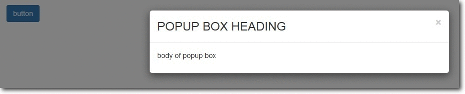
1. Let’s create a bootstrap button/image/link. So, when user clicks it a popup box will get displayed .
<button type="button" class="btn btn-primary" data-toggle="modal" data-target=".demo-popup">button</button>NOTE : the data-target option is set to the id or class given to modal. So when the user clicks the button, popup box will be displayed.
2. Design modal (popup box ) :
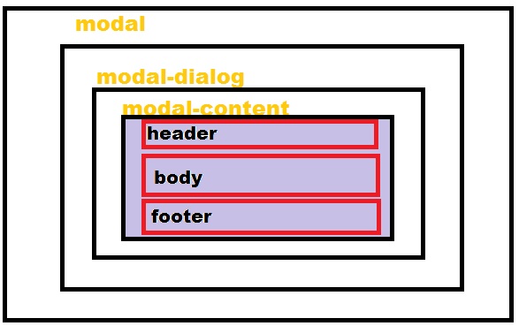 In the above modal structure we can see that modal is the outer layer and it contain further two sections. Let’s create them :
MODAL :
<div class="modal fade demo-popup" tabindex="-1" role="dialog" aria-labelledby="myLargeModalLabel-1" aria-hidden="true">In the above modal code class is set to fade, only if we want a fade effect. Demo-popup class is given to modal, which is already linked with the button we designed above.
MODAL DIALOG :
<div class="modal-dialog modal-sm"> modal-sm is given for small popup box, modal -lg for large popup box and if we don’t specify size of popup box the default is medium.
MODAL CONTENT:
<div class="modal-content"> Now, In Modal-Content we set our Popup box , Header (title), Body and Footer.
Header (of pop-up box)
<div class="modal-header"><button type="button" class="close" data-dismiss="modal" aria-hidden="true">×</button> <h3 class="modal-title">this is my title of popup box </h3> </div> Body(of popup box)
<div class="modal-body"> This is my body section of popup box .... </div> Footer(of popup box)
<div class="modal-footer"> <a href="http://www.google.com"> This is my FOOTER of popup box ....</a> </div> Now, close opening div of modal content, modal dialog and modal.
Our modal (popup box) is ready. Just run the webpage and click button to view popup box.
Complete Code:
Copy and paste below code in notepad and save as popup.html
<!DOCTYPE html>
<!--
To change this license header, choose License Headers in Project Properties.
To change this template file, choose Tools | Templates
and open the template in the editor.
-->
<html>
<head>
<title>TODO supply a title</title>
<meta charset="UTF-8">
<meta name="viewport" content="width=device-width, initial-scale=1.0">
<link href="css/bootstrap.min.css" rel="stylesheet" type="text/css"/>
<link href="css/style.css" rel="stylesheet" type="text/css"/>
<script src="js/jquery-1.11.3.min (1).js" type="text/javascript"></script>
<script src="js/bootstrap.min.js" type="text/javascript"></script>
<script src="js/script.js" type="text/javascript"></script>
</head>
<body>
<div class="container">
<div class="row">
<button type="button" class="btn btn-primary" data-toggle="modal" data-target=".demo-popup">button</button>
<!-- popup box modal starts here -->
<div class="modal fade demo-popup" tabindex="-1" role="dialog" aria-labelledby="myLargeModalLabel-1" aria-hidden="true">
<div class="modal-dialog">
<div class="modal-content">
<div class="modal-header">
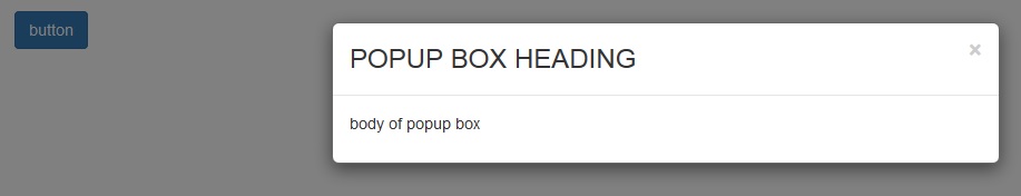
<button type="button" class="close" data-dismiss="modal" aria-hidden="true">×</button> <h3 class="modal-title">POPUP BOX HEADING</h3>
</div>
<div class="modal-body">
<P>body of popup box</P>
</div>
</div><!-- /.modal-content -->
</div><!-- /.modal-dialog -->
</div><!-- /.modal-->
<!-- popup box modal ends -->
</div> <!-- /.row -->
</div> <!-- /.container -->
</body>
</html>Steps For Option 2 . (Automatic display popup box when page loads.)
The steps for creating a modal(popup box ) is same as above. In order to get it loaded automatically, we add JavaScript code in script file. The code is shown below :
$(document).ready(function() { $('.form-popup').modal({ show: true, }) }); where form-popup is the class given to the modal .
Complete Code:
Copy and paste below code in notepad and save as auto.html.
<html>
<head>
<title>TODO supply a title</title>
<meta charset="UTF-8">
<meta name="viewport" content="width=device-width, initial-scale=1.0">
<link href="css/bootstrap.min.css" rel="stylesheet" type="text/css"/>
<link href="css/style.css" rel="stylesheet" type="text/css"/>
<script src="js/jquery-1.11.3.min (1).js" type="text/javascript"></script>
<script src="js/bootstrap.min.js" type="text/javascript"></script>
<script src="js/script.js" type="text/javascript"></script>
</head>
<body>
<div class="container">
<div class="row">
<!-- popup box modal starts here -->
<div class="modal fade form-popup" tabindex="-1" role="dialog" aria-labelledby="myLargeModalLabel-1" aria-hidden="true">
<div class="modal-dialog modal-sm">
<div class="modal-content">
<div class="modal-header"><button type="button" class="close" data-dismiss="modal" aria-hidden="true">×</button>
<h3 class="modal-title">ENQUIRY FORM</h3>
</div>
<div class="modal-body">
<!-- form code starts here -->
<form class="form-horizontal tpad" role="form">
<div class="form-group">
<label for="email" class="col-lg-3 control-label">EMAIL</label>
<div class="col-lg-9">
<input type="email" class="form-control" id="email" placeholder="EMAIL">
</div>
</div>
<div class="form-group tpad">
<label for="message" class="col-lg-3 control-label">Message</label>
<div class="col-lg-9">
<textarea class="form-control" rows="6" id="message" placeholder="MESSAGE..."></textarea>
</div>
</div>
<div class="form-group tpad">
<div class="col-lg-offset-3 col-lg-9">
<a data-toggle="modal" href="#myModal" class="btn btn-default btn-lg">Send</a>
</div>
</div>
</form>
<!-- form code ends here -->
</div>
<div class="modal-footer">
<a href="http://www.google.com">FOOTER</a>
</div>
</div><!-- /.modal-content -->
</div><!-- /.modal-dialog -->
</div><!-- /.modal-->
<!-- popup box modal ends -->
</div>
</div>
</body>
</html>Conclusion
In this tutorial we have learned about, how we can make Bootstrap Popup Modal. Hope you have got the concept. Keep following us for more coding tricks.