
What is Bootstrap Image Gallery ?
Bootstrap Image Gallery is used to group images in a webpage such that the images are displayed while arranged in a grid and they are responsive too. It can display images and videos in the modal dialog of the Bootstrap framework which can also be extended to employ several other features such as swipe, mouse and keyboard navigation, transition effects to other content types too.
For a quick solution, you can have a look at our bootstrap themes.
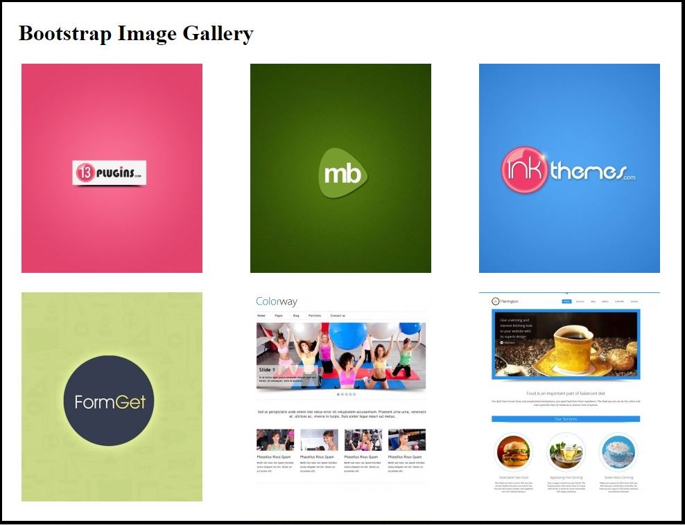
Bootstrap Image gallery in action(Desktop View) :-
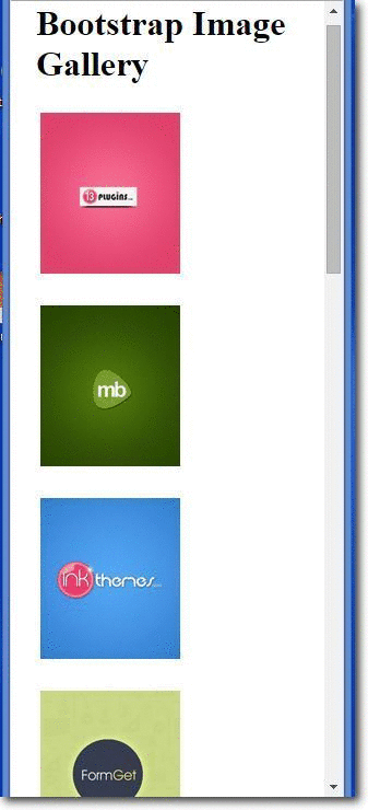
Bootstrap Image gallery in action(Mobile View/Responsive) :-
How to run ?
To run the above functioning Image Gallery we need only two files to be included :-
- The HTML file (Source code provided below)
- The CSS file (Source code provided below)
Source Script :-
HTML Code
<!DOCTYPE html>
<html lang="en">
<head>
<title>WORDPRESS BOOTSTRAP IMAGE GALLERY</title>
<meta charset="utf-8">
<meta http-equiv="X-UA-Compatible" content="IE=edge">
<meta name="viewport" content="width=device-width, initial-scale=1">
<meta name="description" content="">
<meta name="author" content="">
<link href="css/bootstrap.css" rel="stylesheet">
</head>
<body>
<!-- The main container DIV starts here -->
<div class="container">
<div class="row">
<!--First row containing the main Heading-->
<div class="col-lg-12">
<h1 class="page-header">Bootstrap Image Gallery</h1>
</div>
<!--Next row containing the respective images in 3x4 grids starts here -->
<div class="col-lg-3 col-md-4 col-xs-6 thumb">
<a class="thumbnail" href="#">
<img class="img-responsive" src="http://www.magnetbrains.com/wp-content/uploads/thumb-cache/mb-41-9abc11648b1ff2faa5989ff2ae1a4ee0-261x302-100-crop.jpg" alt="">
</a>
</div>
<div class="col-lg-3 col-md-4 col-xs-6 thumb">
<a class="thumbnail" href="#">
<img class="img-responsive" src="http://www.magnetbrains.com/wp-content/uploads/thumb-cache/mb-11-66c0fddfa654a75aefbbce7e1cfa683d-261x302-100-crop.jpg" alt="">
</a>
</div>
<div class="col-lg-3 col-md-4 col-xs-6 thumb">
<a class="thumbnail" href="#">
<img class="img-responsive" src="http://www.magnetbrains.com/wp-content/uploads/thumb-cache/mb-2-692a734b9186185a0a0e9998e1195e57-261x302-100-crop.jpg" alt="">
</a>
</div>
<div class="col-lg-3 col-md-4 col-xs-6 thumb">
<a class="thumbnail" href="#">
<img class="img-responsive" src="http://www.magnetbrains.com/wp-content/uploads/thumb-cache/mb-3-dd10cb33ddceb30eca71b3fd595d549b-261x302-100-crop.jpg" alt="">
</a>
</div>
<div class="col-lg-3 col-md-4 col-xs-6 thumb">
<a class="thumbnail" href="#">
<img class="img-responsive" src="http://www.magnetbrains.com/wp-content/uploads/thumb-cache/in-1-8991cdeed7272c0540d29f38a8009048-261x302-100-crop.jpg" alt="">
</a>
</div>
<div class="col-lg-3 col-md-4 col-xs-6 thumb">
<a class="thumbnail" href="#">
<img class="img-responsive" src="http://www.magnetbrains.com/wp-content/uploads/thumb-cache/in-2-59c51d99bce20def251e0d43e76531c7-261x302-100-crop.jpg" alt="">
</a>
</div>
<div class="col-lg-3 col-md-4 col-xs-6 thumb">
<a class="thumbnail" href="#">
<img class="img-responsive" src="http://www.magnetbrains.com/wp-content/uploads/thumb-cache/in-3-8cf1caffabf532c440396f5d95cd9128-261x302-100-crop.jpg" alt="">
</a>
</div>
<div class="col-lg-3 col-md-4 col-xs-6 thumb">
<a class="thumbnail" href="#">
<img class="img-responsive" src="http://www.magnetbrains.com/wp-content/uploads/thumb-cache/in-4-6503818077dd9003f120e1ecc822ce31-261x302-100-crop.jpg" alt="">
</a>
</div>
<div class="col-lg-3 col-md-4 col-xs-6 thumb">
<a class="thumbnail" href="#">
<img class="img-responsive" src="http://www.magnetbrains.com/wp-content/uploads/thumb-cache/in-5-9c86bc1d11546ac39f4a199d2da5911c-261x302-100-crop.jpg" alt="">
</a>
</div>
<div class="col-lg-3 col-md-4 col-xs-6 thumb">
<a class="thumbnail" href="#">
<img class="img-responsive" src="http://www.magnetbrains.com/wp-content/uploads/thumb-cache/13-1-b39d7d1fd9ec72a468ccec5eddfb7929-261x302-100-crop.jpg" alt="">
</a>
</div>
<div class="col-lg-3 col-md-4 col-xs-6 thumb">
<a class="thumbnail" href="#">
<img class="img-responsive" src="http://www.magnetbrains.com/wp-content/uploads/thumb-cache/13-2-85334e0149f3881975a8a991b4209f01-261x302-100-crop.jpg" alt="">
</a>
</div>
<div class="col-lg-3 col-md-4 col-xs-6 thumb">
<a class="thumbnail" href="#">
<img class="img-responsive" src="http://www.magnetbrains.com/wp-content/uploads/thumb-cache/13-4-4a0acb9dff86fc2ad7c0c19d63d05b83-261x302-100-crop.jpg" alt="">
</a>
</div>
</div>
</div>
</body>
</html>
CSS Code
img {
vertical-align: middle;
}
.img-responsive,.thumbnail a > img {
display: block;
max-width: 100%;
height: auto;
}
.container {
padding-right: 15px;
padding-left: 15px;
margin-right: auto;
margin-left: auto;
}
@media (min-width: 1200px) {
.container {
width: 1170px;
}
}
.container-fluid {
padding-right: 15px;
padding-left: 15px;
margin-right: auto;
margin-left: auto;
}
.row {
margin-right: -15px;
margin-left: -15px;
}
.col-lg-3, .col-md-4, .col-xs-6, .col-lg-12 {
position: relative;
min-height: 1px;
padding-right: 15px;
padding-left: 15px;
}
.col-xs-6 {
width: 50%;
float:left;
}
@media (min-width: 1200px) {
.col-lg-3, .col-lg-12 {
float: left;
}
.col-lg-12 {
width: 100%;
}
.col-lg-3 {
width: 25%;
}
}
.thumbnail {
display: block;
padding: 4px;
margin-bottom: 20px;
background-color: #fff;
//border: 1px solid #ddd;
border-radius: 4px;
-webkit-transition: border .2s ease-in-out;
-o-transition: border .2s ease-in-out;
transition: border .2s ease-in-out;
}
a.thumbnail:hover,
a.thumbnail:focus,
a.thumbnail.active {
border-color: #337ab7;
}
Simplified Explanation of the script
A Bootstrap file to function as a responsive page must include the following statement compulsorily in its <head> section.
<meta name="viewport" content="width=device-width, initial-scale=1">
A responsive page must wrap all the associated statements/function in a DIV class named as “container”.
There are two container classes to choose from:
- The .container class provides a responsive fixed width container
- The .container-fluid class provides a full width container, spanning the entire width of the viewport
<div class="container">

//All the relevant contents are placed here.

</div>
Next, there are four column class variants from among which the proper variant can be chosen as per requirement and the relevant path of the image to be included are provided in place of “image-path”
- col-xs-*
- col-sm-*
- col-md-*
- col-lg-*
<div class="col-lg-3 col-md-4 col-xs-6 thumb">
<a class="thumbnail" href="#">
<img class="img-responsive" src="image-path" alt="">
</a>
</div>
Finally, using CSS the view of the page could be enhanced to a great extent to that the page is finely visibly in all devices of varying range.
Conclusion
So if someone has got a head scratch in displaying images gallery with responsive features too, he/she can just employ the above code snippets and by just replacing the image paths accordingly and altering the CSS for the desired view, one can have a beautiful image gallery that can be viewed in desktops, small devices and extra-small devices too.
Recommended blogs:-