
What is Bootstrap Accordion ?
Accordion is a built in capability of Bootstrap to create menus and technical widgets which can properly organize large content and navigation lists. Here, the areas are designed where information can be displayed by just clicking on a button and sliding an area to open and close. It implements the collapse plugin to manage divisions in a webpage.
Our premium bootstrap themes will serve the purpose for you. Take a look.
Bootstrap Required files
For Bootstrap framework, we must include bootstrap.min.js, bootstrap.min.css, and jquery.min.js files (as shown below) in the head section of our page.
<link href="css/bootstrap.min.css" rel="stylesheet" type="text/css"/>
<script src="http://ajax.googleapis.com/ajax/libs/jquery/1.11.3/jquery.min.js"></script>
<script src="js/bootstrap.min.js" type="text/javascript"></script>
Create Accordion
Bootstrap Accordion menu and widgets are widely used on the website and are very easy to create. Without any JavaScript code you can create accordion or a simple collapsible panel.
The following example show simple Accordion.
data-toggle=”collapse” is added to the link on which you click to expand or collapse the component.
href or a data-target attribute is added to the parent component, whose value is id of the child component.
data-parent attribute is added for creating the accordion like effect.
<a data-toggle="collapse" data-parent="#accordion" href="#collapse1">HTML</a>HTML code
<meta name="viewport" content="width=device-width, initial-scale=1.0">
<link href="css/bootstrap.min.css" rel="stylesheet" type="text/css"/>
<script src="http://ajax.googleapis.com/ajax/libs/jquery/1.11.3/jquery.min.js"></script>
<script src="js/bootstrap.min.js" type="text/javascript"></script>
<html>
<head>
<title> </title>
<meta charset="UTF-8">
<meta name="viewport" content="width=device-width, initial-scale=1.0">
<link href="css/bootstrap.min.css" rel="stylesheet" type="text/css"/>
<script src="http://ajax.googleapis.com/ajax/libs/jquery/1.11.3/jquery.min.js"></script>
<script src="js/bootstrap.min.js" type="text/javascript"></script>
<style>
#a{
background-color: #3C85C4;
color: #fff;
}
#b{
background-color: #44C767;
color: #fff;
}
#c{
background-color: #FA8B7C;
color: #fff;
}
</style>
</head>
<body>
// This is the main container div
<div class="container">
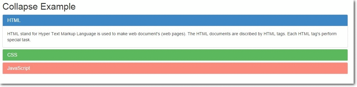
<h2>Collapse Example</h2>
// This is data-parent div
<div class="main-panel" id="accordion">
<div class="panel panel-default">
<div class="panel-heading" id="a">
<h4 class="panel-title" >
<a data-toggle="collapse" data-parent="#accordion" href="#collapse1">HTML</a>
</h4>
</div>
// This is the data-child div
<div id="collapse1" class="panel-collapse collapse in">
<div class="panel-body">Hypertext Markup Language, a standardized system for tagging text files to achieve font, colour, graphic, and hyperlink effects on World Wide Web pages.</div>
</div>
</div>
<div class="panel panel-default">
<div class="panel-heading" id="b">
<h4 class="panel-title">
<a data-toggle="collapse" data-parent="#accordion" href="#collapse2">CSS</a>
</h4>
</div>
// This is the data-child div
<div id="collapse2" class="panel-collapse collapse">
<div class="panel-body">Cascading Style Sheets (CSS) is a style sheet language used for describing the look and formatting of a document written in a markup language
</div>
</div>
</div>
<div class="panel panel-default">
<div class="panel-heading" id="c">
<h4 class="panel-title">
<a data-toggle="collapse" data-parent="#accordion" href="#collapse3">JavaScript</a>
</h4>
</div>
// This is the data-child div
<div id="collapse3" class="panel-collapse collapse">
<div class="panel-body">an object-oriented computer programming language commonly used to create interactive effects within web browsers.</div>
</div>
</div>
</div>
</div>
</body>The Collapse Plugin Classes
.collapse – This class hides the contents.
.collapse in – This class shows the contents.
.collapsing – Added when the transition starts and removes when it finishes.
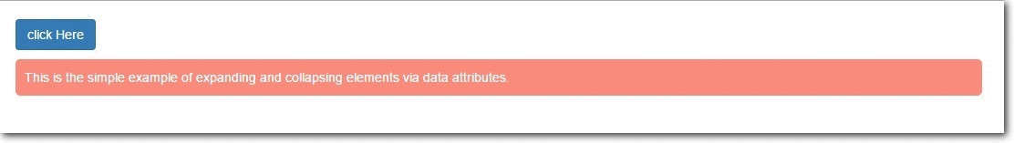
Collapsing Elements via Data Attributes
It can be used for expanding and to collapse any specific element via data attributes without using the accordion mark.
The following example shows simple collapse.
HTML code
<html>
<head>
<title>Bootstrap Collapse</title>
<meta charset="UTF-8">
<meta name="viewport" content="width=device-width, initial-scale=1.0">
<link href="css/bootstrap.min.css" rel="stylesheet" type="text/css"/>
<script src="http://ajax.googleapis.com/ajax/libs/jquery/1.11.3/jquery.min.js"></script>
<script src="js/bootstrap.min.js" type="text/javascript"></script>
<style>
.my-example{
padding: 20px;
}
#demo1{
border-radius:  5px;
margin-top: 10px;
margin-right: 500px;
background-color: #FA8B7C;
color: #fff;
}
p{
padding: 10px;
}
</style>
</head>
<body>
//  Anchor element html
<div class="my-example">
<a href="#demo1" class="btn btn-primary" data-toggle="collapse" > click Here </a>
// Collepsible element html
<div id="demo1" class="collapse in">
<p>
This is the simple example of expanding and collapsing elements via data attributes.
</p>
</div>
</div>
</body>
</html>
Collapsing Element via JavaScript
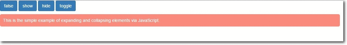
We can collapse and expand any specific elements via JavaScript. Just call the the collapse() bootstrap method with ‘id’ or ‘class’ selector.
$('.collapse').collapse() There are several Options, Methods and Events, which can be used with Bootstrap Collapsible JavaScript Plugin. Here are the details:
Options
parent: Type of value is Selector. Default value is false. When the parent element is displayed, all collapsible elements under the parent is closed.
toggle: Type of value is Boolean. Default value is true. When called, all collapsible elements are toggled.
Methods
.collapse(options) – Activates collapsible content. It accepts an optional option object.
$('#my-example').collapse({
toggle: false
})
.collapse(‘toggle’) – A collapsible element is either shown or hidden.
$('#my-example').collapse('toggle').collapse(‘show’) – A collapsible element is shown.
$('#my-example').collapse('show').collapse(‘hide’) – A collapsible element is hidden.
$('#my-example').collapse('hide')Complete Code and output
HTML code
<html>
<head>
<title>Collapsing via Javascript</title>
<meta charset="UTF-8">
<meta name="viewport" content="width=device-width, initial-scale=1.0">
<link href="css/bootstrap.min.css" rel="stylesheet" type="text/css"/>
<script src="http://ajax.googleapis.com/ajax/libs/jquery/1.11.3/jquery.min.js"></script>
<script src="js/bootstrap.min.js" type="text/javascript"></script>
<script type="text/javascript">
// Main function
$(document).ready(function(){
$('.x').click(function(){
// Optional element function
$("#my-example").collapse({
toggle:false
});
});
$('.y').click(function(){
// Show element function
$("#my-example").collapse('show');
});
$('.z').click(function(){
// Hide element function
$("#my-example").collapse('hide');
});
$('.a').click(function(){
// Toggle(show/hide) element function
$("#my-example").collapse('toggle');
});
});
</script>
<style>
p{
border-radius: 5px;
margin-top: 10px;
background-color: #FA8B7C;
padding: 10px;
margin-right: 500px;
color: #fff;
}
</style>
</head>
<body>
// Main container div
<div class="ss">
<input type="button" class="btn btn-primary x" value="false">
<input type="button" class="btn btn-primary y" value="show">
<input type="button" class="btn btn-primary z" value="hide">
<input type="button" class="btn btn-primary a" value="toggle">
<div id="my-example">
<p>
This is the simple example of expanding and collapsing elements via JavaScript.</p>
</div>
</div>
</body>
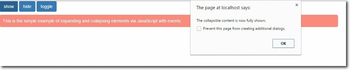
</html>Events
| Event | Description |
|---|---|
| show.bs.collapse | Occurs when the collapsible element is about to be shown. |
| shown.bs.collapse | Occurs when the collapsible element is fully shown. |
| hide.bs.collapse | Occurs when the collapsible element is about to be hidden. |
| hidden.bs.collapse | Occurs when the collapsible element is fully hidden. |
Complete code and output
Complete code
<html>
<head>
<title>Collapsing via Javascript with Events</title>
<meta charset="UTF-8">
<meta name="viewport" content="width=device-width, initial-scale=1.0">
<link href="css/bootstrap.min.css" rel="stylesheet" type="text/css"/>
<script src="http://ajax.googleapis.com/ajax/libs/jquery/1.11.3/jquery.min.js"></script>
<script src="js/bootstrap.min.js" type="text/javascript"></script>
<script type="text/javascript">
$(document).ready(function(){
$('.y').click(function(){
$("#my-example").collapse('show');
});
$('.z').click(function(){
$("#my-example").collapse('hide');
});
$('.a').click(function(){
$("#my-example").collapse('toggle');
});
// Event occur when collapsible content is about to be shown.
$("#my-example").on('show.bs.collapse', function(){
alert('The collapsible content is about to be shown.');
});
// Event occur when collapsible content is now fully shown.
$("#my-example").on('shown.bs.collapse', function(){
alert('The collapsible content is now fully shown.');
});
// Event occur when collapsible content is about to be hidden.
$("#my-example").on('hide.bs.collapse', function(){
alert('The collapsible content is about to be hidden.');
});
// Event occur when collapsible content is now hidden.
$("#my-example").on('hidden.bs.collapse', function(){
alert('The collapsible content is now hidden.');
});
});
</script>
<style>
p{
border-radius: 5px;
margin-top: 10px;
background-color: #FA8B7C;
padding: 10px;
margin-right: 500px;
color: #fff;
}
</style>
</head>
<body>
// Main container div
<div class="ss">
<input type="button" class="btn btn-primary y" value="show">
<input type="button" class="btn btn-primary z" value="hide">
<input type="button" class="btn btn-primary a" value="toggle">
<div id="my-example">
<p>
This is the simple example of expanding and collapsing elements via JavaScript with events.</p>
</div>
</div>
</body>
</html>
Conclusion :
So, we’ve learned how to make accordion menu and widget to manage navigation list and content by using bootstrap. The above provided codes can be directly employed within any source segments to run Accordion. I hope it was helpful for you. Keep visiting our website.
Also read our popular post:-