
Bootstrap Tab provides an ease of handling a huge amount of data within a small area. Using this we can quickly access the content of panes without leaving the page. This also helps in easy organization of data, so that all similar data are arranged in a single pane. This proper arrangement helps in easily accessing and retrieving of information.
To use Bootstrap we have to include some files in our code such as bootstrap.min.css, bootstrap.vertical-tabs.css, jquery-2.1.1.min.js, bootstrap.min.js of Bootstrap library.
You can use our responsive design templates of bootstrap for a rapid solution to your problems.
Basic Tabs With Bootstrap
The following example will create basic tabs:
HTML Code:-
<!-- nav nav-tabs class makes the tabs -->
<ul class=”nav nav-tabs”>
<!--active tab is mentioned as "active" class-->
<li class=”active”><a href=”#”>Menu 1</a></li>
<li>< a href=”#”>Menu 2</a></li>
<li><a href=”#”>Menu 3</a></li>
</ul>
Note:- In-order to mark the current tab, this can be done using class=”active”. Tabs in Bootstrap are created using a class=”nav nav-tabs” of Bootstrap library .
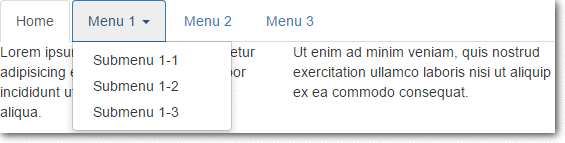
Tabs With Dropdown Menu
We can also create the tabs with a Dropdown menu.
Following example demonstrates such a tab:
HTML Code:-
<!--"nav nav-tabs" makes tabs in bootstrap-->
<ul class="nav nav-tabs">
<li class="active"><a href="#">Home</a></li>
<!--makes tab with dropdown feature-->
<li class="dropdown">
<!--make dropdown tabs toggable-->
<a class="dropdown-toggle" data-toggle="dropdown" href="#">Menu 1
<span class="caret"></span></a>
<ul class="dropdown-menu">
<li><a href="#">Submenu 1-1</a></li>
<li><a href="#">Submenu 1-2</a></li>
<li><a href="#">Submenu 1-3</a></li>
</ul>
</li>
<li><a href="#">Menu 2</a></li>
<li><a href="#">Menu 3</a></li>
</ul>
Explanation:-
To create tabs with dropdown menu add data-toggle=”dropdown” attribute and .dropdown class to each link and it’s submenus are defined by a <ul> with .dropdown-menu class .
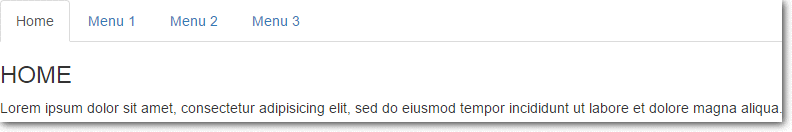
Dynamic Tabs
The user can quickly access the content through switching between the panes without leaving the page. content will get changed as the user switches between the tab.
Following code snippet will create dynamic tabs.
HTML Code:-
<ul class="nav nav-tabs">
<!--make tabs toggable-->
<li class="active"><a data-toggle="tab" href="#home">Home</a></li>
<li><a data-toggle="tab" href="#menu1">Menu 1</a></li>
<li><a data-toggle="tab" href="#menu2">Menu 2</a></li>
</ul>
<!--code to open the cantent of tabs-->
<div class="tab-content">
<div id="home" class="tab-pane fade in active">
<h3>HOME</h3>
<p>Some content.</p>
</div>
<div id="menu1" class="tab-pane fade">
<h3>Menu 1</h3>
<p>Some content in menu 1.</p>
</div>
<div id="menu2" class="tab-pane fade">
<h3>Menu 2</h3>
<p>Some content in menu 2.</p>
</div>
</div>
Explanation:-
To create Dynamic Tabs add data-toggle=”tab” attribute to each link then add a tab-pane class with unique id for every tab content and wrap them all inside a <div> element with tab-content class .
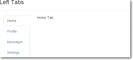
Bootstrap-vertical-tabs
nav nav-tabs tabs-left and nav nav-tabs tabs-right classes of Bootstrap are used to make vertical tab.
HTML Code:–
<html>
<head>
<meta charset="utf-8">
<title>Bootstrap Vertical Tabs</title>
<link rel="stylesheet" href="http://netdna.bootstrapcdn.com/bootstrap/3.3.0/css/bootstrap.min.css">
<link rel="stylesheet" href="bootstrap.vertical-tabs.css">
<script src="https://code.jquery.com/jquery-2.1.1.min.js"></script>
<script src="http://netdna.bootstrapcdn.com/bootstrap/3.3.0/js/bootstrap.min.js"></script>
</head>
<body>
<div class="container">
<div class="page-header">
<h1>Bootstrap Vertical Tabs <small> | Demo</small></h1>
</div>

<div class="row" style="min-height:600px;">
<div class="col-sm-6">
<h3>Left Tabs</h3>
<hr/>
<div class="col-xs-3"> <!-- required for floating -->
<!-- Nav tabs -->
<ul class="nav nav-tabs tabs-left">
<li class="active"><a href="#home" data-toggle="tab">Home</a></li>
<li><a href="#profile" data-toggle="tab">Profile</a></li>
<li><a href="#messages" data-toggle="tab">Messages</a></li>
<li><a href="#settings" data-toggle="tab">Settings</a></li>
</ul>
</div>
<div class="col-xs-9">
<!-- Tab panes -->
<div class="tab-content">
<div class="tab-pane active" id="home">Home Tab.</div>
<div class="tab-pane" id="profile">Profile Tab.</div>
<div class="tab-pane" id="messages">Messages Tab.</div>
<div class="tab-pane" id="settings">Settings Tab.</div>
</div>
</div>
</div>
</div>
</div>
</body>
</html>
CSS Code:-
/*!
* bootstrap-vertical-tabs - v1.2.1
*/
.tabs-left, .tabs-right {
border-bottom: none;
padding-top: 2px;
}
.tabs-left {
border-right: 1px solid #ddd;
}
.tabs-right {
border-left: 1px solid #ddd;
}
.tabs-left>li, .tabs-right>li {
float: none;
margin-bottom: 2px;
}
.tabs-left>li {
margin-right: -1px;
}
.tabs-right>li {
margin-left: -1px;
}
.tabs-left>li.active>a,
.tabs-left>li.active>a:hover,
.tabs-left>li.active>a:focus {
border-bottom-color: #ddd;
border-right-color: transparent;
}

.tabs-right>li.active>a,
.tabs-right>li.active>a:hover,
.tabs-right>li.active>a:focus {
border-bottom: 1px solid #ddd;
border-left-color: transparent;
}
.tabs-left>li>a {
border-radius: 4px 0 0 4px;
margin-right: 0;
display:block;
}
.tabs-right>li>a {
border-radius: 0 4px 4px 0;
margin-right: 0;
}
.sideways {
margin-top:50px;
border: none;
position: relative;
}
.sideways>li {
height: 20px;
width: 120px;
margin-bottom: 100px;
}
.sideways>li>a {
border-bottom: 1px solid #ddd;
border-right-color: transparent;
text-align: center;
border-radius: 4px 4px 0px 0px;
}
.sideways>li.active>a,
.sideways>li.active>a:hover,
.sideways>li.active>a:focus {
border-bottom-color: transparent;
border-right-color: #ddd;
border-left-color: #ddd;
}
.sideways.tabs-left {
left: -50px;
}
.sideways.tabs-right {
right: -50px;
}
.sideways.tabs-right>li {
-webkit-transform: rotate(90deg);
-moz-transform: rotate(90deg);
-ms-transform: rotate(90deg);
-o-transform: rotate(90deg);
transform: rotate(90deg);
}
.sideways.tabs-left>li {
-webkit-transform: rotate(-90deg);
-moz-transform: rotate(-90deg);
-ms-transform: rotate(-90deg);
-o-transform: rotate(-90deg);
transform: rotate(-90deg);
}Note:-To run the above code you must include bootstrap.min.css, bootstrap.vertical-tabs.css, jquery-2.1.1.min.js, bootstrap.min.js files in your code
Conclusion
In this tutorial we have learned about, how to create Tabs in Bootstrap, Hope you have had a great experienced reading it. Keep visiting our website in future for more knowledge and information.
Also read our popular post:-