
Bootstrap makes it easy with the simple HTML markup and extended classes for different styles of forms.
Bootstrap greatly simplifies the process of styling and alignment of form controls like labels, input fields, select boxes, textareas, buttons, etc. through predefined set of classes.

HTML forms are the integral part of the web pages and applications, but styling the form controls manually one by one with CSS are often boring and tedious.
This tutorial will help you to create various types of forms with Bootstrap.
Three types of forms in Bootstrap are:
- Vertical or Basic form (By default)
- Horizontal form
- Inline form
For a better solution, you can take a look at our Bootstrap Landing Page Templates.
Rules For Form Layouts
- Use of role attribute in <form role=”form“> this improves accessibility for screen readers
- Wrap up labels and form controls in <div class=”form-group“> for better spacing
- Use of class =”form-control“ in all text elements (<input>, <select>, <textarea>)
Vertical or Basic Form
In Vertical or Basic Form layout there is no need to add any base class in the <form> element and in result labels are left-aligned on the top of form control.
Example:
<form role="form">
<div class="form-group">
<label for="email">Email:</label>
<input type="email" class="form-control" id="email" placeholder="Enter email">
</div>
<div class="form-group">
<label for="pwd">Password:</label>
<input type="password" class="form-control" id="pwd" placeholder="Enter password">
</div>
<div class="checkbox">
<label><input type="checkbox"> Remember me</label>
</div>
<button type="submit" class="btn btn-default">Submit</button>
</form>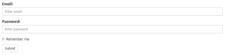
Horizontal Form
Creates a horizontal form that uses the horizontal layout where labels are right aligned in this form.
Following rules are additional:
- Use class=”form-horizontal“ in the <form> element
- Use class=”control-label“ in the <label> element
Example:
<form class="form-horizontal" role="form">
<div class="form-group">
<label class="control-label col-sm-2" for="email">Email:</label>
<div class="col-sm-10">
<input type="email" class="form-control" id="email" placeholder="Enter email">
</div>
</div>
<div class="form-group">
<label class="control-label col-sm-2" for="pwd">Password:</label>
<div class="col-sm-10">
<input type="password" class="form-control" id="pwd" placeholder="Enter password">
</div>
</div>
<div class="form-group">
<div class="col-sm-offset-2 col-sm-10">
<div class="checkbox">
<label><input type="checkbox"> Remember me</label>
</div>
</div>
</div>
<div class="form-group">
<div class="col-sm-offset-2 col-sm-10">
<button type="submit" class="btn btn-default">Submit</button>
</div>
</div>
</form>
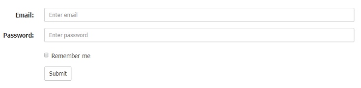
Note: In horizontal layout we will use Bootstrap’s predefined grid classes for alignment of labels and groups of form controls.
Inline Form
An inline form show a compact layout of form. In this form labels are aligned alongside and all the elements are left-aligned and inline.
Following rule is additional:
- Use class =”form-inline“ in the <form> element
Example:
<form class="form-inline" role="form">
<div class="form-group">
<label for="email">Email:</label>
<input type="email" class="form-control" id="email" placeholder="Enter email">
</div>
<div class="form-group">
<label for="pwd">Password:</label>
<input type="password" class="form-control" id="pwd" placeholder="Enter password">
</div>
<div class="checkbox">
<label><input type="checkbox"> Remember me</label>
</div>
<button type="submit" class="btn btn-default">Submit</button>
</form>
Note: Use a label for every input, Otherwise screen readers will have trouble with your forms.(We can use class=”sr-only“ in <label> element to hide these labels )
Supported Form Controls
Bootstrap easily supports the standard and important form controls namely:
- input
- textarea
- checkbox
- radio
- select
Input
Input is the most common and useful form control. All the HTML5 input types (text, password, datetime, datetime-local, date, month, time, week, number, email, url, search, tel, and color) are supported by Bootstrap.
The following example includes two input types text and password :
Example:
<div class="form-group">
<label for="user">Name:</label>
<input type="text" class="form-control" id="usr">
</div>
<div class="form-group">
<label for="password">Password:</label>
<input type="password" class="form-control" id="pwd">
</div>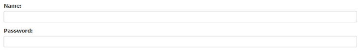
Textarea
The textarea supports multiple lines of text. According to your need you can update (increase or decrease) rows attribute.
Example:
<div class="form-group">
<label for="message">Comment:</label>
<textarea class="form-control" rows="4" id="comment"></textarea>
</div>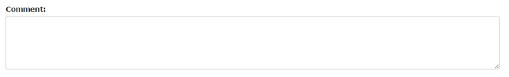
Checkbox
Checkbox is used to select one or several options in a list. For inline appearance of controls we can use class=”checkbox-inline“ in <label> element.
The following example shows three checkboxes(Third Checkbox is disabled) :
Example:
<div class="checkbox">
<label><input type="checkbox" value="">Option 1</label>
</div>
<div class="checkbox">
<label><input type="checkbox" value="">Option 2</label>
</div>
<div class="checkbox disabled">
<label><input type="checkbox" value="" disabled>Option 3</label>
</div>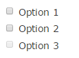
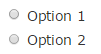
Radio
Radio buttons are used to select one option from many in a list. For inline appearance of controls we can use class=”radio-inline“ in <label> element.
The following example shows two radio buttons :
Example:
<div class="radio">
<label><input type="radio" name="oradio">Option 1</label>
</div>
<div class="radio">
<label><input type="radio" name="oradio">Option 2</label>
</div>
Select
Select is a drop-down list and it is used when you want to allow the user to pick a option from multiple options. Use multiple=”multiple” in <select> tag to allow the users to select more than one option.
The following example shows a select list of name :
Example:
<div class="form-group">
<label for="name">Select list(select one):</label>
<select class="form-control" id="name">
<option>1</option>
<option>2</option>
<option>3</option>
<option>4</option>
</select><br>

<label for="name1">Mutiple select(Hold shift to select more than one option):</label>
<select multiple class="form-control" id="name1">
<option>1</option>
<option>2</option>
<option>3</option>
<option>4</option>
<option>5</option>
</select>
</div>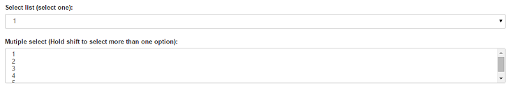
Conclusion
So, you’ve learned that how we can make form and its components stylish using bootstrap. I hope it was helpful. Keep visiting our blogs and feel free to comment.
You may also like –