
Bootstrap is a front-end framework use to make responsive mobile-first websites.
For mobile-first approach, its grid function force designers to create websites for small screen devices like mobile phones.
Our bootstrap responsive templates will provide you a better solution.
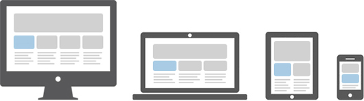
Below are the examples which will give you a basic idea about the structure of the large screen and small screen.
Example 1 – For a large screen (Desktop):

On the other hand, In a mobile phone, its structure breaks down and adjust accordingly.
Example 2-For a small screen (Mobile Phone):

Role of a grid system in bootstrap mobile
Working of each grid system in bootstrap is exactly the same. It is differentiated just by the width of the screen size. It includes a responsive mobile-first grid system that scales up to 12 columns in a row.
Mobile First Strategy
- Content
- Everything in a website revolves around the content.
- Layout
- First priority must be smaller width design for mobile devices.
- Progressive Enhancement
- Add new elements as screen size increases.
Different types of grid-
There are four Grid Systems in bootstrap:
- Extra small devices –Phones (< 768px)
- Small devices – Tablets (>= 768px)
- Medium devices – Desktops (>= 992px)
- Large devices – Desktops (>= 1200px)
And each viewport has its own class
- col-xs- (Extra small devices)
- col-sm- (Small devices)
- col-md- (Medium devices)
- col-lg- (Large devices)
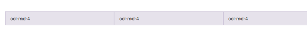
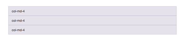
To make use of the Grid System, you’d need a container element, with a class”container”, and inside a second container with a class “row”. Notice how in both cases the “fluid” suffix has disappeared And inside the second container you’d place your columns.
  <div class="container">
<div class="row">
<div class="col-md-4">col-md-4</div>
<div class="col-md-4">col-md-4</div>
<div class="col-md-4">col-md-4</div>
</div>
</div>
If you were to say, use columns prefixed by “md” and the viewport happened to be less than 992px wide (even 991px), those columns will stack one below the other with a 100% width, as shown here,
Working of Bootstrap grid System
Grid systems are mainly used for creating page layouts through a series of rows and columns. Let’s see how the Bootstrap grid system works:
- Rows must be placed within a .container class for proper alignment and padding.
- Use rows to create horizontal groups of columns.
- Content should be placed within the columns, and only columns may be the immediate children of rows.
- Predefined grid classes like .row and .col-xs-4 are available for quickly making grid layouts.
- Columns create gutters (gaps between column content) via padding. That padding is offset in rows for the first and the last column via negative margin on .rows.
- Grid columns are created by specifying the number of twelve available columns you wish to span. For example, three equal columns would use three .col-xs-4.
Enabling the Grid system
Grid system is enabled simply by adding the viewport meta tag in your document.
<meta name="viewport" content="width=device-width, initial-scale=1.0">Responsive tables:-
<div class="table-responsive">
    <table class="table">...</table>
</div>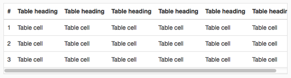
Conclusion-
I hope that you have got a detailed description of, how bootstrap works in a mobile device. So this was all about it, keep reading our blog posts that will help you to enhance your knowledge and will sharpen your coding tricks.
Check out some more related blogs here –