
Bootstrap Grid System is mobile-first fluid grid system which is made up of a series rows and columns to provide a structure to website and to place it’s content in the intersected areas easily.
The Bootstrap grid is a library of HTML/CSS components that allow you to structure a website and place a website’s content in desired locations easily. It appropriately scales up to 12 columns as the device or viewport size increases.
For an appropriate solution, you can refer to our premium bootstrap templates.
Bootstrap Grid System allows you to create up to 12 columns and unlimited rows. Hence it is made up of 3 things:-
- A container
- Rows
- Columns
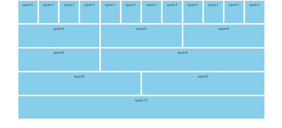
To create the above structure of website the HTML code is :-
<!--to create a grid-->

<div class="container">
<div class="row">
<div class="col-md-1">span 1</div>
<div class="col-md-1">span 1</div>
<div class="col-md-1">span 1</div>
<div class="col-md-1">span 1</div>
<div class="col-md-1">span 1</div>
<div class="col-md-1">span 1</div>
<div class="col-md-1">span 1</div>
<div class="col-md-1">span 1</div>
<div class="col-md-1">span 1</div>
<div class="col-md-1">span 1</div>
<div class="col-md-1">span 1</div>
<div class="col-md-1">span 1</div>
</div>
<div class="row">
<div class="col-md-4">span 4</div>
<div class="col-md-4">span 4</div>
<div class="col-md-4">span 4</div>
</div>
<div class="row">
<div class="col-md-4">span 8</div>
<div class="col-md-8">span 4</div>
</div>
<div class="row">
<div class="col-md-6">span 6</div>
<div class="col-md-6">span 6</div>
</div>
<div class="row">
<div class="col-md-12">span 12</div>
</div>
Container
A container is used to hold rows and columns. It is a simple <div> element with a class of .container. The container provides a proper width for the layout, acting as a wrapper for the content. There are two types of containers:-
1. .container is used for responsive fixed width containers. It also has different fixed widths in different sized devices.
<!--to create a container-->
<div class="container">
<div class="row">
......
</div>
</div>
2. .fluid-container is used for full width containers, and use entire width of your viewport.
<!--to create a fluid-container-->
<div class="fluid-container">
<div class="row">
......
</div>
</div>
Row
A row acts like a wrapper around the columns. It nullifies the padding set by the container element by using a negative margin value of -15px on both the left and right sides.
A row is created by adding the class .row to a block level element inside the container and spans from the left edge to the right edge of the container element.
Finally, there’s no limit on the number of rows you can create.
Columns
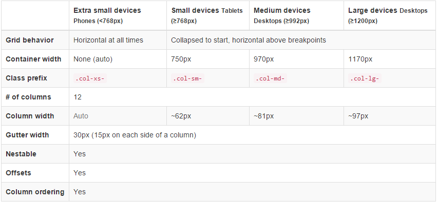
Different column class prefixes are used by Bootstrap for different sized devices. These prefixes are shown below:-
| Class Prefix | Device Size |
|---|---|
| .col-xs- | <768px |
| .col-sm- | 768px to 991px |
| .col-md- | 992px to 1199px |
| .col-lg- | ≥ 1200px |
The class .col-xs-12 creates a single column that spans across 12 virtual Bootstrap columns. Hence, this column’s width will be the width of the row. In Bootstrap, if a column is defined for a particular type of device then it is guaranteed to behave similarly in larger devices as well.
Therefore, a column defined for extra smaller devices will work in all types of devices.
Grid Classes
Bootstrap grid system has four types of classes which can be combined to obtain more dynamic and flexible layouts.
- xs class(for the phone)
- sm(for the tablets)
- md(for the desktop)
- lg(for the large desktop)
Structure of bootstrap grid
Hence the basic structure of bootstrap grid:
firstly, create a container <div class=”container”>
secondly, create a row <div class=”row”>
and then add desire columns<div class=”col-*-*”>
<!--to create bootstrap grid structure-->

<div class="container">
<div class="row">
<div class="col-*-*"></div>
</div>
<div class="row">
<div class="col-*-*"></div>
<div class="col-*-*"></div>
<div class="col-*-*"></div>
</div>
<div class="row">

</div>

</div>
Mobile first strategy:
- content : determine what is most important.
- Layout : firstly, design to smaller width, media queries address for tablet,desktop.
- Progressively Enhancement : Add elements as screen size increasingly.
To proper rendering and zooming touch. add the viewport meta tag in the <head> section.
<!--to create viewport meta tag for mobile phone-->

<meta name="viewport" content="width=device-width, initial-scale=1.0">
Grid options
Below table summarizes on working of the bootstrap grid system in multiple devices .
Offset Columns
Offsets is useful feature for layouts. To use offsets for large displays layout, use the .col-md-offsets-* classes. These classes increase the left margin of columns by * columns where*range from 1 to 11.
classes .col-xs-offset-* doesn’t supports offsets but they are easily replicated by using an empty cell.
<!--to creating the offset -->

<div class="container">
<h1>Hello, world!</h1>
<div class="row" >
<div class="col-xs-6 col-md-offset-3"
style="background-color: #dedef8;box-shadow:
inset 1px -1px 1px #444, inset -1px 1px 1px #444;">
<p>Lorem ipsum dolor sit amet, consectetur adipisicing
elit.
</p>
</div>
</div>
Bootstrap Example
Below are some of the bootstrap examples for different website layouts:
Three Equal Columns
We can create three columns of same size but one must remember that every row is 12 in size and so one must divide the column accordingly.

<!--to create two equal columns-->

<div class="row">
<div class="col-sm-4">.col-sm-4</div>
<div class="col-sm-4">.col-sm-4</div>
<div class="col-sm-4">.col-sm-4</div>
</div>
Three unequal Columns
We can also create three unequal size columns and thus has to adjust as follows:

<!--to create three unequal columns-->

<div class="row">
<div class="col-md-3">.col-md-3</div>
<div class="col-md-6">.col-md-6</div>
<div class="col-md-3">.col-md-3</div>
</div>
Two columns with two nested columns
We can create nested columns by inserting a row of columns within an existing column. This gives you two columns starting at desktops and scaling to large desktops with another two (equal widths) within the larger column.

<!--to create nested columns-->

<div class="row">
<div class="col-md-8">.col-md-8
<div class="row">
<div class="col-md-6"></div>
<div class="col-md-6"></div>
</div>
</div>
<div class="col-sm-4">.col-sm-4</div>
</div>
Mobile and desktop
We can create layouts for extra small and medium devices by adding classes .col-xs-* * .col-md-* in columns.
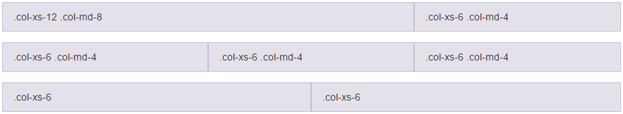
<!--stack the column on mobile by one full width and other half width-->
<div class="row">
<div class="col-xs-12 col-md-8">col-xs-12 col-md-8</div>
<div class="col-xs-6 col-md-4">col-xs-6 col-md-4</div>
</div>

<!-- Columns start at 50% wide on mobile and bump up to 33.3% wide on desktop -->
<div class="row">
<div class="col-xs-6 col-md-4">col-xs-6 col-md-4</div>
<div class="col-xs-6 col-md-4">col-xs-6 col-md-4</div>
<div class="col-xs-6 col-md-4">col-xs-6 col-md-4</div>
</div>

<!-- Columns are always 50% wide, on mobile and desktop -->
<div class="row">
<div class="col-xs-6">.col-xs-6</div>
<div class="col-xs-6">.col-xs-6</div>
</div>
Conclusion
Form this tutorial you have learned how to make responsive and semantic website using Bootstrap Grid System.
Keep reading our blogs and feel free to comment if there’s anything that I haven’t discussed in Bootstrap’s grid system which you find thought-provoking or questionable, etc.
For more related information check out the following blogs –