
Buttons are the integral part of a website and application. They are used for various purposes like, submit or reset an HTML form, performing interactive actions such as showing or hiding something on a web page on click of the button, etc.
Give it a look at our bootstrap premium themes for a bettter solution to your problems.
Button Tags
Buttons in bootstrap are created using some specific classes of bootstrap.
These classes can be used with <a> <button> <input> element.
Note: – As a best practice, we highly recommend using the <button> element whenever possible to ensure matching cross-browser compatibility
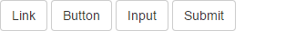
<a class="btn btn-default" href="#" role="button">Link</a>
<button class="btn btn-default" type="submit">Button</button>
<input class="btn btn-default" type="button" value="Input">
<input class="btn btn-default" type="submit" value="Submit">
Button Styles
Bootstrap provides seven classes for styling the buttons as well as to indicate the different states. following are those classes:-
- .btn-default
- .btn-primary
- .btn-success
- .btn-info
- .btn-warning
- .btn-danger
- .btn-link
<!DOCTYPE html>
<html lang="en">
<head>
<title>Bootstrap Example</title>
<meta charset="utf-8">
<meta name="viewport" content="width=device-width, initial-scale=1">
<link rel="stylesheet" href="http://maxcdn.bootstrapcdn.com/bootstrap/3.3.5/css/bootstrap.min.css">
<script src="https://ajax.googleapis.com/ajax/libs/jquery/1.11.3/jquery.min.js"></script>
<script src="http://maxcdn.bootstrapcdn.com/bootstrap/3.3.5/js/bootstrap.min.js"></script>
</head>
<body>
<div class="container">
<h2>Button Styles</h2>
<!-- Standard button -->
<button type="button" class="btn btn-default">Default</button>
<!-- identifies the primary action in a set of buttons -->
<button type="button" class="btn btn-primary">Primary</button>
<!-- Indicates a successful or positive action -->
<button type="button" class="btn btn-success">Success</button>
<!-- button for informational alert messages -->
<button type="button" class="btn btn-info">Info</button>
<!-- Indicates caution should be taken with this action -->
<button type="button" class="btn btn-warning">Warning</button>
<!-- Indicates a dangerous or potentially negative action -->
<button type="button" class="btn btn-danger">Danger</button>
<!-- button look like a link -->
<button type="button" class="btn btn-link">Link</button>
</div>
</body>
</html>
Warning: Internet Explorer 9 doesn’t crop background gradients on rounded corners, so the gradient is removed from buttons.
Button Sizes
Bootstrap provides four classes to get buttons of various sizes:-
- .btn-lg
- .btn-md
- .btn-sm
- .btn-xs
<!DOCTYPE html>
<html lang="en">
<head>
<title>Bootstrap Example</title>
<meta charset="utf-8">
<meta name="viewport" content="width=device-width, initial-scale=1">
<link rel="stylesheet" href="http://maxcdn.bootstrapcdn.com/bootstrap/3.3.5/css/bootstrap.min.css">
<script src="https://ajax.googleapis.com/ajax/libs/jquery/1.11.3/jquery.min.js"></script>
<script src="http://maxcdn.bootstrapcdn.com/bootstrap/3.3.5/js/bootstrap.min.js"></script>
</head>
<body>
<div class="container">
<h2>Button Sizes</h2>
<!--This makes the button size large.-->
<button type="button" class="btn btn-primary btn-lg">Large</button>
<!--This makes the button of medium size-->
<button type="button" class="btn btn-primary btn-md">Medium</button>
<!--This makes the button of small size-->
<button type="button" class="btn btn-primary btn-sm">Small</button>
<!--This makes the button of extra small size-->
<button type="button" class="btn btn-primary btn-xs">XSmall</button>
</div>
</body>
</html>
Block Level Buttons
You can also create block level buttons (buttons that cover the full width of the parent elements) by adding an extra class .btn-block.
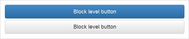
<button type="button" class="btn btn-primary btn-lg btn-block">Block level button</button>
<button type="button" class="btn btn-default btn-lg btn-block">Block level button</button>
Button State
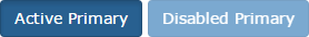
Bootstrap classes allow you to change the state of buttons as active, disabled etc.
A button can be set to an active (appear pressed) or a disabled (unclickable) state.
The class .active makes a button appear pressed, and the class .disabled makes a button unclickable.
<button type="button" class="btn btn-primary active">Active Primary</button>
<button type="button" class="btn btn-primary disabled">Disabled Primary</button>
Note: – The .disabled class only changes the visual appearance of the link by making it gray and removing the hover effect, however, the link will remain clickable unless you remove the “href” attribute.
Conclusion:-
In this tutorial we have learned about, how to create Buttons in Bootstrap, Hope you have benefited from it. Keep visiting our website in future for more knowledge and information.
Also read our popular post:-