
Bootstrap provides a clean layout for building tables. To design a basic table with just some light padding and horizontal dividers, add the base class of .table to any table markup.
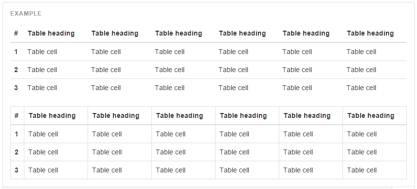
Create bootstrap responsive tables by wrapping any .table in .table-responsive to make them scroll horizontally up to small devices (under 768px). When viewing on anything larger than 768px wide, you will not see any difference in these tables.
If you view it on your mobile device or shrink the width of your browser you will see it will automatically scroll the table contents. No plugin or additional CSS required!
For a rapid solution, you can take a look at our bootstrap responsive design templates.
What is table?
The table is also called as file. The HTML table is generally a way to present data in grid manner like row and columns.
Learn step by step to make Bootstrap Table:-
Basic example-
Here is an example to show how to develop a simple table.
<table class="table ">
<thead>
<tr>
<th>Firstname</th>
<th>Lastname</th>
<th>location</th>
</tr>
</thead>
<tbody>
<tr>
<td> Amit</td>
<td> Tiwari</td>
<td> Bhopal</td>
</tr>
<tr>
<td> Sumit</td>
<td> Joshi</td>
<td> Sehore</td>
</tr>
<tr>
<td> Nitin</td>
<td> Sharma</td>
<td> Bhopal</td>
</tr>
</tbody>
</table>
NOTE:- Tables are divided into row <tr>. Similarly table rows are divided into table data<td>. Table headings can be write as tag <th>. Table can be defined as the tag <table>.
Bootstrap table:-
You are ready to design your first responsive bootstrap table. First open your designing tool, and save all bootstrap files properly. After this, you have to give an exact location of the bootstrap files like (css/js). Here are the bootstrap files, which must be enclosed within head section.
<meta name="viewport" content="width=device-width, initial-scale=1">The “initial-sclae=1” part set the initial zoom level when the page is loaded on the browser.
The “width=device-width” part set the full width of the screen.
<link rel="stylesheet" href="http://maxcdn.bootstrapcdn.com/bootstrap/3.3.5/css/bootstrap.min.css"><script src="https://ajax.googleapis.com/ajax/libs/jquery/1.11.3/jquery.min.js"></script><script src="http://maxcdn.bootstrapcdn.com/bootstrap/3.3.5/js/bootstrap.min.js"></script>Responsive Table Design:-
Now we will apply different styles in table content.
Hover Row:-
| Firstname | Lastname | |
|---|---|---|
| amit | pastor | [email protected] |
| sachin | joshi | [email protected] |
| nitin | sharma | [email protected] |
<!DOCTYPE html>
<head>
<title>Bootstrap Table</title>
<meta charset="utf-8">
<meta name="viewport" content="width=device-width, initial-scale=1">
<link rel="stylesheet" href="http://maxcdn.bootstrapcdn.com/bootstrap/3.3.5/css/bootstrap.min.css">
<script src="https://ajax.googleapis.com/ajax/libs/jquery/1.11.3/jquery.min.js"></script>
<script src="http://maxcdn.bootstrapcdn.com/bootstrap/3.3.5/js/bootstrap.min.js"></script>
</head>
<body>
<div class="container">
<table class="table table-hover">
<thead>
<tr>
<th>Firstname</th>
<th>Lastname</th>
<th>Email</th>
</tr>
</thead>
<tbody>
<tr>
<td>amit</td>
<td>pastor</td>
<td>[email protected]</td>
</tr>
<tr>
<td>sachin</td>
<td>joshi</td>
<td>[email protected]</td>
</tr>
<tr>
<td>nitin</td>
<td>sharma</td>
<td>[email protected]</td>
</tr>
</tbody>
</table>
</div>
</body>
</html>
Contextual class:-
This article changes the color of table row and table cell.
Example-
| Firstname | Lastname | |
|---|---|---|
| amit | tiwari | [email protected] |
| sachin | joshi | [email protected] |
| nitin | sharma | [email protected] |
Contextual class for a table is shown below. Remaining code will be same which is used earlier.
<table class="table table-">
<thead>
<tr>
<th>Firstname</th>
<th>Lastname</th>
<th>Email</th>
</tr>
</thead>
<tbody>
<tr class="success">
<td>amit</td>
<td>tiwari</td>
<td>[email protected]</td>
</tr>
<tr class="danger">
<td>sachin</td>
<td>joshi</td>
<td>[email protected]</td>
</tr>
<tr class="info">
<td>nitin</td>
<td>sharma</td>
<td>[email protected]</td>
</tr>
</tbody>
</table>
Some contextual classes that can be used are:
| CLASS |
DESCRIPTION |
|---|---|
| .active | It applies hover color in a table cell or table row |
| .success | It indicates success signal |
| .info | It shows informative change |
| .warning | It shows warning |
| .danger | It shows negative changes |
Striped Rows:-
This class shows the zebra-stripes to a table.
Example-
| Firstname | Lastname | |
|---|---|---|
| Amit | Tiwari | [email protected] |
| Sachin | Joshi | [email protected] |
| Nitin | Sharma | [email protected] |
<table class="table table-striped">
<thead>
<tr>
<th>Firstname</th>
<th>Lastname</th>
<th>Email</th>
</tr>
</thead>
<tbody>
<tr>
<td>Amit</td>
<td>Tiwari</td>
<td>[email protected]</td>
</tr>
<tr>
<td>Sachin</td>
<td>Joshi</td>
<td>[email protected]</td>
</tr>
<tr>
<td>Nitin</td>
<td>Sharma</td>
<td>[email protected]</td>
</tr>
</tbody>
</table>
Bordered Table:-
It creates border on all sides of the table and cell.
Example-
| Firstname | Lastname | |
|---|---|---|
| Amit | Tiwari | [email protected] |
| Sachin | Joshi | [email protected] |
| Nitin | Sharma | [email protected] |
<table class="table table-bordered">
<thead>
<tr>
<th>Firstname</th>
<th>Lastname</th>
<th>Email</th>
</tr>
</thead>
<tbody>
<tr>
<td>Amit</td>
<td>Tiwari</td>
<td>[email protected]</td>
</tr>
<tr>
<td>Sachin</td>
<td>Joshi</td>
<td>[email protected]</td>
</tr>
<tr>
<td>Nitin</td>
<td>Sharma</td>
<td>[email protected]</td>
</tr>
</tbody>
</table>
Conclusion
I hope that you have got a detailed description on, how to design bootstrap responsive table. Keep reading our blog posts it will help you enhance your knowledge and will sharpen your coding tricks.
Recommended blogs:-