
Nowadays, approximate 50% of emails are opened on mobile devices. this means the designer must have to consider two major aspects first, emails should be displayed optimally on different mobile devices and second, it must be supported by different mobile clients like Gmail, Yahoo, Outlook.
We can also make use of media query, but they are not supported by various email clients. Here we are going to use fluid hybrid method to create responsive email .fluid part means we will use lots of percentage , and hybrid part is to restrict the size of some element on larger screen.
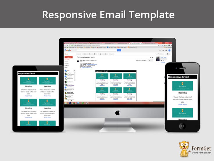
Check Out Some Awesome Email Templates Made By MailGet Email Builder –
You can create Responsive Email Templates by using Email Builder offered by MailGet – email marketing platform.
Basics of Responsive Email
<html xmlns="http://www.w3.org/1999/xhtml">
<head>
<meta http-equiv="Content-Type" content="text/html; charset=utf-8" />
<!--[if !mso]><!-->
<meta http-equiv="X-UA-Compatible" content="IE=edge" />
<!--<![endif]-->
<meta name="viewport" content="width=device-width, initial-scale=1.0">
<title></title>
<link rel="stylesheet" type="text/css" href="styles.css" />
<!--[if (gte mso 9)|(IE)]>
<style type="text/css">
table {border-collapse: collapse;}
</style>
<![endif]-->
</head>
<body>
<center class="wrapper">
<div class="webkit">
[content goes here]
</div>
</center>
</body>
</html>
The use of tags of above code is listed below:
<meta http-equiv="X-UA-Compatible" content="IE=edge" />This tag is used to make email compatible for windows mobile , it is hidden inside a conditional tag so this tag will be hidden for Microsoft outlook .if we will not do this, Windows Live Mail will not display images
<meta name="viewport" content="width=device-width, initial-scale=1.0">This tag controls the size of the viewport , according to the device in which it is opened.
<!--[if (gte mso 9)|(IE)]> and <![endif]-->These are the conditional statement, content written with in it only runs for Microsoft Outlook.
<div class="webkit">......Content......</div>This class is used for earlier versions of WebKit-powered mail clients. WebKit mail client only supports max-width in a block level element so we should write our content within it to set our layout display at the correct size.
body {
Margin: 0;
padding: 0;
min-width: 100%;
background-color: #ffffff;
}
table {
border-spacing: 0;
font-family: sans-serif;
color: #333333;
}
td {
padding: 0;
}
img {
border: 0;
}
.wrapper {
width: 100%;
table-layout: fixed;
-webkit-text-size-adjust: 100%;
-ms-text-size-adjust: 100%;
}
.webkit {
border:1px solid black;
max-width: 600px;
}
Here in the above style.css we set the margin and padding of the body and the border of a table, image to zero.
we set the width of wrapper to 100% ,making the table layout fixed , we also set the width of webkit to 600px to contain everything in Apple Mail 6 (and below) and Outlook 2022.
Creating Structure of Responsive Email

<table id="outer">
<tr>
<td>
<!--outer table's td start from here-->

<!--conditional statement start for outlook-->
<!-- below code will get enabled automatically when the outlook email client will get detected -->
<!--[if (gte mso 9)|(IE)]>
<table width="600" align="center">
<tr>
<td>
<![endif]-->
<!--conditional statement ends for outlook-->

<table id="inner">
<!-- .......content....... -->
</table>

<!-- conditional statement start for outlook -->
<!--[if (gte mso 9)|(IE)]>
</td>
</tr>
</table>
<![endif]-->
<!--conditional statement ends for outlook-->

<!-- end <td> of outer table-->
</td>
</tr>
</table>
Explanation:
(i) we wil set the width of outer table 100% for smaller device, but for large device we fix the maximum width of the outer table at 600px.
(ii) <!–[if (gte mso 9)|(IE)]>……code………..<![endif]–> the code within this conditional statement only execute when the outlook mail client is detected.The outlook mail client doesn’t support [max-width] , so we make use of another table within the conditional statement of fix height to make email responsive in outlook also.
(iii) inner table contains the content of the email. we fix the width to 100% and the max-width to a certain size according to our requirement.
Creating Two Column Structure of Email
Below code will create two column structure :
 <table class="outer" align="center">
<div id="header"><p class="h1" id="head">Responsive Email</p>
</div>
<tr>
<td class="two-column-layout">
<!--[if (gte mso 9)|(IE)]>
<table width="100%">
<tr>
<td width="50%" valign="top">
<![endif]-->
<div class="inner">
<table width="100%">
<tr>
write content here
</tr>
</table>
</div>
<!--[if (gte mso 9)|(IE)]>
</td>
<td width="50%" valign="top">
<![endif]-->
<div class="inner">
<table width="100%">
<tr>
write content here
</tr>
</table>
</div>
<!--[if (gte mso 9)|(IE)]>
</td>
<td width="50%" valign="top">
<![endif]-->
<div class="inner">
<table width="100%">
<tr>
write content here
</tr>
</table>
</div>
<!--[if (gte mso 9)|(IE)]>
</td>
<td width="50%" valign="top">
<![endif]-->
<div class="inner">
<table width="100%">
<tr>
write content here
</tr>
</table>
</div>
<!--[if (gte mso 9)|(IE)]>
</td>
</tr>
</table>
<![endif]-->
</td>
</tr>
</table>
In the above code replace the content with this:
 <td class="inner1">
<table class="contents">
<tr>
<td>
<div id="cont1"><img src="https://www.formget.com/mailget/upload_files/1431944509-1601297505-Formget_welcome_email_png" width="280" alt="Formget image" /></div>
</td>
</tr>
<tr>
<td class="text">
<p class="h1"> secand coloum Maecenas sed ante pellentesque, posuere leo id, eleifend dolor. Class aptent taciti sociosqu ad litora torquent per conubia nostra, per inceptos himenaeos. </p>
</td>
</tr>
</table>
</td>
Now we set the width of outer table to 100% , and the max-width to 600px so that in larger device the table extend upto width of 600px.
same as we set the width of inner table to 100%, and the max-width to 300px . this will create a structure in which 2 column lies on a single row.
For outlook mail client, we use the conditional statement in which we fix the width of <td> to 50% to get the required structure in outlook also.
Below is the stylesheet of above code:
.outer {
Margin: 0 auto;
width: 100%;
max-width: 600px;
}
.inner1 {
padding: 10px;
}
p {
Margin: 0;
}
.h1 {
font-size: 21px;
font-weight: bold;
Margin-bottom: 18px;
}
.h2 {
font-size: 18px;
font-weight: bold;
Margin-bottom: 12px;
}
#header{
width:100%;
max-width:600px;
background-color:black;
color:white;
}
.two-column-layout .inner {
width: 100%;
max-width: 300px;
display: inline-block;
vertical-align: top;
}
.two-column-layout {
text-align: center;
font-size: 0;
}
.contents {
width: 100%;
}
.two-column-layout .contents {
font-size: 14px;
text-align: left;
}
.two-column-layout img {
width: 100%;
max-width: 280px;
height: auto;
}
.two-column-layout .text {
padding-top: 10px;
}
p#head{
margin:0;
}
Creating Three Column Structure of Emails
We can also create a three column structure by following the same phenomena
 <table class="outer" align="center">
<div id="header"><p class="h1" id="head">Responsive Email</p>
</div>
<tr>
<td class="three-column-layout">
<!--[if (gte mso 9)|(IE)]>
<table width="100%">
<tr>
<td width="200" valign="top">
<![endif]-->
<table class="inner">
write your content here
</table>
<!--[if (gte mso 9)|(IE)]>
</td><td width="200" valign="top">
<![endif]-->
<table class="inner">
write your content here
</table>
<!--[if (gte mso 9)|(IE)]>
</td><td width="200" valign="top">
<![endif]-->
<table class="inner">
write your content here
</table>
<!--[if (gte mso 9)|(IE)]>
</td>
</tr>
<tr>
<td width="200" valign="top">
<![endif]-->
<table class="inner">
write your content here
</table> <!--[if (gte mso 9)|(IE)]>
</td><td width="200" valign="top">
<![endif]-->
<table class="inner">
write your content here
</table>
<!--[if (gte mso 9)|(IE)]>
</td>
<td width="200" valign="top">
<![endif]-->
<table class="inner">
write your content here
</table>
<!--[if (gte mso 9)|(IE)]>
</td>
</tr>
</table>
<![endif]-->
</td>
</tr>
</table>
In the above code replace the content with the below code:
<tr>
<td class="inner1 contents">
<img src="https://www.formget.com/mailget/upload_files/1431944509-1601297505-Formget_welcome_email_png" width="280" alt="Formget image" />
<p class="h2">Heading</p>
<p>This is the first column of first row reside within inner table</p>
<p><a href="#">Read more</a></p>
</td>
</tr>
</table>
In the above code we set the width of .outer table to 100% and the max-width to 600px. we also set the width of .inner table to 100% and the max-width to 200px.
For outlook, we also set the width of <td> to 200 within the conditional statement.
.three-column-layout {
text-align: center;
font-size: 0;
padding-top: 10px;
padding-bottom: 10px;
}
.three-column-layout .inner {
width: 100%;
max-width: 200px;
display: inline-block;
vertical-align: top;
}
.three-column-layout .contents {
font-size: 14px;
text-align: center;
}
.three-column-layout .text {
padding-top: 10px;
}
Now if we resize our window, we will see that the columns stack to fill the available space. Three columns will reduce to two-columns with three rows, until they collapse finally to a single column with six rows.
Inline your css
Email client didn’t support internal or external CSS they only support inline css , so we have to inline our css there are various tools available to inline our css such as zurb inliner and many more.
These tools accept the HTML code with internal or external CSS (must be complete URL) and convert it into inline CSS.
Note: you have to maintain the uniform margin at every level of structure. you can notice that I am using a uniform margin of 10px at the inner side table.
Conclusion :
I hope after reading the whole script you are feeling comfortable with responsive email design. Feel free to visit our website again in the future to get in touch with new coding tricks. You can let us know about your feedback in the space provided below.
Recommended blogs –
- Duplicate Email Remover
- Unsubscribe PHP : Add an Unsubscribe Link to an Email
One Reply to “How to Design Responsive Email Template”
Dear sir I have required a login page in php after login I redirect to other page.
When I open direct other page then auto redirect to login page.
Can you provide me.