
The Bootstrap carousel is a component for sliding through elements. It is a flexible, responsive and attractive way for adding a slider in our website.
It is a dynamic presentation of contents where text and images are made visible or accessible to the user by sliding through several items.
Bootstrap carousel are not supported properly in Internet Explorer 9 and earlier (because they use CSS3 transitions and animations to achieve the slider effect).
Take a look at our bootstrap responsive templates which will provide you the better solution for your problems.
Bootstrap Carousel In Normal Form
<!-- this is simple example of bootstrap carousel-->
<html>
<head>
<title>Bootstrap carousel</title>
</head>
<body>
<div id="myCarousel" class="carousel slide" data-ride="carousel">
<!-- this is Carousel indicators -->
<ol class="carousel-indicators">
<li data-target="#myCarousel" data-slide-to="0" class="active"></li>
<li data-target="#myCarousel" data-slide-to="1"></li>
<li data-target="#myCarousel" data-slide-to="2"></li>
</ol>
<!--this is Wrapper for carousel items which are divided into three parts -->
<div class="carousel-inner">
<!-- this is first part-->
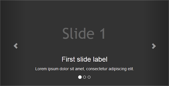
<div class="item active">
<h2>Slide 1</h2>
<div class="carousel-caption">
<h3>First slide label</h3>
<p>Lorem ipsum dolor sit amet consectetur…</p>
</div>
</div>
<!-- this is second part-->
<div class="item">
<h2>Slide 2</h2>
<div class="carousel-caption">
<h3>Second slide label</h3>
<p>Aliquam sit amet gravida nibh, facilisis gravida…</p>
</div>
</div>
<!-- this is third part-->
<div class="item">
<h2>Slide 3</h2>
<div class="carousel-caption">
<h3>Third slide label</h3>
<p>Praesent commodo cursus magna vel…</p>
</div>
</div>
</div>
<!-- this is Carousel controls -->
<a class="carousel-control left" href="#myCarousel" data-slide="prev">
<span class="glyphicon glyphicon-chevron-left"></span>
</a>
<a class="carousel-control right" href="#myCarousel" data-slide="next">
<span class="glyphicon glyphicon-chevron-right"></span>
</a>
</div>
</body>
</html>
The output of the above example
Bootstrap Carousel With Javascript And Jquery Library Files
<!-- this is simple example of bootstrap carousel-->
<!DOCTYPE html>
<html lang="en">
<head>
<meta charset="UTF-8">
<title>Example of Bootstrap 3 Carousel</title>
<!-- these are library file of css-->
<link rel="stylesheet" href="https://maxcdn.bootstrapcdn.com/bootstrap/3.3.5/css/bootstrap.min.css">
<link rel="stylesheet" href="https://maxcdn.bootstrapcdn.com/bootstrap/3.3.5/css/bootstrap-theme.min.css">
<!-- this is library file of Jquery-->
<script src="https://ajax.googleapis.com/ajax/libs/jquery/1.11.3/jquery.min.js"></script>
<!--this is library file of javascript-->
<script src="https://maxcdn.bootstrapcdn.com/bootstrap/3.3.5/js/bootstrap.min.js"></script>
<!-- this css used for body-->
<style type="text/css">
h2{
margin: 0;
color: #666;
padding-top: 90px;
font-size: 52px;
font-family: "trebuchet ms", sans-serif;
}
.item{
background: #333;
text-align: center;
height: 300px !important;
}
.carousel{
margin-top: 20px;
}
.bs-example{
margin: 20px;
}
</style>
</head>
<body>
<!--this DIV use for carousel and sliding time-->
<div class="bs-example">
<div id="myCarousel" class="carousel slide" data-interval="3000" data-ride="carousel">
<!-- this DIV use for carousel indicators for slider-->
<ol class="carousel-indicators">
<li data-target="#myCarousel" data-slide-to="0" class="active"></li>
<li data-target="#myCarousel" data-slide-to="1"></li>
<li data-target="#myCarousel" data-slide-to="2"></li>
</ol>
<!--Wrapper for carousel items which are show in output form-->
<div class="carousel-inner">
<!--this is first slider page-->
<div class="active item">
<h2>Slide 1</h2>
<div class="carousel-caption">
<h3>First slide label</h3>
<p>Lorem ipsum dolor sit amet, consectetur adipiscing elit.</p>
</div>
</div>
<!-- this is second slider page-->
<div class="item">
<h2>Slide 2</h2>
<div class="carousel-caption">
<h3>Second slide label</h3>
<p>Aliquam sit amet gravida nibh, facilisis gravida odio.</p>
</div>
</div>
<!-- this is third slider page-->
<div class="item">
<h2>Slide 3</h2>
<div class="carousel-caption">
<h3>Third slide label</h3>
<p>Praesent commodo cursus magna, vel scelerisque nisl consectetur.</p>
</div>
</div>
</div>
<!-- this is carousel controls for used of next and previous pages slider-->
<a class="left carousel-control" href="#myCarousel" role="button" data-slide="prev">
<span class="glyphicon glyphicon-chevron-left" aria-hidden="true"></span>
<span class="sr-only">Previous</span>
</a>
<a class="right carousel-control" href="#myCarousel" role="button" data-slide="next">
<span class="glyphicon glyphicon-chevron-right" aria-hidden="true"></span>
<span class="sr-only">Next</span>
</a>
</div>
</div>
</body>
</html>
Bootstrap Carousel Through JavaScript
You may also activate carousel manually using javascript- just call the carousel() method. You should copy-paste the basic Bootstrap template and add javascript and jquery library files.
//this code use for starting javascript
<script type="text/javascript">
$(document).ready(function(){
// start carousel for java script
$("#myCarousel").carousel();
// Enable carousel control for previous pages
$(".left").click(function(){
$("#myCarousel").carousel('prev');
});
// Enable carousel control for next pages
$(".right").click(function(){
$("#myCarousel").carousel('next');
});
// Enable carousel indicators as like pages which these are start
$(".slide-one").click(function(){
$("#myCarousel").carousel(0);
});
$(".slide-two").click(function(){
$("#myCarousel").carousel(1);
});
$(".slide-three").click(function(){
$("#myCarousel").carousel(2);
});
});
</script>
How We Can Find Sliding Time
// For check sliding time through javascript
<script type="text/javascript">
$(document).ready(function(){
$("#myCarousel").carousel({
interval : 1000,//sliding time
pause: false
});
});
</script>
Disable Auto Slider In Bootstrap Carousel
When page loads bootstrap carousel starts sliding automatically. However, you can close this auto sliding by simply setting the carousel ‘interval’ option to ‘false’ through javascript.
// For automatic disable slider through javascript
<script type="text/javascript">
$(document).ready(function(){
$("#myCarousel").carousel({
// sliding time for automatic sliding page
interval : 1000,
// this is option for automatic sliding page
pause: false
});
});
</script>
Methods in Bootstrap Carousel
- carousel(options)
This method initialize optional options in bootstrap carousel and starts cycling through javascript.
// activates the carousel with an option
<script type="text/javascript">
$(document).ready(function(){
$("#myCarousel").carousel({
interval:3000
});
});
</script>
- carousel(‘cycle’)
This method is used to start carousel cycle through the javascript from left to right.
// Goes through the carousel items from left to right
<script type="text/javascript">
$(document).ready(function(){
// define condition here
$("#.start-slide").click(function(){
$("#myCarousel").carousel('cycle');
});
});
</script>
-
carousel(‘pause’)
This method is used to stop the carousel cycle through the javascript.
// Stops the carousel from going through items
<script type="text/javascript">
$(document).ready(function(){
$("#.pause-slide").click(function(){
$("#myCarousel").carousel('pause');
});
});
</script>
- carousel(number)
This method is used to set the carousel to particular frame(start with 0).
// Goes to a specified item (zero-based: first item is 0, second item is 1, etc..)
<script type="text/javascript">
$(document).ready(function(){
$("#.slide-three").click(function(){
$("#myCarousel").carousel('3');
});
});
</script>
-
carousel(‘prev’)
This method is used for carousel to slide previously.
// Goes to the previous item
<script type="text/javascript">
$(document).ready(function(){
$("#.prev-slide").click(function(){
$("#myCarousel").carousel('prev');
});
});
</script>
- carousel(‘next’)
This method is used for carousel to slide next.
// Goes to the next item
<script type="text/javascript">
$(document).ready(function(){
$("#.next-slide").click(function(){
$("#myCarousel").carousel('next');
});
});
</script>
Events
Bootstrap carousel class includes some events for hooking into carousel functionality. The events is basically of two types.
- slide.bs.carousel:- It is use when the carousel is about to slide from one item to another.
// here generate alert if you give permission then move to next slide
<script type="text/javascript">
$(document).ready(function(){
$("#myCarousel").on('slide.bs.carousel',function(){
alert("A new slide is about to be shown!");
});
});
</script
- slid.bs.carousel:- It is use when the carousel has finished sliding from one item to another.
// here generate alert for move previous slider
<script type="text/javascript">
$(document).ready(function(){
$("#myCarousel").on('slid.bs.carousel',function(){
alert("The carousel has finished sliding from one item to another!");
});
});
</script
Conclusion
In this tutorial we have learned about, how we can make Bootstrap Carousel. Hope you understood the concept. Keep following us for more coding tricks.
For more related information check out the following blogs –
Bootstrap Progress Bar
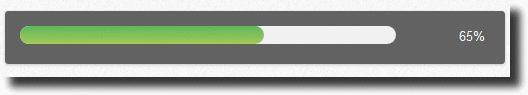
A progress bar is used to view the completion progress of a task. Technically, it is a combination of HTML/CSS/JS. The HTML <progress> element is used.
JavaScript can be used to manipulate the value of progress bar and gives a desired effect of the whole progress body.
For a good solution, you can refer to our bootstrap premium templates.
1. Basic Progress Bar Attributes
Value- Max
- Min
- progress
Value–> Indicates the current status of the progress bar. It must be greater than or equal to 0.0 and less than or equal to 1.0 or the value of the max attribute (if present).
Max–> Indicates how much task needs to be done before it can be considered as complete. If not specified the default value is 1.0.
Progress–>The <progress> element represents the completion progress of a task.
2. Animated Progress Bar Output
3. Files to be included
Please click the download script button get the files.
- index.html
- style.css
- normalize.css
- jquery.js
- modernizr.js
- bootstrap.css
- bootstrap.js
4. Important files in the head section
To use bootstrap framework , in the head section of our page we must set bootstrap.css, bootstrap.js, normalize.css, style.css, jquery.js, and modernizr.js files as shown below .
<head>

<link href="bootstrap-3.3.4-dist/css/bootstrap.css" rel="stylesheet" type="text/css"/>
<script src="bootstrap-3.3.4-dist/js/bootstrap.js" type="text/javascript"></script>                      <link rel="stylesheet" href="css/normalize.css">
<link rel="stylesheet" href="css/style.css">
<script src="js/jquery.js" type="text/javascript"></script>
<script src="js/modernizr.js" type="text/javascript"></script>
<head>
JavaScript Code
This is an important javascript part of the head section. Here are all the codes to animate the progress bar, like that progress of bar, timing, percentage etc.
<script>
$(document).ready(function() {
if (!Modernizr.meter) {
alert('Sorry your browser does not support HTML5 progress bar');
} else {
var progressbar = $('#progressbar'),
max = progressbar.attr('max'),
time = (1000 / max) * 5,
value = progressbar.val();
var loading = function() {
value += 1;
addValue = progressbar.val(value);
$('.progress-value').html(value + '%');
if (value == max) {
clearInterval(animate);
}
};
var animate = setInterval(function() {
loading();
}, time);
}
;
});
</script>
HTML Code
This is the body section.
<body>
<div class="container">
<div class="row">
<div class="col-md-12">
<div class="demo-wrapper html5-progress-bar">
<div class="progress-bar-wrapper">
<progress id="progressbar" value="0" max="100"></progress>
<span class="progress-value">0%s</span>
</div>
</div>
</div>
</div>
</div>
</body>
</html>
CSS code
style.css(This is the CSS body)
/*===Body===*/
body {
background-color: #f9f9f9;
}
/*=== This is a hole container part===*/
.container{
width: 890px;
height:130px;
}
/*=== This is a hole progress bar css===*/
.demo-wrapper {
width: 500px;
margin: 30px auto 0;
}
.html5-progress-bar {
padding: 15px 15px;
border-radius: 3px;
background-color: #626262;
box-shadow: 0px 1px 2px 0px rgba(0, 0, 0, .2);
}
.html5-progress-bar progress {
background-color: #F1F1F1;
border: 0;
width: 80%;
height: 18px;
border-radius: 9px;
}
.html5-progress-bar progress::-webkit-progress-bar {
background-color: #f3f3f3;
border-radius: 9px;
}
.html5-progress-bar progress::-webkit-progress-value {
background: #5CB85C;
background: -moz-linear-gradient(top, #5CB85C 0%, #5CB85C 100%);
background: -webkit-gradient(linear, left top, left bottom, color-stop(0%,#5CB85C), color-stop(100%,#a5c956));
background: -webkit-linear-gradient(top, #5CB85C 0%,#a5c956 100%);
background: -o-linear-gradient(top, #5CB85C 0%,#a5c956 100%);
background: -ms-linear-gradient(top, #5CB85C 0%,#a5c956 100%);
background: linear-gradient(to bottom, #5CB85C 0%,#a5c956 100%);
filter: progid:DXImageTransform.Microsoft.gradient( startColorstr='#5CB85C', endColorstr='#a5c956',GradientType=0 );
border-radius: 9px;
}
.html5-progress-bar progress::-moz-progress-bar {
background: #5CB85C;
background: -moz-linear-gradient(top, #5CB85C 0%, #a5c956 100%);
background: -webkit-gradient(linear, left top, left bottom, color-stop(0%,#5CB85C), color-stop(100%,#a5c956));
background: -webkit-linear-gradient(top, #5CB85C 0%,#a5c956 100%);
background: -o-linear-gradient(top, #5CB85C 0%,#a5c956 100%);
background: -ms-linear-gradient(top, #5CB85C 0%,#a5c956 100%);
background: linear-gradient(to bottom, #5CB85C 0%,#a5c956 100%);
filter: progid:DXImageTransform.Microsoft.gradient( startColorstr='#5CB85C', endColorstr='#a5c956',GradientType=0 );
border-radius: 9px;
}
/*=== This is a % value of progress bar css===*/
.html5-progress-bar .progress-value {
padding: 0px 5px;
line-height: 20px;
margin-left: 5px;
font-size: .9em;
color: #F5F5F5;
height: 18px;
float: right;
}
Conclusion
<meter> tag just like a <progress> tag but the meter tag is not supported in Internet Explorer or Safari 5 (and earlier versions).
In this tutorial, we have learned about, how we can make Bootstrap Animated Progress Bar. Hope you have got the concept. Keep follow us for more tutorial blogs in Formget.com.
You may also like:-
Bootstrap Mobile
Bootstrap is a front-end framework use to make responsive mobile-first websites.

For mobile-first approach, its grid function force designers to create websites for small screen devices like mobile phones.
Our bootstrap responsive templates will provide you a better solution.
Below are the examples which will give you a basic idea about the structure of the large screen and small screen.
Example 1 – For a large screen (Desktop):

On the other hand, In a mobile phone, its structure breaks down and adjust accordingly.
Example 2-For a small screen (Mobile Phone):

Role of a grid system in bootstrap mobile
Working of each grid system in bootstrap is exactly the same. It is differentiated just by the width of the screen size. It includes a responsive mobile-first grid system that scales up to 12 columns in a row.
Mobile First Strategy
- Content
- Everything in a website revolves around the content.
- Layout
- First priority must be smaller width design for mobile devices.
- Progressive Enhancement
- Add new elements as screen size increases.
Different types of grid-
There are four Grid Systems in bootstrap:
- Extra small devices –Phones (< 768px)
- Small devices – Tablets (>= 768px)
- Medium devices – Desktops (>= 992px)
- Large devices – Desktops (>= 1200px)
And each viewport has its own class
- col-xs- (Extra small devices)
- col-sm- (Small devices)
- col-md- (Medium devices)
- col-lg- (Large devices)
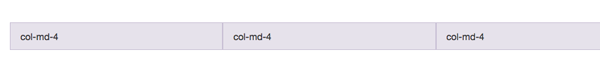
To make use of the Grid System, you’d need a container element, with a class”container”, and inside a second container with a class “row”. Notice how in both cases the “fluid” suffix has disappeared And inside the second container you’d place your columns.
<div class="container">
<div class="row">
<div class="col-md-4">col-md-4</div>
<div class="col-md-4">col-md-4</div>
<div class="col-md-4">col-md-4</div>
</div>
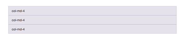
</div> If you were to say, use columns prefixed by “md” and the viewport happened to be less than 992px wide (even 991px), those columns will stack one below the other with a 100% width, as shown here,
Working of Bootstrap grid System
Grid systems are mainly used for creating page layouts through a series of rows and columns. Let’s see how the Bootstrap grid system works:
- Rows must be placed within a .container class for proper alignment and padding.
- Use rows to create horizontal groups of columns.
- Content should be placed within the columns, and only columns may be the immediate children of rows.
- Predefined grid classes like .row and .col-xs-4 are available for quickly making grid layouts.
- Columns create gutters (gaps between column content) via padding. That padding is offset in rows for the first and the last column via negative margin on .rows.
- Grid columns are created by specifying the number of twelve available columns you wish to span. For example, three equal columns would use three .col-xs-4.
Enabling the Grid system
Grid system is enabled simply by adding the viewport meta tag in your document.
<meta name="viewport" content="width=device-width, initial-scale=1.0">Responsive tables:-
<div class="table-responsive">
    <table class="table">...</table>
</div>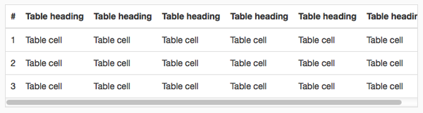
Conclusion-
I hope that you have got a detailed description of, how bootstrap works in a mobile device. So this was all about it, keep reading our blog posts that will help you to enhance your knowledge and will sharpen your coding tricks.
Check out some more related blogs here –
Bootstrap Form

Bootstrap makes it easy with the simple HTML markup and extended classes for different styles of forms.
Bootstrap greatly simplifies the process of styling and alignment of form controls like labels, input fields, select boxes, textareas, buttons, etc. through predefined set of classes.

HTML forms are the integral part of the web pages and applications, but styling the form controls manually one by one with CSS are often boring and tedious.
This tutorial will help you to create various types of forms with Bootstrap.
Three types of forms in Bootstrap are:
- Vertical or Basic form (By default)
- Horizontal form
- Inline form
For a better solution, you can take a look at our Bootstrap Landing Page Templates.
Rules For Form Layouts
- Use of role attribute in <form role=”form“> this improves accessibility for screen readers
- Wrap up labels and form controls in <div class=”form-group“> for better spacing
- Use of class =”form-control“ in all text elements (<input>, <select>, <textarea>)
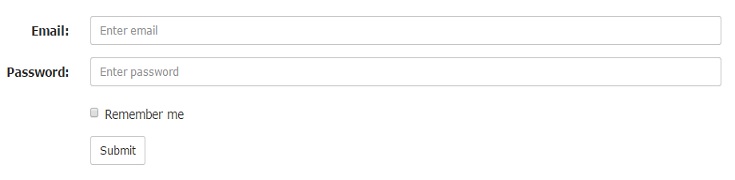
Vertical or Basic Form
In Vertical or Basic Form layout there is no need to add any base class in the <form> element and in result labels are left-aligned on the top of form control.
Example:
<form role="form">
<div class="form-group">
<label for="email">Email:</label>
<input type="email" class="form-control" id="email" placeholder="Enter email">
</div>
<div class="form-group">
<label for="pwd">Password:</label>
<input type="password" class="form-control" id="pwd" placeholder="Enter password">
</div>
<div class="checkbox">
<label><input type="checkbox"> Remember me</label>
</div>
<button type="submit" class="btn btn-default">Submit</button>
</form>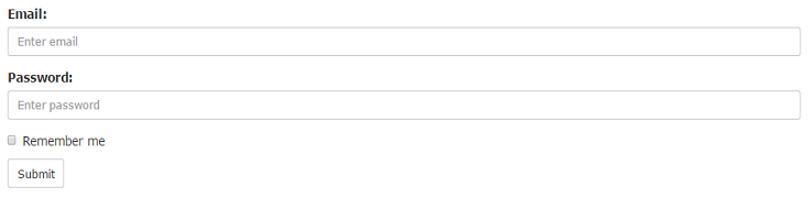
Horizontal Form
Creates a horizontal form that uses the horizontal layout where labels are right aligned in this form.
Following rules are additional:
- Use class=”form-horizontal“ in the <form> element
- Use class=”control-label“ in the <label> element
Example:
<form class="form-horizontal" role="form">
<div class="form-group">
<label class="control-label col-sm-2" for="email">Email:</label>
<div class="col-sm-10">
<input type="email" class="form-control" id="email" placeholder="Enter email">
</div>
</div>
<div class="form-group">
<label class="control-label col-sm-2" for="pwd">Password:</label>
<div class="col-sm-10">
<input type="password" class="form-control" id="pwd" placeholder="Enter password">
</div>
</div>
<div class="form-group">
<div class="col-sm-offset-2 col-sm-10">
<div class="checkbox">
<label><input type="checkbox"> Remember me</label>
</div>
</div>
</div>
<div class="form-group">
<div class="col-sm-offset-2 col-sm-10">
<button type="submit" class="btn btn-default">Submit</button>
</div>
</div>
</form>
Note: In horizontal layout we will use Bootstrap’s predefined grid classes for alignment of labels and groups of form controls.
Inline Form
An inline form show a compact layout of form. In this form labels are aligned alongside and all the elements are left-aligned and inline.
Following rule is additional:
- Use class =”form-inline“ in the <form> element
Example:
<form class="form-inline" role="form">
<div class="form-group">
<label for="email">Email:</label>
<input type="email" class="form-control" id="email" placeholder="Enter email">
</div>
<div class="form-group">
<label for="pwd">Password:</label>
<input type="password" class="form-control" id="pwd" placeholder="Enter password">
</div>
<div class="checkbox">
<label><input type="checkbox"> Remember me</label>
</div>
<button type="submit" class="btn btn-default">Submit</button>
</form>
Note: Use a label for every input, Otherwise screen readers will have trouble with your forms.(We can use class=”sr-only“ in <label> element to hide these labels )
Supported Form Controls
Bootstrap easily supports the standard and important form controls namely:
- input
- textarea
- checkbox
- radio
- select
Input
Input is the most common and useful form control. All the HTML5 input types (text, password, datetime, datetime-local, date, month, time, week, number, email, url, search, tel, and color) are supported by Bootstrap.
The following example includes two input types text and password :
Example:
<div class="form-group">
<label for="user">Name:</label>
<input type="text" class="form-control" id="usr">
</div>
<div class="form-group">
<label for="password">Password:</label>
<input type="password" class="form-control" id="pwd">
</div>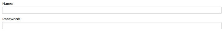
Textarea
The textarea supports multiple lines of text. According to your need you can update (increase or decrease) rows attribute.
Example:
<div class="form-group">
<label for="message">Comment:</label>
<textarea class="form-control" rows="4" id="comment"></textarea>
</div>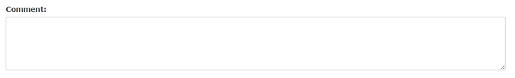
Checkbox
Checkbox is used to select one or several options in a list. For inline appearance of controls we can use class=”checkbox-inline“ in <label> element.
The following example shows three checkboxes(Third Checkbox is disabled) :
Example:
<div class="checkbox">
<label><input type="checkbox" value="">Option 1</label>
</div>
<div class="checkbox">
<label><input type="checkbox" value="">Option 2</label>
</div>
<div class="checkbox disabled">
<label><input type="checkbox" value="" disabled>Option 3</label>
</div>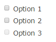
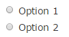
Radio
Radio buttons are used to select one option from many in a list. For inline appearance of controls we can use class=”radio-inline“ in <label> element.
The following example shows two radio buttons :
Example:
<div class="radio">
<label><input type="radio" name="oradio">Option 1</label>
</div>
<div class="radio">
<label><input type="radio" name="oradio">Option 2</label>
</div>
Select
Select is a drop-down list and it is used when you want to allow the user to pick a option from multiple options. Use multiple=”multiple” in <select> tag to allow the users to select more than one option.
The following example shows a select list of name :
Example:
<div class="form-group">
<label for="name">Select list(select one):</label>
<select class="form-control" id="name">
<option>1</option>
<option>2</option>
<option>3</option>
<option>4</option>
</select><br>

<label for="name1">Mutiple select(Hold shift to select more than one option):</label>
<select multiple class="form-control" id="name1">
<option>1</option>
<option>2</option>
<option>3</option>
<option>4</option>
<option>5</option>
</select>
</div>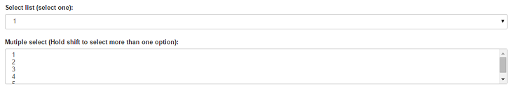
Conclusion
So, you’ve learned that how we can make form and its components stylish using bootstrap. I hope it was helpful. Keep visiting our blogs and feel free to comment.
You may also like –
Bootstrap Calendar
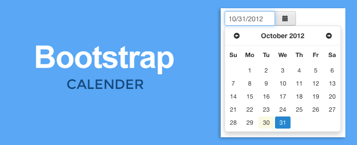
Hello, folks!
We’re going to learn how we can add bootstrap calendar in our web page, that exhibits Year, Month, Dates, Events and additional features of previous and next month buttons.
You can refer to our attractive bootstrap templates for a quick solution.

Let’s take a look at the files we’re going to use in this tutorial.
Files to be included
- fullcalendar.css
- fullcalendar.print.css
- moment.min.js
- jQuery.min.js
- fullcalendar.min.js
Now we’ll move towards the coding part.
Firstly, we’ll include the files we’re going to use in the head section of our web page.
Include Files
<head>

<!--Sylesheets and JavaScript files to be included-->
<link href='fullcalendar.css' rel='stylesheet' />
<link href='fullcalendar.print.css' rel='stylesheet' media='print' />
<script src='moment.min.js'></script>
<script src='jquery.min.js'></script>
<script src='fullcalendar.min.js'></script>
</head>
Make sure you’re including Full calendar stylesheets, Full calendar, jQuery and Moment javascript files.
Without them it is not going to work.
jQuery and Moment must be loaded before theFullcalendar’s javascript.
Now we need to include the javascript code that initializes the calendar with the header section including previous, next and today buttons. This will go in the head section as well.
Script in the Head section
<script>
$(document).ready(function() {
$('#calendar').fullCalendar({

<!--Header Section Including Previous,Next and Today-->
header: {
left: 'prev,next today',
center: 'title',
right: 'month,basicWeek,basicDay'
},

<!--Default Date-->
defaultDate: '2015-02-12',
editable: true,
eventLimit: true, // allow "more" link when too many events
});
});
</script>
Now if we want to add events in our calender, then we just have to include code inside the javascript function and after the code “eventLimit:true”.
Code we need to include :
<script>
$(document).ready(function() {
$('#calendar').fullCalendar({

<!--Header Section Including Previous,Next and Today-->
header: {
left: 'prev,next today',
center: 'title',
right: 'month,basicWeek,basicDay'
},

<!--Default Date-->
defaultDate: '2015-02-12',
editable: true,

<!--Event Section-->
eventLimit: true, // allow "more" link when too many events
events: [
{
title: 'All Day Event',
start: '2015-02-01'
},
{
title: 'Long Event',
start: '2015-02-07',
end: '2015-02-10'
},
{
id: 999,
title: 'Repeating Event',
start: '2015-02-09T16:00:00'
},
{
id: 999,
title: 'Repeating Event',
start: '2015-02-16T16:00:00'
},
{
title: 'Conference',
start: '2015-02-11',
end: '2015-02-13'
},
{
title: 'Meeting',
start: '2015-02-12T10:30:00',
end: '2015-02-12T12:30:00'
},
{
title: 'Lunch',
start: '2015-02-12T12:00:00'
},
{
title: 'Meeting',
start: '2015-02-12T14:30:00'
},
{
title: 'Happy Hour',
start: '2015-02-12T17:30:00'
},
{
title: 'Dinner',
start: '2015-02-12T20:00:00'
},
{
title: 'Birthday Party',
start: '2015-02-13T07:00:00'
},
{
title: 'Click for Google',
url: 'http://google.com/',
start: '2015-02-28'
}
]
});
});
</script>
We can clearly see the event list added in the javascript.Similiarly more events can be added.
Now we need to add the css code inside the head section.
CSS Code
<!--Styling for calendar-->

<style>
body {
margin: 40px 10px;
padding: 0;
font-family: "Lucida Grande",Helvetica,Arial,Verdana,sans-serif;
font-size: 14px;
}
#calendar {
max-width: 900px;
margin: 0 auto;
}
</style>
DIV section
Our next step is to add the following html code in our body section.
<div id='calendar'></div>Our Bootstrap calendar is successfully added to our page.
Conclusion
So, this is how we can add a bootstrap calendar in ourwebpage. I hope it was helpful for you. Keep visiting our website.
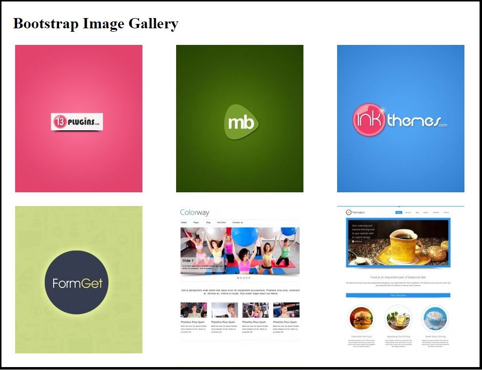
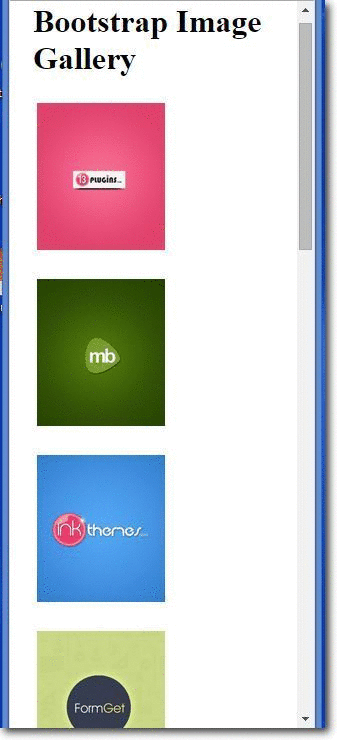
Bootstrap Image Gallery
What is Bootstrap Image Gallery ?
Bootstrap Image Gallery is used to group images in a webpage such that the images are displayed while arranged in a grid and they are responsive too. It can display images and videos in the modal dialog of the Bootstrap framework which can also be extended to employ several other features such as swipe, mouse and keyboard navigation, transition effects to other content types too.
For a quick solution, you can have a look at our bootstrap themes.
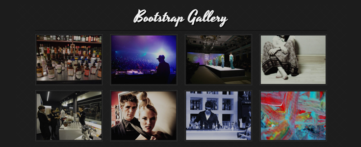
Bootstrap Image gallery in action(Desktop View) :-
Bootstrap Image gallery in action(Mobile View/Responsive) :-
How to run ?
To run the above functioning Image Gallery we need only two files to be included :-
- The HTML file (Source code provided below)
- The CSS file (Source code provided below)
Source Script :-
HTML Code
<!DOCTYPE html>
<html lang="en">
<head>
<title>WORDPRESS BOOTSTRAP IMAGE GALLERY</title>
<meta charset="utf-8">
<meta http-equiv="X-UA-Compatible" content="IE=edge">
<meta name="viewport" content="width=device-width, initial-scale=1">
<meta name="description" content="">
<meta name="author" content="">
<link href="css/bootstrap.css" rel="stylesheet">
</head>
<body>
<!-- The main container DIV starts here -->
<div class="container">
<div class="row">
<!--First row containing the main Heading-->
<div class="col-lg-12">
<h1 class="page-header">Bootstrap Image Gallery</h1>
</div>
<!--Next row containing the respective images in 3x4 grids starts here -->
<div class="col-lg-3 col-md-4 col-xs-6 thumb">
<a class="thumbnail" href="#">
<img class="img-responsive" src="http://www.magnetbrains.com/wp-content/uploads/thumb-cache/mb-41-9abc11648b1ff2faa5989ff2ae1a4ee0-261x302-100-crop.jpg" alt="">
</a>
</div>
<div class="col-lg-3 col-md-4 col-xs-6 thumb">
<a class="thumbnail" href="#">
<img class="img-responsive" src="http://www.magnetbrains.com/wp-content/uploads/thumb-cache/mb-11-66c0fddfa654a75aefbbce7e1cfa683d-261x302-100-crop.jpg" alt="">
</a>
</div>
<div class="col-lg-3 col-md-4 col-xs-6 thumb">
<a class="thumbnail" href="#">
<img class="img-responsive" src="http://www.magnetbrains.com/wp-content/uploads/thumb-cache/mb-2-692a734b9186185a0a0e9998e1195e57-261x302-100-crop.jpg" alt="">
</a>
</div>
<div class="col-lg-3 col-md-4 col-xs-6 thumb">
<a class="thumbnail" href="#">
<img class="img-responsive" src="http://www.magnetbrains.com/wp-content/uploads/thumb-cache/mb-3-dd10cb33ddceb30eca71b3fd595d549b-261x302-100-crop.jpg" alt="">
</a>
</div>
<div class="col-lg-3 col-md-4 col-xs-6 thumb">
<a class="thumbnail" href="#">
<img class="img-responsive" src="http://www.magnetbrains.com/wp-content/uploads/thumb-cache/in-1-8991cdeed7272c0540d29f38a8009048-261x302-100-crop.jpg" alt="">
</a>
</div>
<div class="col-lg-3 col-md-4 col-xs-6 thumb">
<a class="thumbnail" href="#">
<img class="img-responsive" src="http://www.magnetbrains.com/wp-content/uploads/thumb-cache/in-2-59c51d99bce20def251e0d43e76531c7-261x302-100-crop.jpg" alt="">
</a>
</div>
<div class="col-lg-3 col-md-4 col-xs-6 thumb">
<a class="thumbnail" href="#">
<img class="img-responsive" src="http://www.magnetbrains.com/wp-content/uploads/thumb-cache/in-3-8cf1caffabf532c440396f5d95cd9128-261x302-100-crop.jpg" alt="">
</a>
</div>
<div class="col-lg-3 col-md-4 col-xs-6 thumb">
<a class="thumbnail" href="#">
<img class="img-responsive" src="http://www.magnetbrains.com/wp-content/uploads/thumb-cache/in-4-6503818077dd9003f120e1ecc822ce31-261x302-100-crop.jpg" alt="">
</a>
</div>
<div class="col-lg-3 col-md-4 col-xs-6 thumb">
<a class="thumbnail" href="#">
<img class="img-responsive" src="http://www.magnetbrains.com/wp-content/uploads/thumb-cache/in-5-9c86bc1d11546ac39f4a199d2da5911c-261x302-100-crop.jpg" alt="">
</a>
</div>
<div class="col-lg-3 col-md-4 col-xs-6 thumb">
<a class="thumbnail" href="#">
<img class="img-responsive" src="http://www.magnetbrains.com/wp-content/uploads/thumb-cache/13-1-b39d7d1fd9ec72a468ccec5eddfb7929-261x302-100-crop.jpg" alt="">
</a>
</div>
<div class="col-lg-3 col-md-4 col-xs-6 thumb">
<a class="thumbnail" href="#">
<img class="img-responsive" src="http://www.magnetbrains.com/wp-content/uploads/thumb-cache/13-2-85334e0149f3881975a8a991b4209f01-261x302-100-crop.jpg" alt="">
</a>
</div>
<div class="col-lg-3 col-md-4 col-xs-6 thumb">
<a class="thumbnail" href="#">
<img class="img-responsive" src="http://www.magnetbrains.com/wp-content/uploads/thumb-cache/13-4-4a0acb9dff86fc2ad7c0c19d63d05b83-261x302-100-crop.jpg" alt="">
</a>
</div>
</div>
</div>
</body>
</html>
CSS Code
img {
vertical-align: middle;
}
.img-responsive,.thumbnail a > img {
display: block;
max-width: 100%;
height: auto;
}
.container {
padding-right: 15px;
padding-left: 15px;
margin-right: auto;
margin-left: auto;
}
@media (min-width: 1200px) {
.container {
width: 1170px;
}
}
.container-fluid {
padding-right: 15px;
padding-left: 15px;
margin-right: auto;
margin-left: auto;
}
.row {
margin-right: -15px;
margin-left: -15px;
}
.col-lg-3, .col-md-4, .col-xs-6, .col-lg-12 {
position: relative;
min-height: 1px;
padding-right: 15px;
padding-left: 15px;
}
.col-xs-6 {
width: 50%;
float:left;
}
@media (min-width: 1200px) {
.col-lg-3, .col-lg-12 {
float: left;
}
.col-lg-12 {
width: 100%;
}
.col-lg-3 {
width: 25%;
}
}
.thumbnail {
display: block;
padding: 4px;
margin-bottom: 20px;
background-color: #fff;
//border: 1px solid #ddd;
border-radius: 4px;
-webkit-transition: border .2s ease-in-out;
-o-transition: border .2s ease-in-out;
transition: border .2s ease-in-out;
}
a.thumbnail:hover,
a.thumbnail:focus,
a.thumbnail.active {
border-color: #337ab7;
}
Simplified Explanation of the script
A Bootstrap file to function as a responsive page must include the following statement compulsorily in its <head> section.
<meta name="viewport" content="width=device-width, initial-scale=1">
A responsive page must wrap all the associated statements/function in a DIV class named as “container”.
There are two container classes to choose from:
- The .container class provides a responsive fixed width container
- The .container-fluid class provides a full width container, spanning the entire width of the viewport
<div class="container">

//All the relevant contents are placed here.

</div>
Next, there are four column class variants from among which the proper variant can be chosen as per requirement and the relevant path of the image to be included are provided in place of “image-path”
- col-xs-*
- col-sm-*
- col-md-*
- col-lg-*
<div class="col-lg-3 col-md-4 col-xs-6 thumb">
<a class="thumbnail" href="#">
<img class="img-responsive" src="image-path" alt="">
</a>
</div>
Finally, using CSS the view of the page could be enhanced to a great extent to that the page is finely visibly in all devices of varying range.
Conclusion
So if someone has got a head scratch in displaying images gallery with responsive features too, he/she can just employ the above code snippets and by just replacing the image paths accordingly and altering the CSS for the desired view, one can have a beautiful image gallery that can be viewed in desktops, small devices and extra-small devices too.
Recommended blogs:-
Bootstrap Popup

In this tutorial we are going to show how we can create a popup using Bootstrap framework
Bootstrap is a front end GUI framework for developing responsive website. Bootstrap is a combination of HTML, CSS and JavaScript code. Using this we can create a user friendly website whose GUI is similar and responsive for any kind of devices.
Our bootstrap responsive themes will provide you a better solution. Take a look.
Bootstrap Required File
To use bootstrap framework , in the head section of our page we must set viewport, bootstrap.min.js, bootstrap.min.css, and jquery file as shown below.
<meta name="viewport" content="width=device-width, initial-scale=1">
<link href="css/bootstrap.min.css" rel="stylesheet" type="text/css"/>
<script src="js/jquery-1.11.3.min (1).js" type="text/javascript"></script>
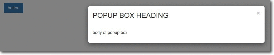
<script src="js/bootstrap.min.js" type="text/javascript"></script>POPUP BOX IN BOOTSTRAP
Bootstrap Pop-Up box can be shown via two ways :
- When a user clicks a button or image
- Automatic display popup box when page loads.
Steps For Option 1 . (When user clicks a button or image):
1. Let’s create a bootstrap button/image/link. So, when user clicks it a popup box will get displayed .
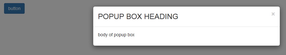
<button type="button" class="btn btn-primary" data-toggle="modal" data-target=".demo-popup">button</button>NOTE : the data-target option is set to the id or class given to modal. So when the user clicks the button, popup box will be displayed.
2. Design modal (popup box ) :
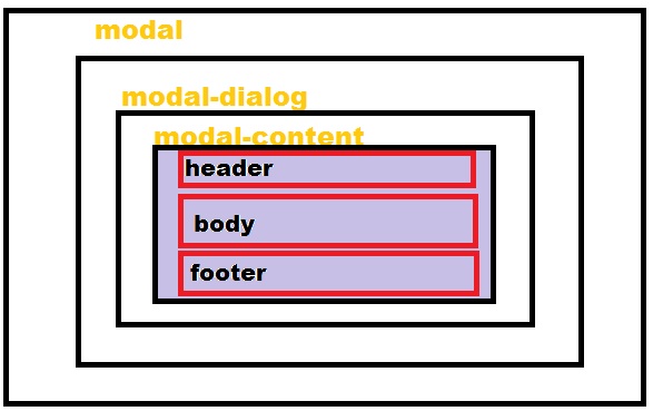 In the above modal structure we can see that modal is the outer layer and it contain further two sections. Let’s create them :
MODAL :
<div class="modal fade demo-popup" tabindex="-1" role="dialog" aria-labelledby="myLargeModalLabel-1" aria-hidden="true">In the above modal code class is set to fade, only if we want a fade effect. Demo-popup class is given to modal, which is already linked with the button we designed above.
MODAL DIALOG :
<div class="modal-dialog modal-sm"> modal-sm is given for small popup box, modal -lg for large popup box and if we don’t specify size of popup box the default is medium.
MODAL CONTENT:
<div class="modal-content"> Now, In Modal-Content we set our Popup box , Header (title), Body and Footer.
Header (of pop-up box)
<div class="modal-header"><button type="button" class="close" data-dismiss="modal" aria-hidden="true">×</button> <h3 class="modal-title">this is my title of popup box </h3> </div> Body(of popup box)
<div class="modal-body"> This is my body section of popup box .... </div> Footer(of popup box)
<div class="modal-footer"> <a href="http://www.google.com"> This is my FOOTER of popup box ....</a> </div> Now, close opening div of modal content, modal dialog and modal.
Our modal (popup box) is ready. Just run the webpage and click button to view popup box.
Complete Code:
Copy and paste below code in notepad and save as popup.html
<!DOCTYPE html>
<!--
To change this license header, choose License Headers in Project Properties.
To change this template file, choose Tools | Templates
and open the template in the editor.
-->
<html>
<head>
<title>TODO supply a title</title>
<meta charset="UTF-8">
<meta name="viewport" content="width=device-width, initial-scale=1.0">
<link href="css/bootstrap.min.css" rel="stylesheet" type="text/css"/>
<link href="css/style.css" rel="stylesheet" type="text/css"/>
<script src="js/jquery-1.11.3.min (1).js" type="text/javascript"></script>
<script src="js/bootstrap.min.js" type="text/javascript"></script>
<script src="js/script.js" type="text/javascript"></script>
</head>
<body>
<div class="container">
<div class="row">
<button type="button" class="btn btn-primary" data-toggle="modal" data-target=".demo-popup">button</button>
<!-- popup box modal starts here -->
<div class="modal fade demo-popup" tabindex="-1" role="dialog" aria-labelledby="myLargeModalLabel-1" aria-hidden="true">
<div class="modal-dialog">
<div class="modal-content">
<div class="modal-header">
<button type="button" class="close" data-dismiss="modal" aria-hidden="true">×</button> <h3 class="modal-title">POPUP BOX HEADING</h3>
</div>
<div class="modal-body">
<P>body of popup box</P>
</div>
</div><!-- /.modal-content -->
</div><!-- /.modal-dialog -->
</div><!-- /.modal-->
<!-- popup box modal ends -->
</div> <!-- /.row -->
</div> <!-- /.container -->
</body>
</html>Steps For Option 2 . (Automatic display popup box when page loads.)
The steps for creating a modal(popup box ) is same as above. In order to get it loaded automatically, we add JavaScript code in script file. The code is shown below :
$(document).ready(function() { $('.form-popup').modal({ show: true, }) }); where form-popup is the class given to the modal .
Complete Code:
Copy and paste below code in notepad and save as auto.html.
<html>
<head>
<title>TODO supply a title</title>
<meta charset="UTF-8">
<meta name="viewport" content="width=device-width, initial-scale=1.0">
<link href="css/bootstrap.min.css" rel="stylesheet" type="text/css"/>
<link href="css/style.css" rel="stylesheet" type="text/css"/>
<script src="js/jquery-1.11.3.min (1).js" type="text/javascript"></script>
<script src="js/bootstrap.min.js" type="text/javascript"></script>
<script src="js/script.js" type="text/javascript"></script>
</head>
<body>
<div class="container">
<div class="row">
<!-- popup box modal starts here -->
<div class="modal fade form-popup" tabindex="-1" role="dialog" aria-labelledby="myLargeModalLabel-1" aria-hidden="true">
<div class="modal-dialog modal-sm">
<div class="modal-content">
<div class="modal-header"><button type="button" class="close" data-dismiss="modal" aria-hidden="true">×</button>
<h3 class="modal-title">ENQUIRY FORM</h3>
</div>
<div class="modal-body">
<!-- form code starts here -->
<form class="form-horizontal tpad" role="form">
<div class="form-group">
<label for="email" class="col-lg-3 control-label">EMAIL</label>
<div class="col-lg-9">
<input type="email" class="form-control" id="email" placeholder="EMAIL">
</div>
</div>
<div class="form-group tpad">
<label for="message" class="col-lg-3 control-label">Message</label>
<div class="col-lg-9">
<textarea class="form-control" rows="6" id="message" placeholder="MESSAGE..."></textarea>
</div>
</div>
<div class="form-group tpad">
<div class="col-lg-offset-3 col-lg-9">
<a data-toggle="modal" href="#myModal" class="btn btn-default btn-lg">Send</a>
</div>
</div>
</form>
<!-- form code ends here -->
</div>
<div class="modal-footer">
<a href="http://www.google.com">FOOTER</a>
</div>
</div><!-- /.modal-content -->
</div><!-- /.modal-dialog -->
</div><!-- /.modal-->
<!-- popup box modal ends -->
</div>
</div>
</body>
</html>Conclusion
In this tutorial we have learned about, how we can make Bootstrap Popup Modal. Hope you have got the concept. Keep following us for more coding tricks.
Bootstrap Accordion
What is Bootstrap Accordion ?
Accordion is a built in capability of Bootstrap to create menus and technical widgets which can properly organize large content and navigation lists. Here, the areas are designed where information can be displayed by just clicking on a button and sliding an area to open and close. It implements the collapse plugin to manage divisions in a webpage.
Our premium bootstrap themes will serve the purpose for you. Take a look.
Bootstrap Required files
For Bootstrap framework, we must include bootstrap.min.js, bootstrap.min.css, and jquery.min.js files (as shown below) in the head section of our page.
<link href="css/bootstrap.min.css" rel="stylesheet" type="text/css"/>
<script src="http://ajax.googleapis.com/ajax/libs/jquery/1.11.3/jquery.min.js"></script>
<script src="js/bootstrap.min.js" type="text/javascript"></script>
Create Accordion
Bootstrap Accordion menu and widgets are widely used on the website and are very easy to create. Without any JavaScript code you can create accordion or a simple collapsible panel.
The following example show simple Accordion.
data-toggle=”collapse” is added to the link on which you click to expand or collapse the component.
href or a data-target attribute is added to the parent component, whose value is id of the child component.
data-parent attribute is added for creating the accordion like effect.
<a data-toggle="collapse" data-parent="#accordion" href="#collapse1">HTML</a>HTML code
<meta name="viewport" content="width=device-width, initial-scale=1.0">
<link href="css/bootstrap.min.css" rel="stylesheet" type="text/css"/>
<script src="http://ajax.googleapis.com/ajax/libs/jquery/1.11.3/jquery.min.js"></script>
<script src="js/bootstrap.min.js" type="text/javascript"></script>
<html>
<head>
<title> </title>
<meta charset="UTF-8">
<meta name="viewport" content="width=device-width, initial-scale=1.0">
<link href="css/bootstrap.min.css" rel="stylesheet" type="text/css"/>
<script src="http://ajax.googleapis.com/ajax/libs/jquery/1.11.3/jquery.min.js"></script>
<script src="js/bootstrap.min.js" type="text/javascript"></script>
<style>
#a{
background-color: #3C85C4;
color: #fff;
}
#b{
background-color: #44C767;
color: #fff;
}
#c{
background-color: #FA8B7C;
color: #fff;
}
</style>
</head>
<body>
// This is the main container div
<div class="container">
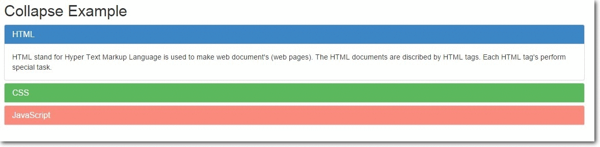
<h2>Collapse Example</h2>
// This is data-parent div
<div class="main-panel" id="accordion">
<div class="panel panel-default">
<div class="panel-heading" id="a">
<h4 class="panel-title" >
<a data-toggle="collapse" data-parent="#accordion" href="#collapse1">HTML</a>
</h4>
</div>
// This is the data-child div
<div id="collapse1" class="panel-collapse collapse in">
<div class="panel-body">Hypertext Markup Language, a standardized system for tagging text files to achieve font, colour, graphic, and hyperlink effects on World Wide Web pages.</div>
</div>
</div>
<div class="panel panel-default">
<div class="panel-heading" id="b">
<h4 class="panel-title">
<a data-toggle="collapse" data-parent="#accordion" href="#collapse2">CSS</a>
</h4>
</div>
// This is the data-child div
<div id="collapse2" class="panel-collapse collapse">
<div class="panel-body">Cascading Style Sheets (CSS) is a style sheet language used for describing the look and formatting of a document written in a markup language
</div>
</div>
</div>
<div class="panel panel-default">
<div class="panel-heading" id="c">
<h4 class="panel-title">
<a data-toggle="collapse" data-parent="#accordion" href="#collapse3">JavaScript</a>
</h4>
</div>
// This is the data-child div
<div id="collapse3" class="panel-collapse collapse">
<div class="panel-body">an object-oriented computer programming language commonly used to create interactive effects within web browsers.</div>
</div>
</div>
</div>
</div>
</body>The Collapse Plugin Classes
.collapse – This class hides the contents.
.collapse in – This class shows the contents.
.collapsing – Added when the transition starts and removes when it finishes.
Collapsing Elements via Data Attributes
It can be used for expanding and to collapse any specific element via data attributes without using the accordion mark.
The following example shows simple collapse.
HTML code
<html>
<head>
<title>Bootstrap Collapse</title>
<meta charset="UTF-8">
<meta name="viewport" content="width=device-width, initial-scale=1.0">
<link href="css/bootstrap.min.css" rel="stylesheet" type="text/css"/>
<script src="http://ajax.googleapis.com/ajax/libs/jquery/1.11.3/jquery.min.js"></script>
<script src="js/bootstrap.min.js" type="text/javascript"></script>
<style>
.my-example{
padding: 20px;
}
#demo1{
border-radius: 5px;
margin-top: 10px;
margin-right: 500px;
background-color: #FA8B7C;
color: #fff;
}
p{
padding: 10px;
}
</style>
</head>
<body>
// Anchor element html
<div class="my-example">
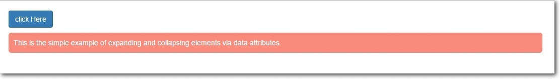
<a href="#demo1" class="btn btn-primary" data-toggle="collapse" > click Here </a>
// Collepsible element html
<div id="demo1" class="collapse in">
<p>
This is the simple example of expanding and collapsing elements via data attributes.
</p>
</div>
</div>
</body>
</html>Collapsing Element via JavaScript
We can collapse and expand any specific elements via JavaScript. Just call the the collapse() bootstrap method with ‘id’ or ‘class’ selector.
$('.collapse').collapse() There are several Options, Methods and Events, which can be used with Bootstrap Collapsible JavaScript Plugin. Here are the details:
Options
parent: Type of value is Selector. Default value is false. When the parent element is displayed, all collapsible elements under the parent is closed.
toggle: Type of value is Boolean. Default value is true. When called, all collapsible elements are toggled.
Methods
.collapse(options) – Activates collapsible content. It accepts an optional option object.
$('#my-example').collapse({
toggle: false
})
.collapse(‘toggle’) – A collapsible element is either shown or hidden.
$('#my-example').collapse('toggle').collapse(‘show’) – A collapsible element is shown.
$('#my-example').collapse('show').collapse(‘hide’) – A collapsible element is hidden.
$('#my-example').collapse('hide')Complete Code and output
HTML code
<html>
<head>
<title>Collapsing via Javascript</title>
<meta charset="UTF-8">
<meta name="viewport" content="width=device-width, initial-scale=1.0">
<link href="css/bootstrap.min.css" rel="stylesheet" type="text/css"/>
<script src="http://ajax.googleapis.com/ajax/libs/jquery/1.11.3/jquery.min.js"></script>
<script src="js/bootstrap.min.js" type="text/javascript"></script>
<script type="text/javascript">
// Main function
$(document).ready(function(){
$('.x').click(function(){
// Optional element function
$("#my-example").collapse({
toggle:false
});
});
$('.y').click(function(){
// Show element function
$("#my-example").collapse('show');
});
$('.z').click(function(){
// Hide element function
$("#my-example").collapse('hide');
});
$('.a').click(function(){
// Toggle(show/hide) element function
$("#my-example").collapse('toggle');
});
});
</script>
<style>
p{
border-radius: 5px;
margin-top: 10px;
background-color: #FA8B7C;
padding: 10px;
margin-right: 500px;
color: #fff;
}
</style>
</head>
<body>
// Main container div
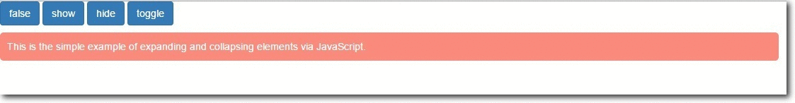
<div class="ss">
<input type="button" class="btn btn-primary x" value="false">
<input type="button" class="btn btn-primary y" value="show">
<input type="button" class="btn btn-primary z" value="hide">
<input type="button" class="btn btn-primary a" value="toggle">
<div id="my-example">
<p>
This is the simple example of expanding and collapsing elements via JavaScript.</p>
</div>
</div>
</body>
</html>Events
| Event | Description |
|---|---|
| show.bs.collapse | Occurs when the collapsible element is about to be shown. |
| shown.bs.collapse | Occurs when the collapsible element is fully shown. |
| hide.bs.collapse | Occurs when the collapsible element is about to be hidden. |
| hidden.bs.collapse | Occurs when the collapsible element is fully hidden. |
Complete code and output
Complete code
<html>
<head>
<title>Collapsing via Javascript with Events</title>
<meta charset="UTF-8">
<meta name="viewport" content="width=device-width, initial-scale=1.0">
<link href="css/bootstrap.min.css" rel="stylesheet" type="text/css"/>
<script src="http://ajax.googleapis.com/ajax/libs/jquery/1.11.3/jquery.min.js"></script>
<script src="js/bootstrap.min.js" type="text/javascript"></script>
<script type="text/javascript">
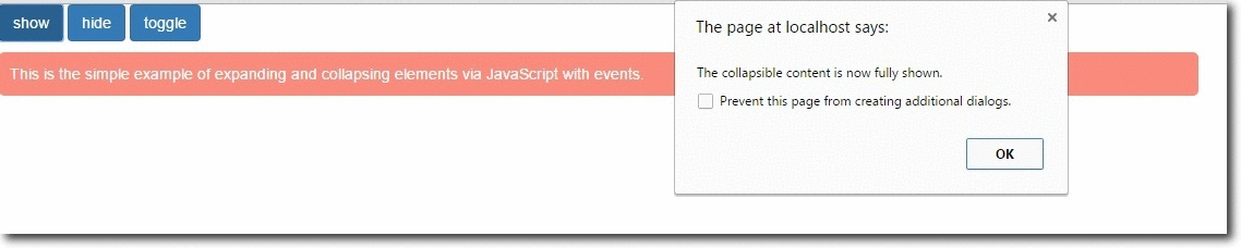
$(document).ready(function(){
$('.y').click(function(){
$("#my-example").collapse('show');
});
$('.z').click(function(){
$("#my-example").collapse('hide');
});
$('.a').click(function(){
$("#my-example").collapse('toggle');
});
// Event occur when collapsible content is about to be shown.
$("#my-example").on('show.bs.collapse', function(){
alert('The collapsible content is about to be shown.');
});
// Event occur when collapsible content is now fully shown.
$("#my-example").on('shown.bs.collapse', function(){
alert('The collapsible content is now fully shown.');
});
// Event occur when collapsible content is about to be hidden.
$("#my-example").on('hide.bs.collapse', function(){
alert('The collapsible content is about to be hidden.');
});
// Event occur when collapsible content is now hidden.
$("#my-example").on('hidden.bs.collapse', function(){
alert('The collapsible content is now hidden.');
});
});
</script>
<style>
p{
border-radius: 5px;
margin-top: 10px;
background-color: #FA8B7C;
padding: 10px;
margin-right: 500px;
color: #fff;
}
</style>
</head>
<body>
// Main container div
<div class="ss">
<input type="button" class="btn btn-primary y" value="show">
<input type="button" class="btn btn-primary z" value="hide">
<input type="button" class="btn btn-primary a" value="toggle">
<div id="my-example">
<p>
This is the simple example of expanding and collapsing elements via JavaScript with events.</p>
</div>
</div>
</body>
</html>Conclusion :
So, we’ve learned how to make accordion menu and widget to manage navigation list and content by using bootstrap. The above provided codes can be directly employed within any source segments to run Accordion. I hope it was helpful for you. Keep visiting our website.
Also read our popular post:-
Bootstrap Navbar
The navigation bar allows a user to navigate through a website and obtain the web page they desire. Bootstrap navbar is a responsive navigation bar having the functionality of collapsing and toggling according to the screen size (viewport).
Navbars are responsive ‘meta’ components that serve as navigation headers for your application or site. Navbars collapse in mobile views and become horizontal as the available viewport width increases. At its core, the navbar includes styling for site names and basic navigation.
Our bootstrap attractive themes will provide you a rapid solution. Take a look at it.
Firstly, I’m going to tell you that how we can create a navbar using bootstrap classes step by step. Afterwards, I will explain its variations.
Bootstrap Navbar Classes:
- navbar: fundamental class for a navigation bar sets styles like border, min-height, position: relative etc.
- navbar-default: sets other fundamental styles for a navigation bar like background gradient and box-shadow.
- navbar-header: identified as the header of the navbar.
- navbar-brand: sets styles for special hyperlinks and other ordinary text in a menu.
- navbar-fixed-top: use to make the navbar fixed at the top (or bottom) of the page as you scroll.
- navbar-fixed-bottom: use to make the navbar fixed at the bottom of the page as you scroll.
- navbar-static-top: no top, right and left border and also no border-radius present in the navbar.
- navbar-left: align the components to the left in a navbar.
- navbar-right: align the components to the left in a navbar.
- navbar-collapse: collapsing nature of a button is created by this class.
- navbar-toggle: collapsed button is created by this class.
- navbar-search: add a proper search form inside a navbar.
- navbar-form: add a properly styled and positioned form inside a navbar.
- navbar-btn: used to create button outside the form in a navbar.
- navbar-text: Wrap text in an element with it.
- navbar-link: includes a link in a navbar which actually presents outside it.
- navbar-inverse: a variation of navbar-default but with dark colors.
Steps To Get Started
- The first step is to add the default class of the bootstrap navbar,i.e, “navbar” along with “navbar-default”. “navbar-default” is one of the styled navbar present in the bootstrap.
<div class="navbar navbar-default" role="navigation"> </div>- Next step is to add a class named “navbar-header“.
<div class="navbar-header"> </div>Now we’ve all the default styling for the navigation bar.
Let’s take a look at the components we’re going to use inside the navbar.
- We’re going to create a button for our responsive design. As we collapse our browser, the button will show up.
<button type="button" class="navbar-toggle" data-toggle="collapse" data-target=".navbar-collapse"> </button>- To add a brand text which will style your brand.
<a class="navbar-brand" href="#">FormGet</a>Now let’s see how collapse navbar is working.
- If you remember, we’ve already set data-toggle=”collapse” and data-target=”navbar-collapse”.
So what exactly going to happen is, when we shrink our browser window, jQuery kicks in and will reference the contents present in the div.
<div class="navbar-collapse collapse"> </div>Now, Let’s take a look at the variations of the navbar.
Variations of navbar:
- Default navbar
- Brand image
- Forms
- Buttons
- Text
- Non-nav links
- Component alignment
- Fixed to top
- Fixed to bottom
- Static top
- Inverted navbar
Different Variations of Navbar
1: Default navbar

A default navigation bar can be created with <nav class=”navbar navbar-default“>.
Whenever a user shrinks the window size, navbar will shrink accordingly and transforms into a button that is formed by the class=”navbar-toggle“.
HTML Code:
Copy below code in your HTML file.
<!--Default Navbar-->
<nav class="navbar navbar-default" role="navigation">
<div class="navbar-header">
<!--Toggled Button-->
<button type="button" class="navbar-toggle" data-toggle="collapse" data-target="#example-navbar-collapse">
<span class="sr-only">Toggle</span>
<span class="icon-bar"></span>
<span class="icon-bar"></span>
<span class="icon-bar"></span>
</button>
<!--Navigation Header-->
<a class="navbar-brand" href="#">FormGet</a>
</div>
<div class="collapse navbar-collapse" id="example-navbar-collapse">
<ul class="nav navbar-nav">
<li class="active"><a href="#">AJAX</a></li>
<li><a href="#">Form Builder</a></li>
<!--Dropdown Toggle-->
<li class="dropdown">
<a href="#" class="dropdown-toggle" data-toggle="dropdown">Tutorials <b class="caret"></b></a>
<!--Dropdown Items-->
<ul class="dropdown-menu">
<li><a href="#">AJAX</a></li>
<li><a href="#">Code Igniter</a></li>
<li><a href="#">PHP</a></li>
<li class="divider"></li>
<li><a href="#">Form</a></li>
<li class="divider"></li>
<li><a href="#">Email</a></li>
</ul>
</li>
</ul>
</div>
</nav>
2: Brand Image

A brand image can be created with the class=”navbar-brand“. We use an image (usually logo) in place of the header text.
HTML Code:
Copy below code in your HTML file.
<!--Brand Image Navbar-->
<nav class="navbar navbar-default">
<div class="container-fluid">
<!--Navbar Header-->
<div class="navbar-header">
<a class="navbar-brand" href="#">
<img alt="FormGet" src="fugo.png">
</a>
</div>
</div>
</nav>
3: Forms

A form navbar can be created with the class=”navbar-form“. It creates a form inside a navigation bar with proper styling.
HTML Code:
Copy below code in your HTML file.
<!--Forms Navbar-->
<nav class="navbar navbar-default" role="navigation">
<!--Navbar Header-->
<div class="navbar-header">
<a class="navbar-brand" href="#">FormGet</a>
</div>
<!--Search Form-->
<div>
<form class="navbar-form navbar-left" role="search">
<div class="form-group">
<input type="text" class="form-control" placeholder="Search">
</div>
<!--Submit Button-->
<button type="submit" class="btn btn-default">Submit</button>
</form>
</div>
</nav>
4: Buttons

Buttons inside a navbar can be created with the class=”navbar-btn” along with classes like “btn” and “btn-default”.
HTML Code:
Copy below code in your HTML file.
<!--Buttons Navbar-->
<nav class="navbar navbar-default" role="navigation">
<!--Navbar Header-->
<div class="navbar-header">
<a class="navbar-brand" href="#">FormGet</a>
</div>
<div>
<!--Navigation Button-->
<button type="button" class="btn btn-default navbar-btn">Navigation</button>
</div>
</nav>
5: Text

Text inside a navbar can be created with the class=”navbar-text.
HTML Code:
Copy below code in your HTML file.
<!--Text Navbar-->
<nav class="navbar navbar-default" role="navigation">
<!--Navbar Header-->
<div class="navbar-header">
<a class="navbar-brand" href="#">FormGet</a>
</div>
<!--Text-->
<div>
<p class="navbar-text">Signed in as Fugo</p>
</div>
</nav>
6: Non-nav Links

Non-nav links are the links that are actually not a part of the navigation bar. They can be created with class=”navbar-link“.
HTML Code:
Copy below code in your HTML file.
<!--Non-nav Links Navbar-->
<nav class="navbar navbar-default" role="navigation">
<!--Navbar Header-->
<div class="navbar-header">
<a class="navbar-brand" href="#">FormGet</a>
</div>
<!--Text along with a link-->
<div>
<p class="navbar-text navbar-right">Signed in as <a href="#" class="navbar-link">Fugo</a></p>
</div>
</nav>
7: Component Alignment

A component alignment bar can be created with the classes class=”navbar-left” for the left alignment & class=”navbar-right” for the right alignment inside the navigation bar.
HTML Code:
Copy below code in your HTML file.
<!--Component Alignment Navbar-->
<nav class="navbar navbar-default" role="navigation">
<!--Navbar Header-->
<div class="navbar-header">
<a class="navbar-brand" href="#">Form Get</a>
</div>
<div>
<!--Left Aligned Navigation Bar-->
<ul class="nav navbar-nav navbar-left">
</ul>
<!--Search Form-->
<form class="navbar-form navbar-left" role="search">
<button type="submit" class="btn btn-default">Left Submit Button</button>
</form>
<!--Left Text-->
<p class="navbar-text navbar-left">Left Text</p>
<!--Right Aligned Navigation Bar-->
<ul class="nav navbar-nav navbar-right">
</ul>
<!--Search Form-->
<form class="navbar-form navbar-right" role="search">
<!--Submit Button-->
<button type="submit" class="btn btn-default">Right Submit Button</button>
</form>
<!--Right Text-->
<p class="navbar-text navbar-right">Right Text</p>
</div>
</nav>
8: Fixed to Top

A navbar can be fixed at the top of the web page even when we are scrolling the page down. It can be achieved by the class=”navbar-fixed-top“.
HTML Code:
Copy below code in your HTML file.
<!--Fixed to Top Navbar-->
<nav class="navbar navbar-default navbar-fixed-top" role="navigation">
<!--Navbar Header-->
<div class="navbar-header">
<a class="navbar-brand" href="#">FormGet</a>
</div>
<!--Menu Items-->
<div>
<ul class="nav navbar-nav">
<li class="active"><a href="#">Form Builder</a></li>
<li><a href="#">Lead Generation</a></li>
</ul>
</div>
</nav>
9: Fixed to Bottom

A navbar can be fixed at the bottom of the webpage even when we are scrolling the page up. It can be achieved by the class=”navbar-fixed-bottom“.
HTML Code:
Copy below code in your HTML file.
<!--Fixed to Bottom-->
<nav class="navbar navbar-default navbar-fixed-bottom" role="navigation">
<!--Navbar Header-->
<div class="navbar-header">
<a class="navbar-brand" href="#">FormGet</a>
</div>
<!--Menu Items-->
<div>
<ul class="nav navbar-nav">
<li class="active"><a href="#">Form Builder</a></li>
<li><a href="#">Lead Generation</a></li>
</ul>
</div>
</nav>
10: Static Top

A full length static navigation bar can be created with the class : class=”navbar-static-top“. Unlike fixed-top, it doesn’t scroll with the webpage.
HTML Code:
Copy below code in your HTML file.
<!--Static Top Navbar-->
<nav class="navbar navbar-default navbar-static-top" role="navigation">
<!--Navbar Header-->
<div class="navbar-header">
<a class="navbar-brand" href="#">FormGet</a>
</div>
<!--Menu Items-->
<div>
<ul class="nav navbar-nav">
<li class="active"><a href="#">Form Builder</a></li>
<li><a href="#">Lead Generation</a></li>
<!--Dropdown Toggle-->
<li class="dropdown">
<a href="#" class="dropdown-toggle" data-toggle="dropdown">Tutorials <b class="caret"></b></a>
<!--Dropdown Items-->
<ul class="dropdown-menu">
<li><a href="#">AJAX</a></li>
<li><a href="#">Code Igniter</a></li>
<li><a href="#">PHP</a></li>
<li class="divider"></li>
<li><a href="#">Form</a></li>
<li class="divider"></li>
<li><a href="#">Email</a></li>
</ul>
</li>
</ul>
</div>
</nav>
11: Inverted navbar

An inverted navbar can be created with the class : class=”navbar-inverse”
An inverted navbar is exactly same as default navbar except its styling. Inverted possess dark colors.
HTML Code:
Copy below code in your HTML file.
<!--Inverted Navbar-->
<nav role="navigation" class="navbar navbar-inverse">
<!-- Navbar Header -->
<div class="navbar-header">
<!--Toggled Button-->
<button type="button" data-target="#navbarCollapse" data-toggle="collapse" class="navbar-toggle">
<span class="sr-only">Toggle navigation</span>
<span class="icon-bar"></span>
<span class="icon-bar"></span>
<span class="icon-bar"></span>
</button>
<a href="#" class="navbar-brand">FormGet</a>
</div>
<!--Menu Items-->
<div id="navbarCollapse" class="collapse navbar-collapse">
<ul class="nav navbar-nav">
<li class="active"><a href="#">Form Buider</a></li>
<li><a href="#">Lead Generation</a></li>
<!--Dropdown Toggle-->
<li class="dropdown">
<a data-toggle="dropdown" class="dropdown-toggle" href="#">Tutorials <b class="caret"></b></a>
<!--Dropdown Items-->
<ul role="menu" class="dropdown-menu">
<li><a href="#">AJAX</a></li>
<li><a href="#">Code Igniter</a></li>
<li><a href="#">Form</a></li>
<li class="divider"></li>
<li><a href="#">Email</a></li>
</ul>
</li>
</ul>
<!-- Search Bar -->
<form role="search" class="navbar-form navbar-left">
<div class="form-group">
<input type="text" placeholder="Search" class="form-control">
</div>
</form>
<!-- Sign In Button -->
<ul class="nav navbar-nav navbar-right">
<li><a href="#">Sign In</a></li>
</ul>
</div>
</nav>
Conclusion
So, you’ve learned that how we can make our navigation bar and its components stylish using bootstrap. I hope it was helpful. Keep visiting our blogs and feel free to comment.
Also read our popular post:-
How I Increased My Email Open Rate by over 300% with this simple trick

Few weeks back, I sent an email campaign to my 80,000 subscribers.
When I checked my stats, I got an open rate of mere 4%. Which means, out of the 80,000 emails that I sent, Only 3200 people opened my email…
I felt bad seeing that more than 76,000 people didn’t even checked my email …
That was really bad and for the last few months, I was seeing the similar pattern of less email opens from my emails …
I wanted to solve that problem… So, I started to dig a little deeper and started experimenting …
So, in my next email campaign instead of using my regular (and quite popular) SMTP service. I flipped my SMTP service to another one and connected it with MailGet.
The very next campaign tripled my open rates instantly. I was pretty much astonished to see the change as the SMTP service that I used before for sending emails was quite reputed in the market …
You should give a trial for this Email Campign for better email inbox delivery using MailGet.
When I researched a bit, I figured out that the SMTP provider that I used earlier had a “bad reputation” phase going on with them.
Most of the emails that were sent through them were ending up in people’s spam, that resulted in less open emails.
This is not the story with just one email service provider out there … This happens all the time …
Recently I found a guy who was using “GetResponse” telling me that his opens rates have gone down drastically….
I have learned that most email service providers put you on shared IP for email sending. If someone sends out bad emails, it hurts your email providers reputation which in turn hurts your email campaigns as well.
I have found that the only way to get more email opens is to not rely on just one email service anymore…
You have to have some kind of mechanism where you can connect multiple SMTP services in one system and send emails on a rotational basis using each one of them …and see which SMTP service gives you the maximum open rate.
Once I learned that the very next day I registered account with
- MailGun,
- SendGrid
- Mandrill
- SMTPProvider
The amazing thing with all of them is that they charge on the usage basis… So you pay money for the volume of emails that you send … There is no monthly fee involved …
Apart from Amazon SES .. I connected all 4 SMTP services in my MailGet account …
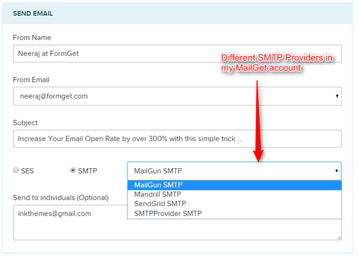
That means now I have the power to select any SMTP service while sending the emails.. That means I can now experiment and optimize my email marketing easily …
Plus since MailGet works with any SMTP service, I can track my opens, clicks and keep track of unsubscribed and handle spam and bounces through any of the services in one dashboard … That is like having power of all the email providers out there in a single system ….
I have started sending the emails using them to see which one gives the best open rate …
Just using and experimenting with different email providers has increased my opens by over 300% in last few weeks alone …
That means now more than 10,000 more people are seeing my emails that earlier was not seeing them at all…
If you are in the same boat as me and getting less opens of your email..
Don’t stop … start experimenting today, choose the best provider and increase your inbox deliverability and sales …
You can also check out API Integration for subscriber sign-up form using MailGet.
Bootstrap Table/Bootstrap Responsive Table

Bootstrap provides a clean layout for building tables. To design a basic table with just some light padding and horizontal dividers, add the base class of .table to any table markup.
Create bootstrap responsive tables by wrapping any .table in .table-responsive to make them scroll horizontally up to small devices (under 768px). When viewing on anything larger than 768px wide, you will not see any difference in these tables.
If you view it on your mobile device or shrink the width of your browser you will see it will automatically scroll the table contents. No plugin or additional CSS required!
For a rapid solution, you can take a look at our bootstrap responsive design templates.
What is table?
The table is also called as file. The HTML table is generally a way to present data in grid manner like row and columns.
Learn step by step to make Bootstrap Table:-
Basic example-
Here is an example to show how to develop a simple table.
<table class="table ">
<thead>
<tr>
<th>Firstname</th>
<th>Lastname</th>
<th>location</th>
</tr>
</thead>
<tbody>
<tr>
<td> Amit</td>
<td> Tiwari</td>
<td> Bhopal</td>
</tr>
<tr>
<td> Sumit</td>
<td> Joshi</td>
<td> Sehore</td>
</tr>
<tr>
<td> Nitin</td>
<td> Sharma</td>
<td> Bhopal</td>
</tr>
</tbody>
</table>
NOTE:- Tables are divided into row <tr>. Similarly table rows are divided into table data<td>. Table headings can be write as tag <th>. Table can be defined as the tag <table>.
Bootstrap table:-
You are ready to design your first responsive bootstrap table. First open your designing tool, and save all bootstrap files properly. After this, you have to give an exact location of the bootstrap files like (css/js). Here are the bootstrap files, which must be enclosed within head section.
<meta name="viewport" content="width=device-width, initial-scale=1">The “initial-sclae=1” part set the initial zoom level when the page is loaded on the browser.
The “width=device-width” part set the full width of the screen.
<link rel="stylesheet" href="http://maxcdn.bootstrapcdn.com/bootstrap/3.3.5/css/bootstrap.min.css"><script src="https://ajax.googleapis.com/ajax/libs/jquery/1.11.3/jquery.min.js"></script><script src="http://maxcdn.bootstrapcdn.com/bootstrap/3.3.5/js/bootstrap.min.js"></script>Responsive Table Design:-
Now we will apply different styles in table content.
Hover Row:-
| Firstname | Lastname | |
|---|---|---|
| amit | pastor | [email protected] |
| sachin | joshi | [email protected] |
| nitin | sharma | [email protected] |
<!DOCTYPE html>
<head>
<title>Bootstrap Table</title>
<meta charset="utf-8">
<meta name="viewport" content="width=device-width, initial-scale=1">
<link rel="stylesheet" href="http://maxcdn.bootstrapcdn.com/bootstrap/3.3.5/css/bootstrap.min.css">
<script src="https://ajax.googleapis.com/ajax/libs/jquery/1.11.3/jquery.min.js"></script>
<script src="http://maxcdn.bootstrapcdn.com/bootstrap/3.3.5/js/bootstrap.min.js"></script>
</head>
<body>
<div class="container">
<table class="table table-hover">
<thead>
<tr>
<th>Firstname</th>
<th>Lastname</th>
<th>Email</th>
</tr>
</thead>
<tbody>
<tr>
<td>amit</td>
<td>pastor</td>
<td>[email protected]</td>
</tr>
<tr>
<td>sachin</td>
<td>joshi</td>
<td>[email protected]</td>
</tr>
<tr>
<td>nitin</td>
<td>sharma</td>
<td>[email protected]</td>
</tr>
</tbody>
</table>
</div>
</body>
</html>
Contextual class:-
This article changes the color of table row and table cell.
Example-
| Firstname | Lastname | |
|---|---|---|
| amit | tiwari | [email protected] |
| sachin | joshi | [email protected] |
| nitin | sharma | [email protected] |
Contextual class for a table is shown below. Remaining code will be same which is used earlier.
<table class="table table-">
<thead>
<tr>
<th>Firstname</th>
<th>Lastname</th>
<th>Email</th>
</tr>
</thead>
<tbody>
<tr class="success">
<td>amit</td>
<td>tiwari</td>
<td>[email protected]</td>
</tr>
<tr class="danger">
<td>sachin</td>
<td>joshi</td>
<td>[email protected]</td>
</tr>
<tr class="info">
<td>nitin</td>
<td>sharma</td>
<td>[email protected]</td>
</tr>
</tbody>
</table>
Some contextual classes that can be used are:
| CLASS |
DESCRIPTION |
|---|---|
| .active | It applies hover color in a table cell or table row |
| .success | It indicates success signal |
| .info | It shows informative change |
| .warning | It shows warning |
| .danger | It shows negative changes |
Striped Rows:-
This class shows the zebra-stripes to a table.
Example-
| Firstname | Lastname | |
|---|---|---|
| Amit | Tiwari | [email protected] |
| Sachin | Joshi | [email protected] |
| Nitin | Sharma | [email protected] |
<table class="table table-striped">
<thead>
<tr>
<th>Firstname</th>
<th>Lastname</th>
<th>Email</th>
</tr>
</thead>
<tbody>
<tr>
<td>Amit</td>
<td>Tiwari</td>
<td>[email protected]</td>
</tr>
<tr>
<td>Sachin</td>
<td>Joshi</td>
<td>[email protected]</td>
</tr>
<tr>
<td>Nitin</td>
<td>Sharma</td>
<td>[email protected]</td>
</tr>
</tbody>
</table>
Bordered Table:-
It creates border on all sides of the table and cell.
Example-
| Firstname | Lastname | |
|---|---|---|
| Amit | Tiwari | [email protected] |
| Sachin | Joshi | [email protected] |
| Nitin | Sharma | [email protected] |
<table class="table table-bordered">
<thead>
<tr>
<th>Firstname</th>
<th>Lastname</th>
<th>Email</th>
</tr>
</thead>
<tbody>
<tr>
<td>Amit</td>
<td>Tiwari</td>
<td>[email protected]</td>
</tr>
<tr>
<td>Sachin</td>
<td>Joshi</td>
<td>[email protected]</td>
</tr>
<tr>
<td>Nitin</td>
<td>Sharma</td>
<td>[email protected]</td>
</tr>
</tbody>
</table>
Conclusion
I hope that you have got a detailed description on, how to design bootstrap responsive table. Keep reading our blog posts it will help you enhance your knowledge and will sharpen your coding tricks.
Recommended blogs:-
Bootstrap Tabs
Bootstrap Tab provides an ease of handling a huge amount of data within a small area. Using this we can quickly access the content of panes without leaving the page. This also helps in easy organization of data, so that all similar data are arranged in a single pane. This proper arrangement helps in easily accessing and retrieving of information.
To use Bootstrap we have to include some files in our code such as bootstrap.min.css, bootstrap.vertical-tabs.css, jquery-2.1.1.min.js, bootstrap.min.js of Bootstrap library.
You can use our responsive design templates of bootstrap for a rapid solution to your problems.
Basic Tabs With Bootstrap
The following example will create basic tabs:
HTML Code:-
<!-- nav nav-tabs class makes the tabs -->
<ul class=”nav nav-tabs”>
<!--active tab is mentioned as "active" class-->
<li class=”active”><a href=”#”>Menu 1</a></li>
<li>< a href=”#”>Menu 2</a></li>
<li><a href=”#”>Menu 3</a></li>
</ul>
Note:- In-order to mark the current tab, this can be done using class=”active”. Tabs in Bootstrap are created using a class=”nav nav-tabs” of Bootstrap library .
Tabs With Dropdown Menu
We can also create the tabs with a Dropdown menu.
Following example demonstrates such a tab:
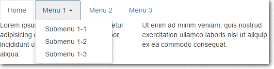
HTML Code:-
<!--"nav nav-tabs" makes tabs in bootstrap-->
<ul class="nav nav-tabs">
<li class="active"><a href="#">Home</a></li>
<!--makes tab with dropdown feature-->
<li class="dropdown">
<!--make dropdown tabs toggable-->
<a class="dropdown-toggle" data-toggle="dropdown" href="#">Menu 1
<span class="caret"></span></a>
<ul class="dropdown-menu">
<li><a href="#">Submenu 1-1</a></li>
<li><a href="#">Submenu 1-2</a></li>
<li><a href="#">Submenu 1-3</a></li>
</ul>
</li>
<li><a href="#">Menu 2</a></li>
<li><a href="#">Menu 3</a></li>
</ul>
Explanation:-
To create tabs with dropdown menu add data-toggle=”dropdown” attribute and .dropdown class to each link and it’s submenus are defined by a <ul> with .dropdown-menu class .
Dynamic Tabs
The user can quickly access the content through switching between the panes without leaving the page. content will get changed as the user switches between the tab.
Following code snippet will create dynamic tabs.
HTML Code:-
<ul class="nav nav-tabs">
<!--make tabs toggable-->
<li class="active"><a data-toggle="tab" href="#home">Home</a></li>
<li><a data-toggle="tab" href="#menu1">Menu 1</a></li>
<li><a data-toggle="tab" href="#menu2">Menu 2</a></li>
</ul>
<!--code to open the cantent of tabs-->
<div class="tab-content">
<div id="home" class="tab-pane fade in active">
<h3>HOME</h3>
<p>Some content.</p>
</div>
<div id="menu1" class="tab-pane fade">
<h3>Menu 1</h3>
<p>Some content in menu 1.</p>
</div>
<div id="menu2" class="tab-pane fade">
<h3>Menu 2</h3>
<p>Some content in menu 2.</p>
</div>
</div>
Explanation:-
To create Dynamic Tabs add data-toggle=”tab” attribute to each link then add a tab-pane class with unique id for every tab content and wrap them all inside a <div> element with tab-content class .
Bootstrap-vertical-tabs
nav nav-tabs tabs-left and nav nav-tabs tabs-right classes of Bootstrap are used to make vertical tab.
HTML Code:–
<html>
<head>
<meta charset="utf-8">
<title>Bootstrap Vertical Tabs</title>
<link rel="stylesheet" href="http://netdna.bootstrapcdn.com/bootstrap/3.3.0/css/bootstrap.min.css">
<link rel="stylesheet" href="bootstrap.vertical-tabs.css">
<script src="https://code.jquery.com/jquery-2.1.1.min.js"></script>
<script src="http://netdna.bootstrapcdn.com/bootstrap/3.3.0/js/bootstrap.min.js"></script>
</head>
<body>
<div class="container">
<div class="page-header">
<h1>Bootstrap Vertical Tabs <small> | Demo</small></h1>
</div>

<div class="row" style="min-height:600px;">
<div class="col-sm-6">
<h3>Left Tabs</h3>
<hr/>
<div class="col-xs-3"> <!-- required for floating -->
<!-- Nav tabs -->
<ul class="nav nav-tabs tabs-left">
<li class="active"><a href="#home" data-toggle="tab">Home</a></li>
<li><a href="#profile" data-toggle="tab">Profile</a></li>
<li><a href="#messages" data-toggle="tab">Messages</a></li>
<li><a href="#settings" data-toggle="tab">Settings</a></li>
</ul>
</div>
<div class="col-xs-9">
<!-- Tab panes -->
<div class="tab-content">
<div class="tab-pane active" id="home">Home Tab.</div>
<div class="tab-pane" id="profile">Profile Tab.</div>
<div class="tab-pane" id="messages">Messages Tab.</div>
<div class="tab-pane" id="settings">Settings Tab.</div>
</div>
</div>
</div>
</div>
</div>
</body>
</html>
CSS Code:-
/*!
* bootstrap-vertical-tabs - v1.2.1
*/
.tabs-left, .tabs-right {
border-bottom: none;
padding-top: 2px;
}
.tabs-left {
border-right: 1px solid #ddd;
}
.tabs-right {
border-left: 1px solid #ddd;
}
.tabs-left>li, .tabs-right>li {
float: none;
margin-bottom: 2px;
}
.tabs-left>li {
margin-right: -1px;
}
.tabs-right>li {
margin-left: -1px;
}
.tabs-left>li.active>a,
.tabs-left>li.active>a:hover,
.tabs-left>li.active>a:focus {
border-bottom-color: #ddd;
border-right-color: transparent;
}

.tabs-right>li.active>a,
.tabs-right>li.active>a:hover,
.tabs-right>li.active>a:focus {
border-bottom: 1px solid #ddd;
border-left-color: transparent;
}
.tabs-left>li>a {
border-radius: 4px 0 0 4px;
margin-right: 0;
display:block;
}
.tabs-right>li>a {
border-radius: 0 4px 4px 0;
margin-right: 0;
}
.sideways {
margin-top:50px;
border: none;
position: relative;
}
.sideways>li {
height: 20px;
width: 120px;
margin-bottom: 100px;
}
.sideways>li>a {
border-bottom: 1px solid #ddd;
border-right-color: transparent;
text-align: center;
border-radius: 4px 4px 0px 0px;
}
.sideways>li.active>a,
.sideways>li.active>a:hover,
.sideways>li.active>a:focus {
border-bottom-color: transparent;
border-right-color: #ddd;
border-left-color: #ddd;
}
.sideways.tabs-left {
left: -50px;
}
.sideways.tabs-right {
right: -50px;
}
.sideways.tabs-right>li {
-webkit-transform: rotate(90deg);
-moz-transform: rotate(90deg);
-ms-transform: rotate(90deg);
-o-transform: rotate(90deg);
transform: rotate(90deg);
}
.sideways.tabs-left>li {
-webkit-transform: rotate(-90deg);
-moz-transform: rotate(-90deg);
-ms-transform: rotate(-90deg);
-o-transform: rotate(-90deg);
transform: rotate(-90deg);
}Note:-To run the above code you must include bootstrap.min.css, bootstrap.vertical-tabs.css, jquery-2.1.1.min.js, bootstrap.min.js files in your code
Conclusion
In this tutorial we have learned about, how to create Tabs in Bootstrap, Hope you have had a great experienced reading it. Keep visiting our website in future for more knowledge and information.
Also read our popular post:-
Bootstrap Grid
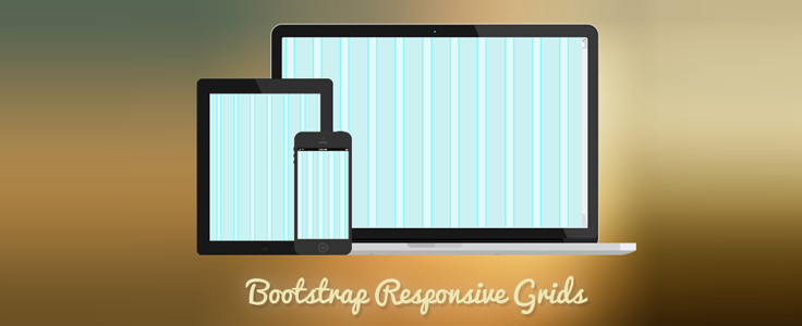
Bootstrap Grid System is mobile-first fluid grid system which is made up of a series rows and columns to provide a structure to website and to place it’s content in the intersected areas easily.
The Bootstrap grid is a library of HTML/CSS components that allow you to structure a website and place a website’s content in desired locations easily. It appropriately scales up to 12 columns as the device or viewport size increases.
For an appropriate solution, you can refer to our premium bootstrap templates.
Bootstrap Grid System allows you to create up to 12 columns and unlimited rows. Hence it is made up of 3 things:-
- A container
- Rows
- Columns
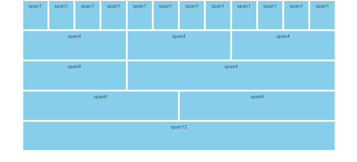
To create the above structure of website the HTML code is :-
<!--to create a grid-->

<div class="container">
<div class="row">
<div class="col-md-1">span 1</div>
<div class="col-md-1">span 1</div>
<div class="col-md-1">span 1</div>
<div class="col-md-1">span 1</div>
<div class="col-md-1">span 1</div>
<div class="col-md-1">span 1</div>
<div class="col-md-1">span 1</div>
<div class="col-md-1">span 1</div>
<div class="col-md-1">span 1</div>
<div class="col-md-1">span 1</div>
<div class="col-md-1">span 1</div>
<div class="col-md-1">span 1</div>
</div>
<div class="row">
<div class="col-md-4">span 4</div>
<div class="col-md-4">span 4</div>
<div class="col-md-4">span 4</div>
</div>
<div class="row">
<div class="col-md-4">span 8</div>
<div class="col-md-8">span 4</div>
</div>
<div class="row">
<div class="col-md-6">span 6</div>
<div class="col-md-6">span 6</div>
</div>
<div class="row">
<div class="col-md-12">span 12</div>
</div>
Container
A container is used to hold rows and columns. It is a simple <div> element with a class of .container. The container provides a proper width for the layout, acting as a wrapper for the content. There are two types of containers:-
1. .container is used for responsive fixed width containers. It also has different fixed widths in different sized devices.
<!--to create a container-->
<div class="container">
<div class="row">
......
</div>
</div>
2. .fluid-container is used for full width containers, and use entire width of your viewport.
<!--to create a fluid-container-->
<div class="fluid-container">
<div class="row">
......
</div>
</div>
Row
A row acts like a wrapper around the columns. It nullifies the padding set by the container element by using a negative margin value of -15px on both the left and right sides.
A row is created by adding the class .row to a block level element inside the container and spans from the left edge to the right edge of the container element.
Finally, there’s no limit on the number of rows you can create.
Columns
Different column class prefixes are used by Bootstrap for different sized devices. These prefixes are shown below:-
| Class Prefix | Device Size |
|---|---|
| .col-xs- | <768px |
| .col-sm- | 768px to 991px |
| .col-md- | 992px to 1199px |
| .col-lg- | ≥ 1200px |
The class .col-xs-12 creates a single column that spans across 12 virtual Bootstrap columns. Hence, this column’s width will be the width of the row. In Bootstrap, if a column is defined for a particular type of device then it is guaranteed to behave similarly in larger devices as well.
Therefore, a column defined for extra smaller devices will work in all types of devices.
Grid Classes
Bootstrap grid system has four types of classes which can be combined to obtain more dynamic and flexible layouts.
- xs class(for the phone)
- sm(for the tablets)
- md(for the desktop)
- lg(for the large desktop)
Structure of bootstrap grid
Hence the basic structure of bootstrap grid:
firstly, create a container <div class=”container”>
secondly, create a row <div class=”row”>
and then add desire columns<div class=”col-*-*”>
<!--to create bootstrap grid structure-->

<div class="container">
<div class="row">
<div class="col-*-*"></div>
</div>
<div class="row">
<div class="col-*-*"></div>
<div class="col-*-*"></div>
<div class="col-*-*"></div>
</div>
<div class="row">

</div>

</div>
Mobile first strategy:
- content : determine what is most important.
- Layout : firstly, design to smaller width, media queries address for tablet,desktop.
- Progressively Enhancement : Add elements as screen size increasingly.
To proper rendering and zooming touch. add the viewport meta tag in the <head> section.
<!--to create viewport meta tag for mobile phone-->

<meta name="viewport" content="width=device-width, initial-scale=1.0">
Grid options
Below table summarizes on working of the bootstrap grid system in multiple devices .
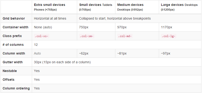
Offset Columns
Offsets is useful feature for layouts. To use offsets for large displays layout, use the .col-md-offsets-* classes. These classes increase the left margin of columns by * columns where*range from 1 to 11.
classes .col-xs-offset-* doesn’t supports offsets but they are easily replicated by using an empty cell.
<!--to creating the offset -->

<div class="container">
<h1>Hello, world!</h1>
<div class="row" >
<div class="col-xs-6 col-md-offset-3"
style="background-color: #dedef8;box-shadow:
inset 1px -1px 1px #444, inset -1px 1px 1px #444;">
<p>Lorem ipsum dolor sit amet, consectetur adipisicing
elit.
</p>
</div>
</div>
Bootstrap Example
Below are some of the bootstrap examples for different website layouts:
Three Equal Columns
We can create three columns of same size but one must remember that every row is 12 in size and so one must divide the column accordingly.

<!--to create two equal columns-->

<div class="row">
<div class="col-sm-4">.col-sm-4</div>
<div class="col-sm-4">.col-sm-4</div>
<div class="col-sm-4">.col-sm-4</div>
</div>
Three unequal Columns
We can also create three unequal size columns and thus has to adjust as follows:

<!--to create three unequal columns-->

<div class="row">
<div class="col-md-3">.col-md-3</div>
<div class="col-md-6">.col-md-6</div>
<div class="col-md-3">.col-md-3</div>
</div>
Two columns with two nested columns
We can create nested columns by inserting a row of columns within an existing column. This gives you two columns starting at desktops and scaling to large desktops with another two (equal widths) within the larger column.

<!--to create nested columns-->

<div class="row">
<div class="col-md-8">.col-md-8
<div class="row">
<div class="col-md-6"></div>
<div class="col-md-6"></div>
</div>
</div>
<div class="col-sm-4">.col-sm-4</div>
</div>
Mobile and desktop
We can create layouts for extra small and medium devices by adding classes .col-xs-* * .col-md-* in columns.
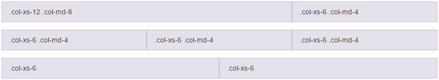
<!--stack the column on mobile by one full width and other half width-->
<div class="row">
<div class="col-xs-12 col-md-8">col-xs-12 col-md-8</div>
<div class="col-xs-6 col-md-4">col-xs-6 col-md-4</div>
</div>

<!-- Columns start at 50% wide on mobile and bump up to 33.3% wide on desktop -->
<div class="row">
<div class="col-xs-6 col-md-4">col-xs-6 col-md-4</div>
<div class="col-xs-6 col-md-4">col-xs-6 col-md-4</div>
<div class="col-xs-6 col-md-4">col-xs-6 col-md-4</div>
</div>

<!-- Columns are always 50% wide, on mobile and desktop -->
<div class="row">
<div class="col-xs-6">.col-xs-6</div>
<div class="col-xs-6">.col-xs-6</div>
</div>
Conclusion
Form this tutorial you have learned how to make responsive and semantic website using Bootstrap Grid System.
Keep reading our blogs and feel free to comment if there’s anything that I haven’t discussed in Bootstrap’s grid system which you find thought-provoking or questionable, etc.
For more related information check out the following blogs –
Bootstrap Buttons
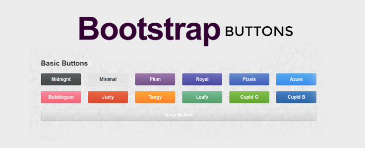
Buttons are the integral part of a website and application. They are used for various purposes like, submit or reset an HTML form, performing interactive actions such as showing or hiding something on a web page on click of the button, etc.
Give it a look at our bootstrap premium themes for a bettter solution to your problems.
Button Tags
Buttons in bootstrap are created using some specific classes of bootstrap.
These classes can be used with <a> <button> <input> element.
Note: – As a best practice, we highly recommend using the <button> element whenever possible to ensure matching cross-browser compatibility
<a class="btn btn-default" href="#" role="button">Link</a>
<button class="btn btn-default" type="submit">Button</button>
<input class="btn btn-default" type="button" value="Input">
<input class="btn btn-default" type="submit" value="Submit">
Button Styles
Bootstrap provides seven classes for styling the buttons as well as to indicate the different states. following are those classes:-
- .btn-default
- .btn-primary
- .btn-success
- .btn-info
- .btn-warning
- .btn-danger
- .btn-link
<!DOCTYPE html>
<html lang="en">
<head>
<title>Bootstrap Example</title>
<meta charset="utf-8">
<meta name="viewport" content="width=device-width, initial-scale=1">
<link rel="stylesheet" href="http://maxcdn.bootstrapcdn.com/bootstrap/3.3.5/css/bootstrap.min.css">
<script src="https://ajax.googleapis.com/ajax/libs/jquery/1.11.3/jquery.min.js"></script>
<script src="http://maxcdn.bootstrapcdn.com/bootstrap/3.3.5/js/bootstrap.min.js"></script>
</head>
<body>
<div class="container">
<h2>Button Styles</h2>
<!-- Standard button -->
<button type="button" class="btn btn-default">Default</button>
<!-- identifies the primary action in a set of buttons -->
<button type="button" class="btn btn-primary">Primary</button>
<!-- Indicates a successful or positive action -->
<button type="button" class="btn btn-success">Success</button>
<!-- button for informational alert messages -->
<button type="button" class="btn btn-info">Info</button>
<!-- Indicates caution should be taken with this action -->
<button type="button" class="btn btn-warning">Warning</button>
<!-- Indicates a dangerous or potentially negative action -->
<button type="button" class="btn btn-danger">Danger</button>
<!-- button look like a link -->
<button type="button" class="btn btn-link">Link</button>
</div>
</body>
</html>
Warning: Internet Explorer 9 doesn’t crop background gradients on rounded corners, so the gradient is removed from buttons.
Button Sizes
Bootstrap provides four classes to get buttons of various sizes:-
- .btn-lg
- .btn-md
- .btn-sm
- .btn-xs
<!DOCTYPE html>
<html lang="en">
<head>
<title>Bootstrap Example</title>
<meta charset="utf-8">
<meta name="viewport" content="width=device-width, initial-scale=1">
<link rel="stylesheet" href="http://maxcdn.bootstrapcdn.com/bootstrap/3.3.5/css/bootstrap.min.css">
<script src="https://ajax.googleapis.com/ajax/libs/jquery/1.11.3/jquery.min.js"></script>
<script src="http://maxcdn.bootstrapcdn.com/bootstrap/3.3.5/js/bootstrap.min.js"></script>
</head>
<body>
<div class="container">
<h2>Button Sizes</h2>
<!--This makes the button size large.-->
<button type="button" class="btn btn-primary btn-lg">Large</button>
<!--This makes the button of medium size-->
<button type="button" class="btn btn-primary btn-md">Medium</button>
<!--This makes the button of small size-->
<button type="button" class="btn btn-primary btn-sm">Small</button>
<!--This makes the button of extra small size-->
<button type="button" class="btn btn-primary btn-xs">XSmall</button>
</div>
</body>
</html>
Block Level Buttons
You can also create block level buttons (buttons that cover the full width of the parent elements) by adding an extra class .btn-block.
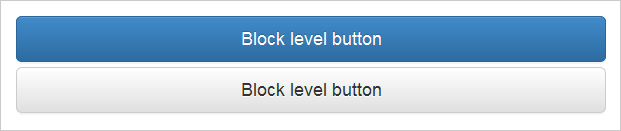
<button type="button" class="btn btn-primary btn-lg btn-block">Block level button</button>
<button type="button" class="btn btn-default btn-lg btn-block">Block level button</button>
Button State
Bootstrap classes allow you to change the state of buttons as active, disabled etc.
A button can be set to an active (appear pressed) or a disabled (unclickable) state.
The class .active makes a button appear pressed, and the class .disabled makes a button unclickable.
<button type="button" class="btn btn-primary active">Active Primary</button>
<button type="button" class="btn btn-primary disabled">Disabled Primary</button>
Note: – The .disabled class only changes the visual appearance of the link by making it gray and removing the hover effect, however, the link will remain clickable unless you remove the “href” attribute.
Conclusion:-
In this tutorial we have learned about, how to create Buttons in Bootstrap, Hope you have benefited from it. Keep visiting our website in future for more knowledge and information.
Also read our popular post:-
How MailGet Is Different From Other Email Marketing Services

I got a “presales” email few days back for MailGet – email service provider from one of the users … Here is what he asked …
Hi Neeraj,
Just curious to know how different are you from Mailjet?
Mailjet happens to have its own SMTP server, also it is offering me a drag and drop feature to send out email campaigns.
While at your end, I have to connect someone else’s SMTP service for sending emails.
Regards,
Hardik Jain
Here is how I answered his query and explained “How MailGet beats any other email service provider out there” …
Hi Hardik,
MailGet gives you the freedom to connect multiple SMTP services in your account.
There are 3 primary advantages when you do that:
1. Achieve Highest Open Rates:
Having multiple SMTP in one account allows you to test and experiment between multiple SMTP’s to see which one brings you the highest open rates and inbox deliverability.2. Freedom to Switch
If you run into any issues with any particular SMTP service or if any particular SMTP service blocks you for high bounce rates, you can always switch to the another without affecting your campaigns earlier records and stats.3. Never Lose any data
All the previous bounces, spams, unsubscribes and all your data remains within MailGet, so that when you switch and start sending with another SMTP, you don’t have to worry that the emails might be sent to those bounced or unsubscribed contacts ever again.Regards,
Neeraj
Personally, we have connected our own MailGet account with Amazon SES, MailGun and SendGrid.
Since, each one of them “charge on the volume basis” … We keep on experimenting between each one of them to achieve highest inbox deliverability …
I personally saw an “increase of 300% in open rates” ever since I started experimenting and trying out sending emails using different SMTP services from within same interface …
Plus, if we run into any problems with any service, we have the “freedom to switch instantly” without affecting our entire campaign management.
When you choose any one email service provider like Getresponse, Aweber, Constant Contact or MailJet, you are locking yourself with just one service and their interface without having the freedom to switch or experiment, if you run into issues or problems with any one of them.
Bootstrap Modal

Bootstrap Modal is basically a pop-up box that is used to provide information and alert to the user. It is displayed on top of the current page.
One of the multi-purpose lightweight JavaScript popup that is custom-built and responsive and can be used: to display alert popups, videos, and images in a website, to warn users for session timeout or to seek their permission before submitting important information.
Our bootstrap themes will provide you an appropriate solution to your problems.
The Bootstrap Modal comprises of three sections :-
1. The Header
2. The Message Body
3. The footer
The most interesting thing about implementing modals is that we don’t have to write any JavaScript code to use it, as all the code and styles are predefined in Bootstrap, we just have to use the proper combination of Markup and Attributes to trigger the actions accordingly.
Watch the live demo or download code from the link given below:
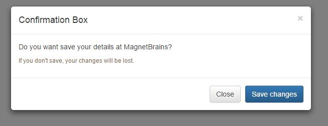
Code:
To employ the above modal, simply copy-paste the below code snippet to a HTML file, which can be run normally.
<!DOCTYPE html>
<html lang="en">
<head>
<meta charset="UTF-8">
<title>Bootstrap Modals</title>
<link rel="stylesheet" href="https://maxcdn.bootstrapcdn.com/bootstrap/3.3.5/css/bootstrap.min.css">
<link rel="stylesheet" href="https://maxcdn.bootstrapcdn.com/bootstrap/3.3.5/css/bootstrap-theme.min.css">
<script src="https://ajax.googleapis.com/ajax/libs/jquery/1.11.3/jquery.min.js"></script>
<script src="https://maxcdn.bootstrapcdn.com/bootstrap/3.3.5/js/bootstrap.min.js"></script>
<script type="text/javascript">
$(document).ready(function(){
$("#myModal").modal('show');
});
</script>
</head>
<body>
// This is Modal Box To hold Complete Content in Div
<div id="myModal" class="modal fade">
<div class="modal-dialog">
<div class="modal-content">
// This is the Div for HEADER
<div class="modal-header">
<button type="button" class="close" data-dismiss="modal" aria-hidden="true">×</button>
<h4 class="modal-title">Confirmation Box</h4>
</div>
// This is the Div for BODY
<div class="modal-body">
<p>Do you want save your details at MagnetBrains?</p>
<p class="text-warning"><small>If you don't save, your changes will be lost.</small></p>
</div>
// This is the Div for FOOTER
<div class="modal-footer">
<button type="button" class="btn btn-default" data-dismiss="modal">Close</button> //Close Button
<button type="button" class="btn btn-primary">Save changes</button> //Save Changes Button
</div>
</div>
</div>
</div>
</body>
</head>
</html>
Detailed explanation of Code
Activating Bootstrap modal via data attributes requires two components:-
- Controller element like a button or link
- Modal element
- The outermost container of every modal in a document must have a unique id (in this case, id=”myModal“), so that it can be targeted via data-target (for buttons) or href (for hyperlinks) attribute of the controller element.
- The attribute data-toggle=”modal” is required to add on the controller element, like a button or an anchor, along with a attribute data-target=”#myModal” or href=”#myModal” to target a specific modal to toggle.
- The .modal-dialog class sets the width as well as horizontal and vertical alignment of the modal box. Whereas the class .modal-content sets the styles like text and background color, borders, rounded corners etc.
- The .modal-header element defines a header for the modal that usually contains a modal title and a close button, whereas the .modal-body element contains the actual content like text, images, forms etc. and the .modal-footer element defines the footer that typically contains action buttons for the user.
- The .fade class on the .modal element adds a fading and sliding animation effect while showing and hiding the modal window. If you want the modal to simply appear without any effect you can remove this class.
Setting the Size of Modals
Bootstrap also gives us option to decide the size of our modals, which can be either large or small. We can a make modals larger (.modal-lg) or smaller (.modal-sm) by adding an extra class on .modal-dialog.
Activating the Modal with jQuery
To control the modal via jQuery, you need to call the .modal() function on the modal’s selector as:-
// Function to activate model via jQuery

$('#basicModal').modal(options);
Bootstrap OPTIONS:
Options are those entities which can be passed as a data attribute or JavaScript to customize the look and enhance the appearance of a Modal.
- backdrop: This can be either true or static and defines whether or not you want the user to be able to close the modal by clicking the background. Specify static for a backdrop, if you don’t want the modal to be closed when the user clicks outside of the modal.
- keyboard: if set to true, the modal will close via the ESC key.
- show: Used for opening and closing the modal. It can be either true or false.
- remote: This is used to load remote content using jQuery .load() method. You need to specify an external page in this option. It is set to false by default.
Bootstrap Modal’s Events
You can further customize the normal behavior of the Bootstrap modal by using various events that are triggered while opening and closing the modal. These events have to be bound using jQuery .on() method.
Various events available are:
- show.bs.modal: fired just before the modal is open.
- shown.bs.modal: fired after the modal is shown.
- hide.bs.modal: fired just before the modal is hidden.
- hidden.bs.modal: fired after the modal is closed.
- loaded.bs.modal: fired when remote content is successfully loaded in the modal’s content area using the remote option mentioned above.
The following table describes how to implement the Events:-
| Event | Description | Example |
|---|---|---|
| show.bs.modal | Fired after the show method is called. | $(‘#identifier’).on(‘show.bs.modal’, function () { // do something… }) |
| shown.bs.modal | Fired when modal has been visible to the user (will wait for CSS transitions to complete). | $(‘#identifier’).on(‘shown.bs.modal’, function () { // do something… }) |
| hide.bs.modal | Fired when the hide instance method has been called. | $(‘#identifier’).on(‘hide.bs.modal’, function () { // do something… }) |
| hidden.bs.modal | Fired when the modal has finished being hidden from the user. | $(‘#identifier’).on(‘hidden.bs.modal’, function () { // do something… }) |
Conclusion :
The Bootstrap modal is a very compact and easy to handle pop-ups. It is one of the best plugin to load content inside a popup screen without writing any JavaScript.
Hope you have enjoyed reading this blog post and got the concept. You can share your views in the space provided below and get in touch with us.
For more related information just go through the following blogs –
Setup Amazon SES Account for Handling Bounces
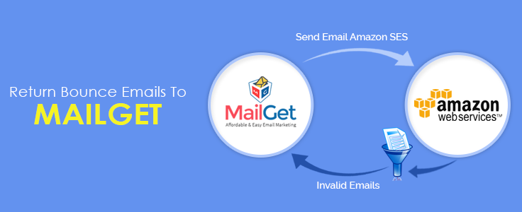
That’s no wonder if your mailing list contains a large number of invalid email addresses.
So we recommend you to configure SNS with your SES account and get rid of any such invalid/expired emails containing in your mailing list.
When next time your emails will be sent, all the bounced email addresses will be filtered out from your contact list.
Just follow these few steps required for configuration after which SNS will start sending notification of every bounced email to your MailGet application then MailGet application will add these emails in your bounce list.
With the help of these notifications, MailGet will be able to filter your emails list and help you maintain a good reputation of your Amazon account.
Follow the below steps –
Step: 1 Go to the “Services” section and click on “SNS – Simple Notification Service” option.
Step: 2 Add topic as “Bounce” under the Topic name option and hit “Next Step” button.
Step: 3 After clicking on a “Create Topic” a display screen will appear, where you will have to give a Topic Name as “Bounce” and Display Name as “Bounce_Complaints”. Once you have added the desired names then click “Create Topic” button.
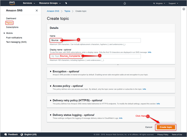
Step: 4 Next, click on “Create subscription” button.
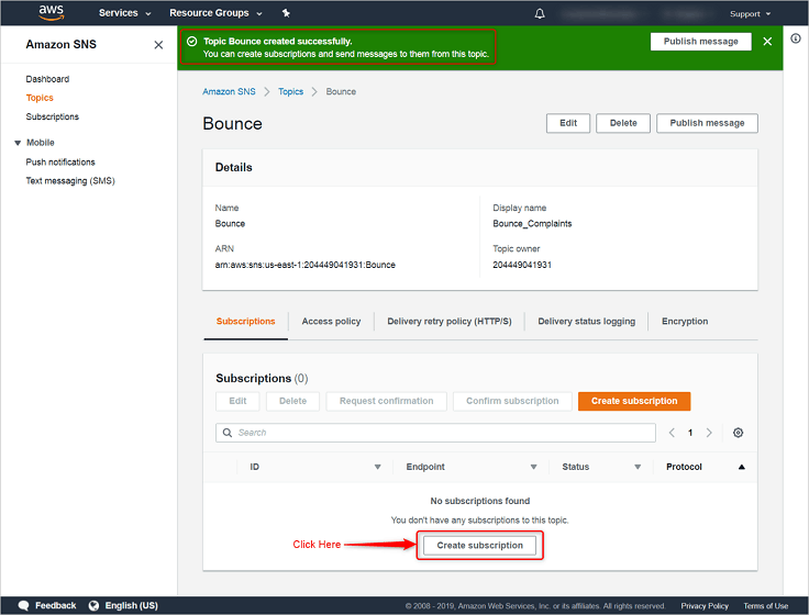
Step: 5 In this step, you will have to add the endpoint. So, select Protocol as “HTTPS”.
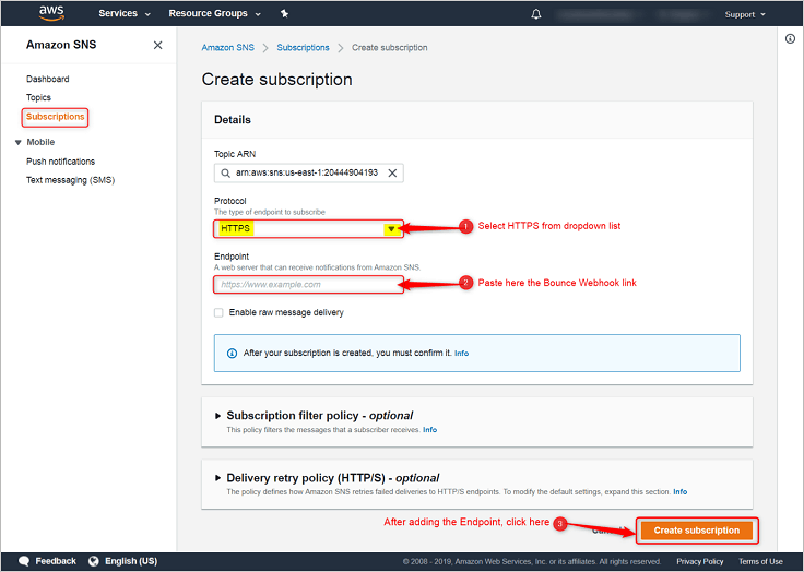
Next, just copy & paste the link for Endpoint viz., given in your MailGet account as “Bounce Webhook”, under Bounce & Spam Handlings section and then click on “Create subscription”.
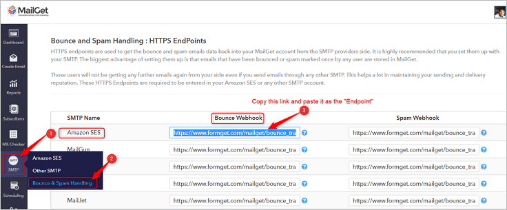
Step: 6 It will show a status of “Pending confirmation” and to confirm it, you will first have to move on to the “Subscriptions” label.
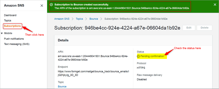
Step: 7 Select “Pending confirmation” option from the checkbox and then click on “Request confirmation” button.
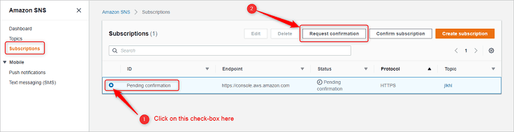
Step: 8 Now go to the “Services” section and then select “SES“.
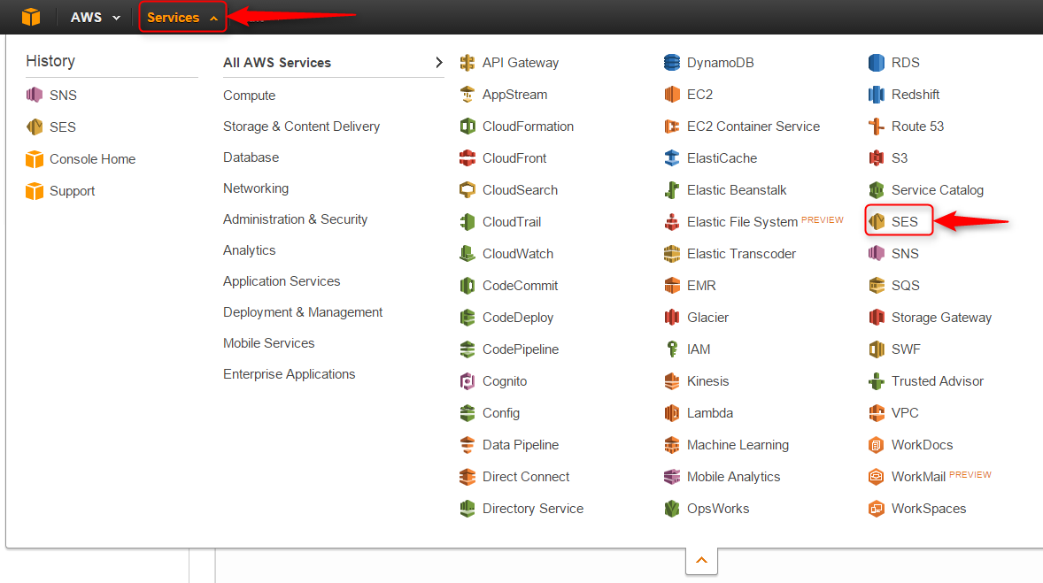
Step: 9 Click on the “Email Addresses” label.
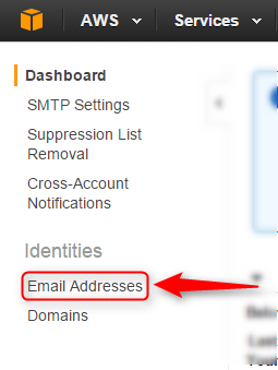
Step: 10 Now click on your verified Sender: “Email address”
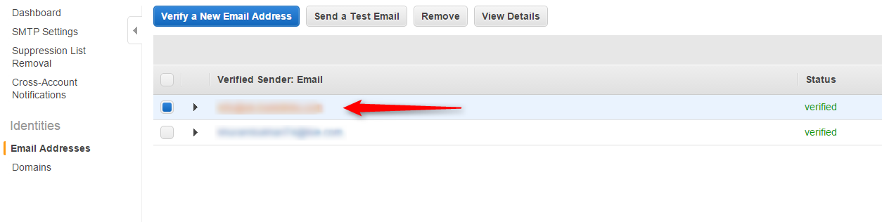
Step: 11 After that click on “Notification” Option.
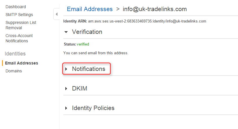
Step: 12 Then click on the “Edit Configuration” Button.
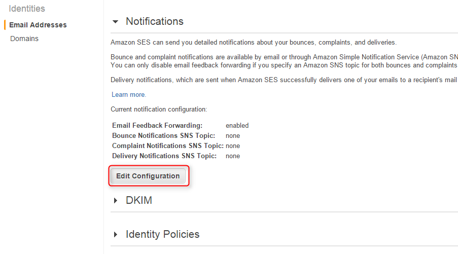
Step: 13 Finally, select the “Bounce_Complaints” available under the dropdown list of SNS Topic Configuration → Bounces. After that, click on “Save Config”.
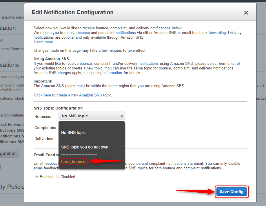
If you still experience problems, you can reach our support team anytime, or can talk to our support member over online chat.
PayPal Sandbox Credit Card Creation

The PayPal Sandbox is a virtual testing environment for testing PayPal application process request without touching any live PayPal accounts. In PayPal you can done payment via buyer email id or PayPal sandbox credit card.
In our previous blog post we covered PayPal’s different topic like PayPal IPN, PayPal Mass Payments, PayPal shopping Cart and much more. In these all example, we have made payment via buyer email id.
And we also cover PayPal, Credit Card Payment in PHP where we test this application via PayPal sandbox credit card.
In this tutorial we are going to explain how we can create a PayPal sandbox credit cart for testing application process in the sandbox.
Do follow steps for generating PayPal sandbox credit card
Step : 1 On Browser, browse https://developer.paypal.com/
Step : 2 Now click on login button.

Step : 3 Now login via your PayPal existing credentials.

Step : 4 After login, below screen will appear now click on the dashboard.

Step : 5 Now Click on accounts link.

Step : 6 After clicking on accounts link sandbox test account’s business and personal email id will show. Now click on any business email id.

Step : 7 When you click on any business id, profile and notification link will appear now click on the profile link.

Step : 8 After clicking on a profile link one popup will appear which show different tab, now click on setting tab and on payment review and Negative testing.

Step : 9 Now click on funding tab here you can see your sandbox Bank account details, your credit card details which include credit card number, expiration date and card type.

Note: You can test your virtual sandbox credit card on our previous blog PayPal, Credit Card Payment in PHP which explain how we can make an application where PayPal payment done via credit card.
Conclusion :
Reading the above post will help you to generate sandbox credit card to test online payment via PayPal using a sandbox virtual credit card. Hope you will be benefited by that. Please share your feedback in the space provided below.. 
Recommended blogs –
- PayPal Refund Process using PHP PayPal Refund API
- Login Form In PHP